Google Icon Update Incoming: Cleaner, Flatter
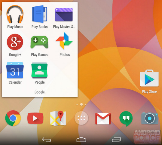
This week there's word that Android – if not the web as well – will be getting a full makeover by Google in the icon department. Evidence suggests that the icons being added to the world of Android and the web will be flatter, a bit more well organized, and sized relative to one another.
This would be the first full-fledged icon update for quite a long time, with KitKat and Jelly Bean bringing in their slight updates but leaving some icons to stick where they were. Here we're seeing what appears to be a fully integrated set.
In other words, it looks like someone sat down and designed the whole set of icons at once, rather than adding them as each new app arrived. This is something that Google will benefit from in systems like Android as their icons will all appear more uniform and professional with one another.

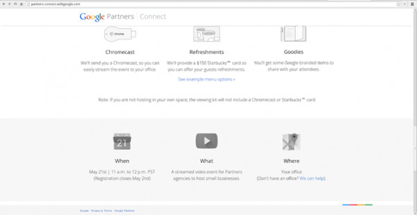
The tip that these icons will exist comes from Android Police where they suggest they've gotten them from at least two different sources. One source lives in Android while the other appears on a Google Partners page on the desktop-based web.

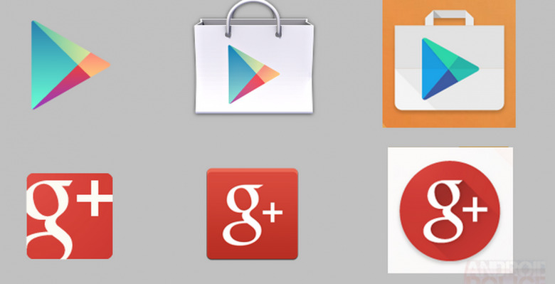
Gmail will look more like a closed envelope, more like the web-based unit, while Hangouts will get a bit more sharp. Calendar turns into a rolodex while Photos gets square. Maps gets rid of the big "g" while YouTUbe stays largely the same, and Google Play turns into a more modern shopping bag with a green and blue arrow. Google+ becomes a circle.
It's unknown whether these icons will stick around to final design or if they'll appear on desktop, Android, or both. Release date is likely soon as the icons appear complete, one way or the other.
