Gmail Changes For Android Leak Via Google+
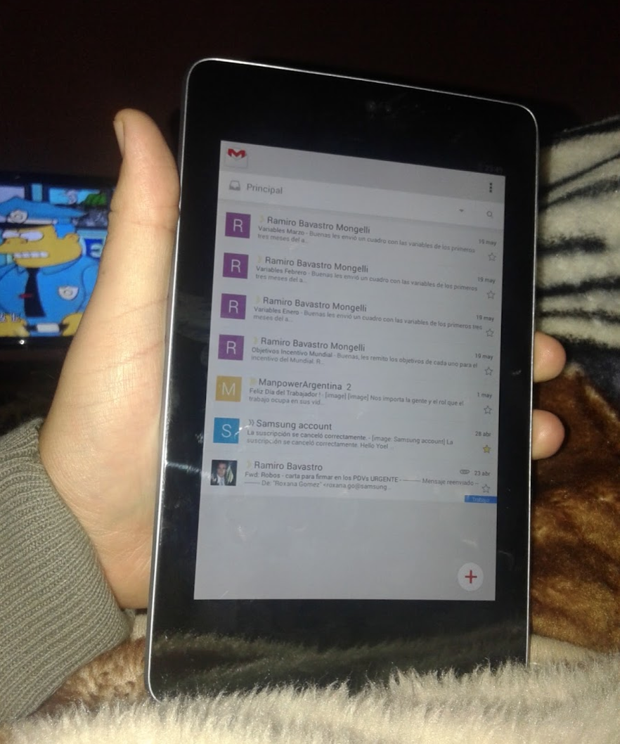
A few pictures of a revamped Gmail for Android have surfaced, showing a slight update to the app. It reminds many of the Google+ update that slid in recently, and seems to get away from the slide-out menu in favor of drop-downs. A floating compose button is also eerily similar to the Google+ Android app.
The interface as it stands doesn't appear to have changed much, but it does bring in a few small changes. The slide-out menu seems to have disappeared, as the three-lined cue on the top left has gone away. It could simply be gesture-based without a visual marker, but based on appearance — it seems to be gone. The downward arrow near the top right suggests we'll get a drop-down menu much like the one from the most recent Google+ update.
Compose also moves to the bottom of the screen, where a floating "plus" round icon is there for us. This migrates it away from the top of the screen, where an envelope with a plus currently sits. The search button has also moved a touch south, sitting next to what appears to be the new drop-down menu icon. The three-dot "refresh" and "label settings" menu is still on the top right, but it's not yet known if it has been altered.
These changes have no release timeframe, and they aren't sold as a finished product. Right now, it seems as though Google is working on additional tweaks to their apps, bringing them in line with another new design philosophy. If it makes news at Google I/O this year, we'll be on location to bring you all the goings-on!
Thanks, anonymous!
Source: Google+


