Facebook Is Testing New 'Conversational' Comment Designs
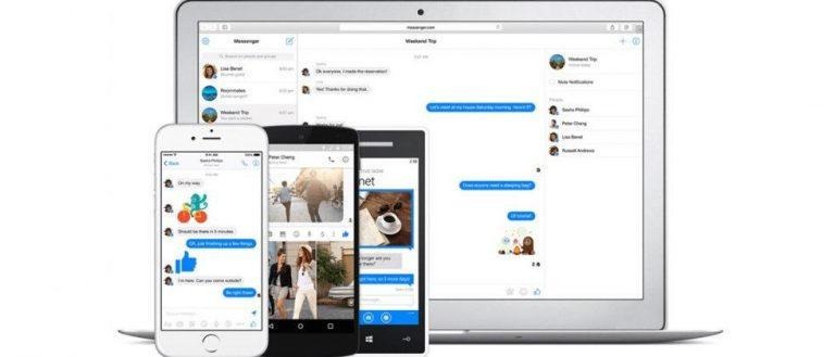
Anyone who uses a messaging app like Messenger will be familiar with the bubble-like style used to encapsulate messages. Such a style may one day be the default design of comments found on Facebook, at least judging by screenshots of a new test that has surfaced. The social network is currently testing multiple new styles for comments on Facebook, indicating that some big changes are in users' futures.
In its current iteration, Facebook comments don't have any clear separation, instead being clean and left-side aligned on a grayish background. In new screenshots that have surfaced, that design has been replaced by one with much more wasted space — the comments are in bubble-like boxes with timestamps, like, and reply options beneath them.

Facebook indicated in a statement to Buzzfeed that it is testing the design you see above as a way to make comments posted on Facebook appear more conversational. The style is akin to what you'd find in a messaging app, including its own Messenger. Whether this is a move to make regular Facebook users feel more comfortable on Messenger and therefore more likely to use it is unclear.
This is apparently only one of multiple designs the company is testing, though screenshots of the others haven't surfaced at this time. Facebook indicates this is one of many tests it performs; it calls the new design a 'small test,' indicating most people won't see it.
SOURCE: Buzzfeed