Evernote Updates Web App With Cleaner, Faster Interface
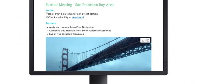
Following a series of beta tests since last October, Evernote has finally started rolling out a fresh new interface for its web app this week. The overall look is intended to provide users with a "distraction-free" environment, thanks to a user interface that is both faster and cleaner. Evernote mentions that it's not trying to replicate the experience of its already existing desktop apps, but it also seems to be more than a little inspired by the editor from web writing platform Medium.
"Rather than be derivative of another client, we felt it should exemplify the speed and lightness of the modern web," the company said in their announcement blog post. Evernote explains that the main menu for navigation has been moved the left side of the screen, where buttons for notebooks, shortcuts, and tags are easily accessible.

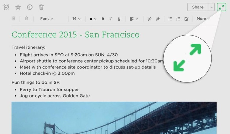
To emphasize the distraction-free goal, there is now a button in the upper-right corner that will expand any writing space into a full-screen view. Choosing to create a new note automatically opens to this view, so users can start with a large, clean workspace.
Evernote adds that it's gradually rolling out the new interface to its users over the next few weeks. During this transition period, those who have the new UI and don't like it can switch back to the old version, although this only be available temporarily. They haven't decided on a hard date yet, but there will come a time when the old interface is completely phased out.
SOURCE Evernote
