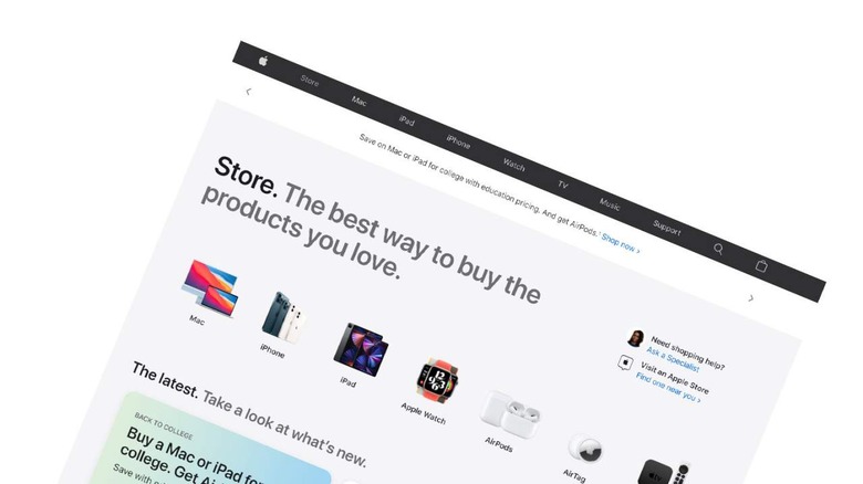
Apple Store Website Redesign Puts Touchscreen Users First
The latest update to Apple's website adds a dedicated "Store" tab to the top of the page. The title of the page is "Store", with a description on the first page: "Store. The best way to buy the products you love." Apple is identifying their store in the same way they identify Apple Watch as "Watch" – they making it clear that the user is already in the Apple universe, so there's little need to further differentiate this "Store" from any other.
The design of the Store page in the Apple website is clearly aimed at mobile users. The design relies on side-scroll menu action – most naturally navigated with a touchscreen interface. Without a touchscreen, users must hover over the rightmost part of any horizontal collection of elements to see a > (right arrow) to scroll.
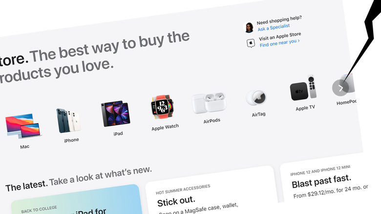
The top row of products does not match what's offered at the top level of the Apple website. We still start with Mac on the left – that's still the product that makes the most sense to appear at the start of the list. It's likely this has a bit to do with precedent, a bit to do with the name "Mac" starting with a capital letter, and a bit to do with the fact that the Mac is generally the most expensive product in the store.
Next we have iPhone, then iPad. This is the reverse order of the same products at the head of the website. Again, this likely has to do with the chosen imagery and the pattern of products that appears on the first screen with this listing on a mobile device. Next is Apple Watch – and it's odd, here, as Apple chooses to list it is "Apple Watch" while at the head of the webpage we still just see "Watch", likely because the Apple logo is at the left of the head of the page.
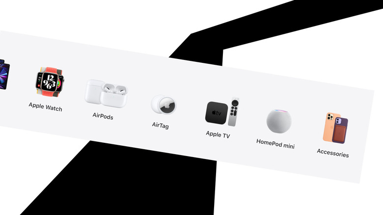
After this, we get a couple of products that aren't generally in the main list on the Apple website. We see AirPods, then AirTag. These products are strewn throughout product pages on Apple.com, for Music, iPhone, iPad, and etc., so they're not included in the main list of products at the top of the site. Now that we're in a list of products in the store, it becomes more sensible to place them on their own in the main list of products for sale.
Next we get Apple TV (again with the "Apple" written out instead of relying on the Apple logo), and HomePod mini. Apple doesn't just list HomePod here. This is the one place in the list where they've listed a very specific model of a product category, and it's not entirely clear why.
On the far right of the list of products we see "Accessories" with iPhone cases as the image. We see additional images of accessories in one of the first links in the next category on the Store page: "The latest." This section allows the user to "Take a look at what's new."
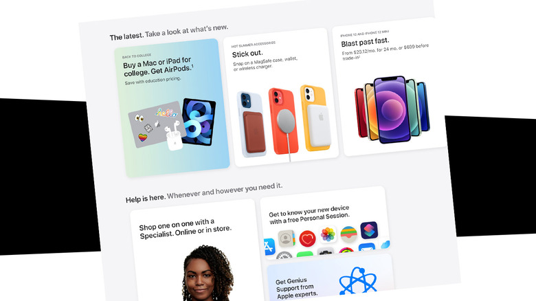
This "The latest" section will allow Apple to call out their latest product releases and deals for specific seasons. At the start, Apple has a "back to college" deal where users can "Buy a Mac or iPad for college. Get Airpods." This is just the latest iteration of a deal Apple's been running for a long, long time – back to when the free item was an iPod.
The next section is "Help is here. Whenever and however you need it." That's product support and guidance, not only for products the user already purchased, but for the process of buying products in the first place.
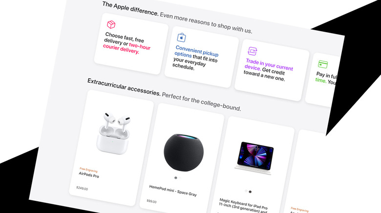
After that is a row with the text: "The Apple difference. Even more reasons to shop with us." If you weren't convinced enough to buy a product by the time you've reached this part of the Apple Store page, you'll find text boxes that'll entice you with reasons why you should consider buying something, or trading something in, or customizing a product so you'll find very little reason not to buy said product.
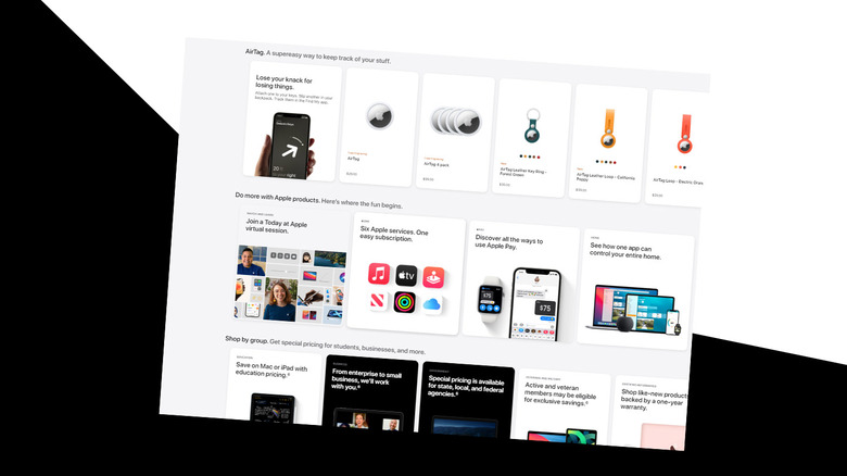
There's also a section for "Extracurricular accessories" that's aimed at "the college-bound", and a whole section for AirTag. There's another section that's titled "Do more with Apple products" that'll encourage you to subscribe to Apple's services, and another section called "Shop by group" that shows all the different sorts of groups that get special prices for products, like students, enterprise, government, and veterans and military.
The whole store can be navigated on most any sort of device, but it seems very, very likely that Apple's seen the majority of online purchases made with mobile interfaces, so they've opted for the simple UI. It's time for buttons, it's time for tapping, it's time for Apple to make the path from website to purchase as simple as possible.
