Apple Music Android App Now Looks More Like The iOS App

Apple, to date, has had only two apps on Android (excluding a Beats-specific app), and both seem to be rather half-hearted attempts to wean users over to iOS. One is even called "Move to iOS". Apple Music, which gives Android users access to the company's music streaming service, hasn't fared any better. It hasn't seen some major action until today. With version 2.0, Apple Music on Android finally gets updated to the look and feel of iOS 10, which was released half a year ago.
Of course, some might argue that Android apps, even from competing companies, should appear and behave like Android apps, using Android conventions and design language. Others would prefer consistency across all platforms. The new Apple Music apps is a mix of both.
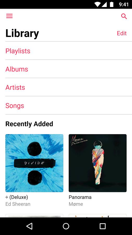
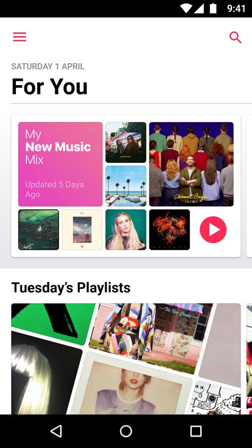
On the one hand, you still have a "hamburger" side menu that you'll never or rarely see on true-blooded iOS apps. But, on the other hand, the rest of the app looks and is organized exactly the same as the iOS counterpart. The app now lumps together playlists, albums, artists, and titles into a single "Library" section. There are also sections For You, to Browse, and, of course, Radio.


Considering Apple's relationship with Google and Android, it's actually more surprising that Apple it bothered with the update at all. The app still gets very low reviews and complaints on Google Play Store, some of which, like a login "bug", turns out to be a feature after all.