Android 8's Most Colorful New Feature
This week we're having a peek at one of the least-mentioned but most deserving of praise features in Android 8.0 Oreo. This update is out for a number of Google's smartphones and will be released to a bunch of phones from other manufacturers over the coming weeks and months. The feature we're talking about today is Google's automatic color selections for ongoing notification controls for media apps.
The feature we're looking at is available to all developers, but one single strict rule is enforced by Google on how it's implemented. "Starting from Android 8.0 (API level 26), you can set and enable a background color for a notification," said the Android developer document. "This should only be used for high priority ongoing tasks like navigation, an ongoing call, or other similarly high-priority events for the user."

Of note is the lack of a smart selection for this feature on the part of the developer. Instead, the developer is given MediaStyle and DecoratedMediaCustomViewStyle, and etcetera. What we're interested in here is the color analysis Google does for their own apps – and therefore (possibly) other media apps playing music or video in the near future.
The guidelines we're seeing met here are part of Material Design guidance as outlined at Material dot IO. That's Google's design guide for developers of all manner of Android or Chrome-based apps. The big piece of the puzzle we're working through today is the Material Design direction: "bold, graphic, intentional".

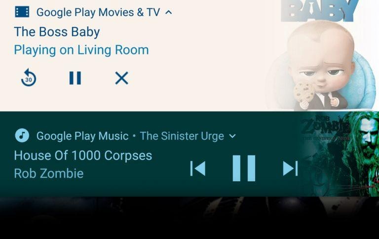
Each piece of media in a media app can be given an icon. If the icon is defined, the notification can become colored based on Google's custom algorithm. Google's algorithm picks what must be the most dominant color in the provided image as the background for the notification.
If you head to Google's Color Tool for Material Design, you'll find the tools to test a wide variety of color pallets with black and white text and with lighter and darker versions of itself. This system is based on work done for the 2008-based W3C – that's the Web Content Accessibility Guidelines – version 2.0. You can see the entire W3C guide on the web for free right now and hopefully well into the future.

Google links to the following section specifically for a deeper understanding of how to handle text on color: "Guideline 1.4 Distinguishable: Make it easier for users to see and hear content including separating foreground from background." There we find the following sentence that explains Google's algorithm for text color/background color fully:
"Contrast (Minimum): The visual presentation of text and images of text has a contrast ratio of at least 4.5:1, except for the following" – W3C, 2008
That which is followed as design law on the internet is also followed in Android, by the makers of Android. Designers make a deal to follow this law when they sign up to send apps to the Google Play app store. And you know what they say: break a deal, spin the wheel.
Meanwhile we were a bit baffled about the combination of colors in 2 or more media apps in the same notifications panel. There we still found clashes aplenty in the weeks before Android Oreo was released to the public. There, chaos reigned supreme! Now in the final release it seems as though Google may have rested on a pre-set number of colors (from the Material Design collection) that all work with one another (within reason).
Whatever they did – they did it right. This feature is so colorfully delicious, it makes me want to use Google Music. That's just crazy!