Android 12 Leak Reveals Major UI Changes
Thursday saw the leak of the Pixel 6 and its rather controversial design which, given Google's past phones, isn't exactly a surprise. While some people may not be that impressed by the way the phone will try to catch attention, the software on it might be less divisive. Android 12 has already been leaked to usher in a new design language but the final look that's being shown off in this latest leak really puts a new different spin on those changes.
Google might be making its biggest aesthetic changes to Android ever since it introduced the first iteration of Material Design way back in 2014. For Android 12, it seems to be making better use of all the space that today's large screens offer. Coincidentally, some might actually see traces of Samsung's One UI in these UI elements.
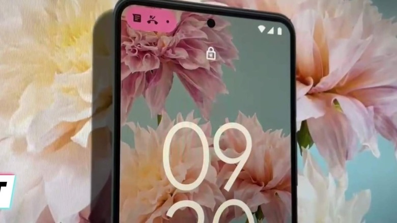
UI elements like buttons and sliders are larger and more spacious, making them easier to touch with a finger of any size. Widgets are also getting a new look with more rounded corners and lots of whitespace inside. Notifications also seem to be visually grouped better this time rather than individual bubbles for each notification.
One of the biggest changes, however, seems to be with the notification icons themselves. Rather than having an icon for each app that has a notification, only a number will be seen beside the clock, both of which are enclosed in an egg-shaped button. That clock also now disappears when you're on the lock screen since there's already a large clock right there in the middle anyway.
Some of these changes will most likely delight some wishing for a refresh of the Android experience. Others, on the other hand, might not be amused at how it hides some things that were easily accessible before while also wasting space. Either way, we'll know the real deal come Tuesday when Google I/O 2021 kicks off.