Windows Explorer Is Getting Some Love With Tabs And Navigation Cleanup
Along with Notepad and Paint, File Explorer has been one of the staples of the Windows operating system since its earliest days. The app is also an element that has changed very little since those days, retaining many of the core concepts and ways of using the program, which is actually a good thing for familiarity. Sure, File Explorer did change themes in line with the rest of the system, including with the addition of boxed groups in Windows XP and the Ribbon UI in Windows 8, but the one-folder-per-window design has remained the same since version 1.0. Fast-forward to today and just like with Notepad and Paint, File Explorer is getting some much-needed attention that both cleans up the interface and also offers more complex ways of using it.
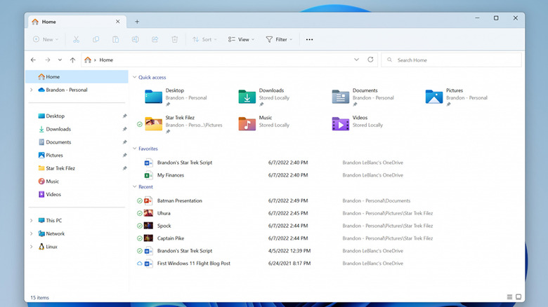
Ever since it launched, File Explorer has used a sidebar to display folders and shortcuts to pre-defined places or networked computers. Over time, the items in that panel have changed, grown, shrunk, and gotten a bit disorganized. The design can sometimes make finding the folders you want and need harder, especially if you have to dig into folders time and time again or click the wrong folder.
The latest Windows 11 Insider Preview Build 22621.160 brings a new order to that navigation pane to make the interface look cleaner and also to make using it easier, Microsoft has announced. OneDrive folders, for example, will be clearly labeled with the user's account name. The "This PC" tree will also no longer be cluttered by other entries and will be focused solely on the drives on that PC. Small changes like these can have compounding effects when it comes to removing the friction associated with using the application.
Keeping tabs on folders is a bit easier now
The biggest new feature, however, is the addition of the tabs that were first announced back in April, which are now rolling out to some testers in the Windows 11 Beta Channel. Tabbed navigation has been around since the early days of web browsers, and many apps, including text editors and file managers, have embraced the idiom, as well. It's definitely high time that File Explorer got its due, which will hopefully open the doors to even more advanced file management features.
The current implementation of tabs in File Explorer is similar to Microsoft Edge, where the tabs are lined up on the window's title bar rather than as a separate row below it. Tabs would allow users to easily switch between different folders without having too many Explorer windows open; whether they will show up as a single entry with Alt+Tab or if there's an option to make them appear separately hasn't been disclosed yet.
While Explorer tabs definitely upgrade the app's multitasking capabilities, Microsoft has unfortunately stopped short of going all out on that front. You are still limited to displaying the contents of a single folder at a time, especially since you can only see one tab at a time anyway. Explorer still doesn't have a popular dual pane or split view feature, which would let users see two folders side-by-side. The only way to do that right now is to have two Explorer windows open, which is tedious and error-prone.