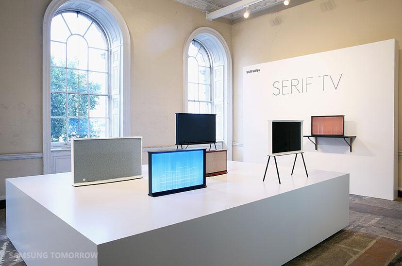
Samsung Serif TV Is Inspired By Font Design
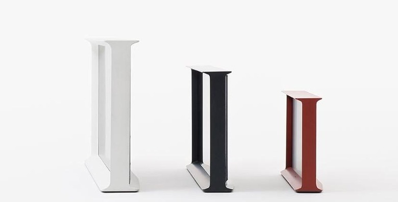
Curved displays notwithstanding, the physical design of televisions hasn't really changed, except to get thinner and thinner. They are simply rectangle screens with a minimal border frame. Well, Samsung has come up with something different, and it's inspired font design: the Serif TV, as in a serif typeface, or one with those little ligatures on the letters. The TV is the result of a collaboration with French designers Ronan and Erwan Bouroullec, and is said to have originated from the capital letter "I" in a serif font.
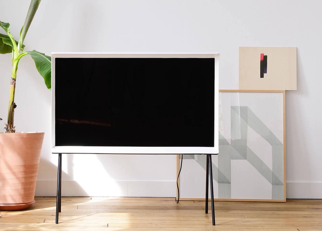
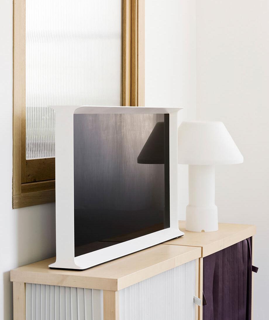
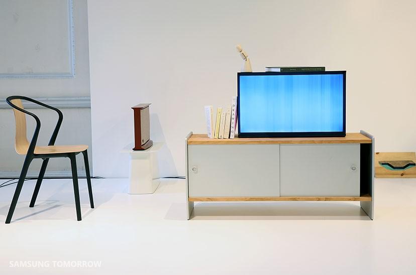
The TV's display looks like it's been placed inside a traditional picture frame. The whole thing is meant to turn the television into something like a piece of furniture that adds to a room's decor, instead of being an appliance that sits on top of furniture.
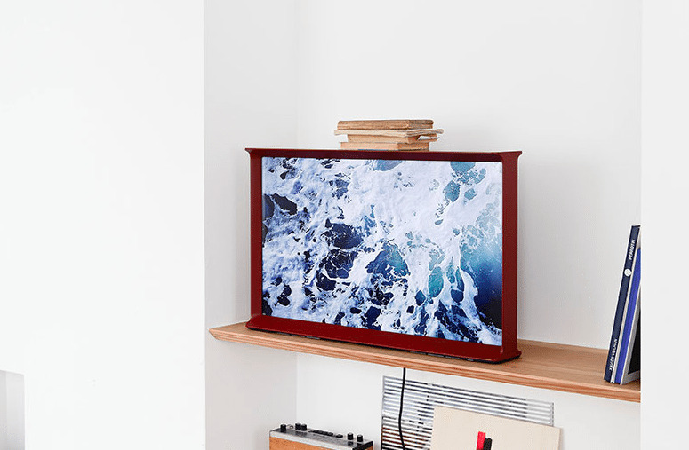
To emphasize this, the top of the Serif TV can even be used as a shelf, and there are optional legs that can be attached to have it stand up off the ground. Even the back of the set features a fabric panel for covering cables and connectors.
The TV comes in three different sizes: 40-inch ultra HD, 32-inch full HD, and 24-inch standard HD. There is also a color choice of either white, blue, or red.
Samsung has revealed the Serif TV at the London Design Festival this week. Global pricing hasn't been confirmed yet, but the TV will going on sale in the UK, France, Denmark, and Sweden starting November 2nd.

SOURCE Samsung Tomorrow