Netflix Testing New Interface Design, Dropping The Annoying Carousel

Good news for Netflix subscribers who are tired of the slow, annoying carousel used to browse TV shows and movies, as it has been discovered that a select number of users are taking part in a trial of a new interface on the service's home screen. The redesign makes it easier for users to select specific episodes of a TV show or read the details of a movie or show, presents more content on the screen at once, and is just overall faster to use.
With Netflix's current interface, a user must hover their cursor over a show or movie to see information like episode list, description, cast, and runtime. The new design lets users click on an item, expanding its details into the screen space below.
Think something similar to clicking on an album cover while using the album view in the most recent iTunes. You can get a better idea by checking out the screens below.
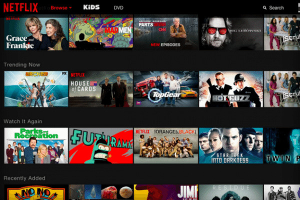
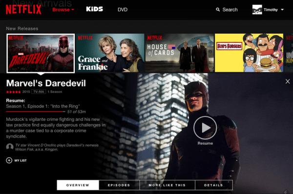
The slow, auto-scrolling carousel is noticeably absent. Content will only cycle to show more when you click. This makes browsing faster, but also decreases the chances of an accidental click, opening up a menu you didn't want to see in the first place. In terms of ease-of-use, it's comparable to Netflix's mobile site when using a tablet.
As of now, the trial is only appearing for a small number of subscribers, and Netflix has yet to comment on when it will roll out for everyone. Hopefully it will be sometime soon, allowing us never see another carousel again while looking for new episodes of House of Cards or Daredevil.
SOURCE Netflix
VIA The Verge