NBA Player And Ball Movement Visualized Using Sensors
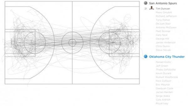
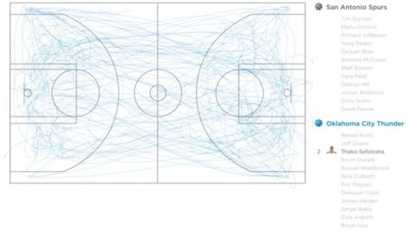
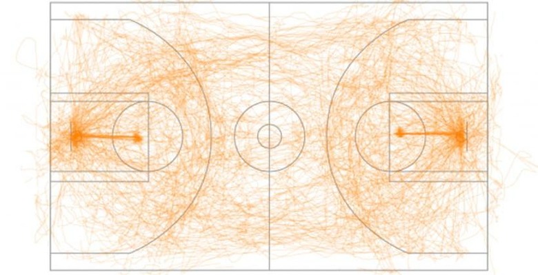
The NBA is always out to get more data that it can share with fans to get them more involved in the sport. One of the ways that the NBA is looking to get data that allows fans and teams alike to visualize movement during the game is by putting sensors on players and inside the ball. The images you see here are the visualizations of the data captured by the sensor.
The data that you see was captured during a game between Oklahoma City and San Antonio. Fathom Information Design put the data into the visualizations. The image at the top with orange lines is the movement of the ball during the entire game.

The image with all the gray lines is data collected from the sensor worn by power forward Tim Duncan. His data plot shows that he sticks very much to the center of the court during a game.

The data visualization with blue lines shows data from Thunder shooting guard Thabo Sefolosha. Clearly, he covers much more of the court than Duncan does. This graphics information is interesting. It would be very intriguing to see of the player's motion around the court changes as they age or after an injury.
SOURCE: Gizmodo
