NASA Graphics Standards Manual Available To Download In PDF
The NASA logo of the '70s was called "the worm" and I can see where that name came from. The font used for the letters in the logo looked like a fat earthworm twisted into the letters needed to spell out NASA. As a high tech space agency, it comes as no surprise that NASA has a manual for just about everything.
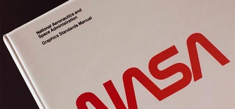
Case in point is the 90-page manual that NASA has had for years that outlines exactly how it should implement the worm logo and the graphics system that went with it. The graphics manual was rather obscure for most of its life until some space/graphics geeks started a Kickstarter with the goal of reproducing that manual in hardback with illustrations.
The Kickstarter was well received and before long, it has over 6,500 folks who paid $79 each for the hard cover version of a boring NASA manual. It would be safe to assume that as a response to that Kickstarter, NASA has announced that it has the PDF version of the same graphics manual now prominently featured on its website for anyone to download at no cost.
Since the official NASA version is a plain PDF document and the other is a geeky, somewhat artsy hardcover book there isn't much in the way of conflict here. The folks interested in the hardcover book should still be interested even though the PDF is now readily available. It's worth noting that the NASA Graphics Standards Manual has always been available to the public.
SOURCE: Wired