Healthcare.gov Is Getting A Sleek, Easy-To-Use Redesign
If you remember the terribly executed healthcare.gov website, you may also remember the frustration from both users and site administrators. Urged to sign up, many users were simply unable to. The fix came, months later, but nobody was really pleased with the whole charade. A newer, easier to use site is incoming, though, which should thwart any future disasters.
One of the bigger changes involves a new app, which was used by nearly 6 million people the first time around. A simpler, more effective user interface is on order this time, which should make the process faster and smoother. Though the team behind the site/app say about 40% won't be able to take advantage, it's a big step in the right direction.
Also being fixed is the "comparing coverage" utility, where we'll see a more plain approach to checking out which coverage is right for us. We'll soon be able to check out plans anonymously without having to go through the painstaking steps of identifying ourselves just to see things like pricing.
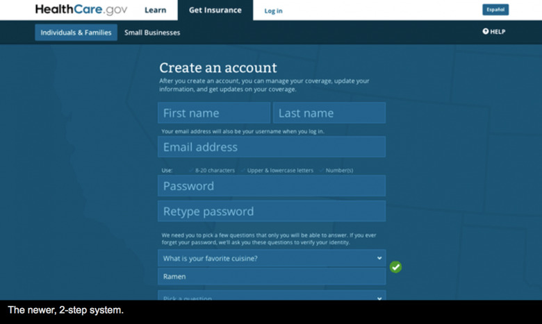
Finally — and maybe most important — the log-in process is getting revamped. This was a major bottleneck with the original site, with many users reporting they'd gone through the entire process, only to be ushered back to the front page to start all over again. The new system will be a two-step design, where we simply choose our state then enter our info.
Finally, the site will have portions handled by Amazon Web Services, which backs other bandwidth heavy services as Netflix. There's no word on just when the redesign will launch, but when it does, we likely won't be hearing much of the outcry we did the first time.
Source: Wired
