Google Search On Mobile Is About To Get A Big Visual Redesign
Google is about to roll out a redesigned Search on mobile, the company said in a blog post today, explaining the adjustments users can expect. Google describes the updated UI as a 'major visual redesign,' one that is intended to simplify things for users, bringing 'information into focus,' improving the readability of text, and more.
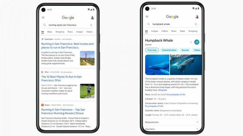
First things first, Google says the redesigned Search interface on mobile makes it easier for users to focus on the content, reducing some of the clutter from design elements. Beyond that, the redesign is also intended to make it easier for users to read content as they browse.

The text has been made bolder and larger, the result of which is easier scanning across search results for the content you want. Google has also added more of its own font into the mix, the one you see on Gmail and Android devices.
"Bringing consistency to when and how we use fonts in Search was important, too, which also helps people parse information more efficiently," explained Google's Aileen Cheng, who led the redesign. Beyond that, Google's redesign uses color to highlight important things in search, emphasizing content first with colors used 'more intentionally' in places to guide the user's eyes.
Shadow use has been minimized and results now span edge-to-edge, ultimately providing more 'visual space,' according to Aileen. Rounding it all out is the use of roundness in new places, something that better reflects the same roundness we see in the Google logo.
Google says the updated design will roll out on Search for mobile in coming days.