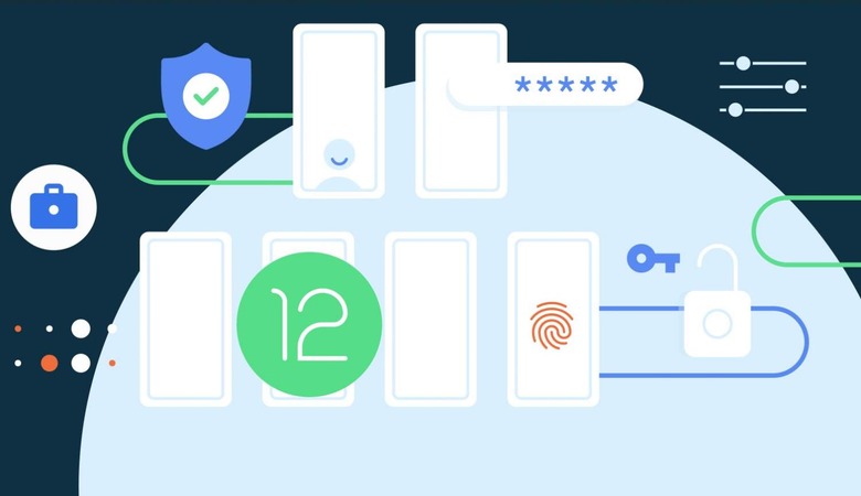
Android 12 Developer Preview: Changes, Additions In Next OS Version
The next version of the Android operating system, codenamed internally as 'Snow Cone' has taken its maiden steps into the realm of inception with Google recently announcing the Developer Preview of the Android 12 OS, which is still around six months from the final release. After the excitement of Android 11 on flagship devices and newly released phones, the next thing for geeks to look forward to is the Android 12 operating system on their devices. The OS will go through eight release cycles in its evolution over this year – with a public beta expected in a few months before finally coming to the users in a stable release version in the latter half of 2021.
The major focus of the operating system is going to be human communications – giving preference over push notifications from on device apps. Other major areas of focus, when it comes to the user interface, are performance and design overhaul. Like all times, Pixel phones including Pixel 3, Pixel 4, and Pixel 5 series phones will have the privilege of getting the first taste of the Android 12 OS.
Right now it's too early to make any conclusions about the intricacies of the Android OS, as it is a developers only preview and not a user-centric build. Still, there are some things that are fueling the excitement already for tech-savvy Android users.
Material NEXT Design
Android OS version upgrade follows a very typical pattern that we all have observed over the years. One version has focus points on the UI changes and the overall look and feel of the operating system while the next one concentrates more on the functional aspects for a deeper under-the-hood revamp. Since Android 11 was more of a functional bump-up, the Android 12 is leveraged more toward the visual end of the spectrum. This time around Google calls it the Material NEXT Design – a design guideline for all the visual changes from here on.
That's the reason, a neutral user is more excited about the upcoming OS as there were no major material changes that came with the Android 11 OS. The accent colors picker in the Android 11 version became the full-blown feature and now with the Android 12 Developers Preview, the UI will be accentuated by the blue-hued theme (from what's apparent thus far) in light as well as dark themes. This cool blue hue will continue to the system apps like Settings.
Similar to the Notifications shade, in the next big OS update, the lockscreen will have a backdrop translucent layer. In fact, the notifications panel has been fine-tuned with more spacy conversations, notifications, and silent notifications. The material theme continues here too with the translucent backdrop having an overlay. Apart from this, there is certain bounce to the pattern unlock animation that'll spice up things for the users.
The Quick Settings tiles get the light blue hue which is refreshing, as the gray for so many years now looks boring. Google has a certain preference for blue for the next OS update and it is very much evident. To tweak things for a better user experience, the order of tiles has changed – Battery Saver and DND have moved by default to the first fold, the mobile data goes to the second card, and the location button is eliminated from the default Quick Settings. Another noticeable visual change is the addition of "Reduce Bright Colors" option that's aimed for secondary brightness toggle as a part of the accessibility feature.
In fact, the Accessibility settings are also getting a visual bump with the cleaner interface that keeps the most important options at the fore. Things like the "Select to Speak", TalkBack" and "Text-to-speech output" retain the same space while options like Font Size, Display Size, and Color Correction are now grouped under "Text and Display" button.
Functional Upgrades
For better one-handed use, the Android 12 gets a major revamp in the form of large empty spaces at the top for optimum one-handed access. To make this even better the OS will have 'Silky Home' feature that pushes the on-screen items even further down. Support for scrolling screenshots now comes natively to the Android ecosystem. Along with this, the screenshot markup menu will allow you to add emojis, notes or doodles to the screenshots. The option to edit or annotate image files will come to Android 12 which is a great addition.
In a bid to match the iOS 14 widgets that Apple released last year, Android now wants to bring back its prowess with this feature that has been native to the platform but somehow faded away with time. To this end, there will be widget stacks for the user to scroll left/right on similar widgets. The snooze button for notifications on the OS is also going to be revamped taking a detour from the half swipe gesture for more accessible usage.
Another interesting option that Android 12 gives geeky users is the ability to customize the Adaptive Notifications Ranking and Adaptive Notifications priority. With the next big update for the Android version, you can reset it according to your preference.
The persistent media controls in the Notifications shade will now be bigger, even compared to the Android 11 media controls, which in itself are quite prominent. To emphasize the artwork and the clean interface, the media player name is removed and just the icon is there. One can also toggle whether a particular media player shows in the notifications shade or not. Picture-in-Picture (PiP) also gets the needed functional bump as resizing is far better in Android 12.