This is what iOS 9's new app switcher looks like
While much has already been said of iOS 9's big features, including a revamped Siri, new health tracking options, and transit directions coming to Maps, we're now getting a fresh look at one of the smaller aspects of Apple's new mobile OS, but one that we use every day: the app switcher. In terms of the overall user interface, iOS 9 changes very little of what was established in 8 and 7, but switching and closing apps is a different story.
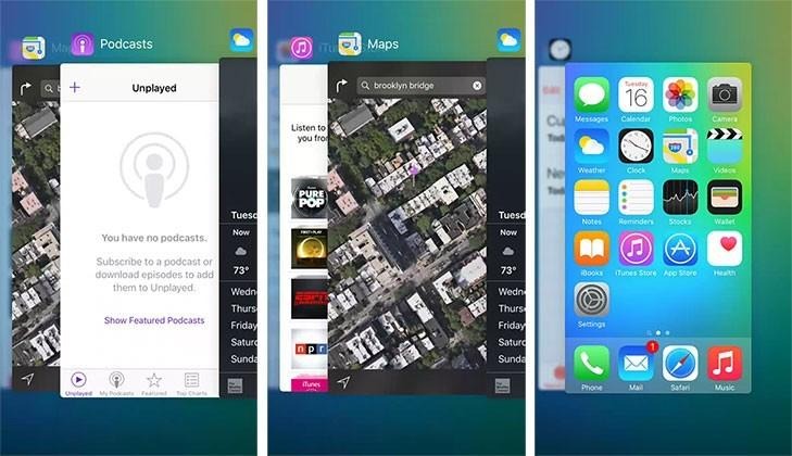
iOS 9's app switcher is still based on swiping left and right to access open apps, much like flipping through a deck of cards, and it's still accessed by double-tapping the iPhone or iPad's home button. What gone now is the quick access to frequent contacts along the top of the screen, which was just introduced last year in iOS 8. Also gone are the icons for open apps along the bottom of the screen.
You can see the animation in action here, and how it's very similar to Apple's old Cover Flow interface that was featured in iTunes until several years ago.
Imagery source: Apple Insider
App screens are now slightly overlapping one another, similar to Safari tabs on the iPhone, but from right to left, instead of bottom to top. The app icons are small, and sit atop the screens, while the name of the app has much larger text now. Also, instead of the home screen being the left-most "card," it is now on the right.
Other things that do remain the same are swiping up on an app to close it, and another single press of the home button will return to the app that open before the switcher was activated. It's hard to say that the new interface is either better or worse than the previous version, as it doesn't really improve functionality or seem to making anything clearer. We'll probably never know what prompted the change, but it will just be something get used to come iOS 9's release this fall.