OS X El Capitan Preview - Ahoy There, Captain!
OS X El Capitan isn't a big of an overhaul update as Yosemite, but there are plenty of new features and design elements that keep a smile on my face. There's a lot to be said for "if it ain't broken, don't fix it" and that's exactly what Apple has done. In El Capitan, it's all about performance and experience, and that could pay real dividends not only for power-users, but for mainstream users wanting to squeeze the most out of their Mac.
Last year's OS X Yosemite release was a huge deal for Mac. Just as El Capitan is a rock formation within Yosemite National Park, so the latest iteration of Apple's desktop software is about refining core elements of the platform.

You might notice the font, first, if you're a keen Mac user. It's a variant of San Francisco that Apple calls SF, already in use on iOS and the Apple Watch, but here tweaked with the best spacing and proportions for desktop use. It looks good, but more importantly it appears crisper on a Retina display than its predecessor, Helvetica.
Navigating around the apps you have running is more straightforward. Mission Control now shows every open window rather than clustering windows by app as Yosemite did it, but it does it in relation to how they were laid out – albeit usually overlapping – on the desktop.
It's a minor change, but if like me your eyes automatically flick to where you're used to an app always being positioned, it'll be less mentally jarring over the course of the day. Similarly useful is the ability to wiggle your finger on the trackpad and have the cursor enlarge to comical levels, just to help you find it.
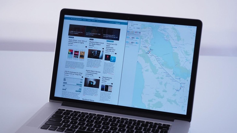
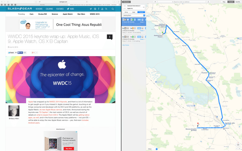
Apple is big on multitasking in 2015, and just as the iPad Air 2 gets the ability to easily arrange two apps on-screen, so El Capitan introduces Split View. Drag a window to the Spaces Bar, or click and hold the full-screen button, and it automatically occupies half the display: Exposé appears on the other side so you can pick the app it'll coexist with.
From there, you can drag the center-split point or switch the position of the two apps open. In theory the UI of each app should be adjusted top suit Split View, though while that's the case for Apple's native apps, some third-party software didn't play so nicely. I'd expect that to change before the full release.
It's also easier to create a new Spaces desktop, by dragging an app to the top and then dropping it on the new workspace that's automatically created. If you want, you can have not only the Dock auto-hide, but the menu bar at the top of the screen fade away too.

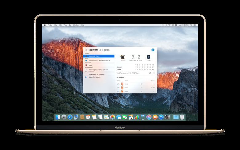
Spotlight gets a refresh, too, with more auto-suggestions now including weather forecasts, sports scores, stock prices, streaming videos, and even nearby public transit options. They can be useful, but I've been more impressed by the way that Apple has supercharged search this time around.
Basically, it's compound searching but in natural language. So, I can type "Email from Chris Davies in May," and El Capitan intelligently figures out what type of results I want, the person I'm concerned with, and the timescale from which those results should come. Right now it only works with Apple's native apps, but there's an API for developers wanting their data to show up in the results too.

I'm torn between that being my favorite search feature and the simple fact that you can now drag (and resize) the Spotlight search window somewhere else on the screen – including up in the top right corner, where search always used to appear – and it'll always open there whenever you summon it in future.

Apple's Mail app got me on its good-side from the outset, and in a very simple way: it prioritizes downloading your most recent emails first. With upward of 25,000 messages to synchronize, it can be a pain waiting for the latest to arrive and be ready to read. Over time, Apple says messages should load up to twice as fast, thanks to changes in how Mail handles IMAP servers among other things.
Some of iOS' gestures have been borrowed, like swiping to the left on a message in the inbox and revealing the delete option, or right to mark it unread. Compose windows can now be tabbed, and there's tighter integration with Contacts and Calendar: if you're emailing someone new, El Capitan will suggest adding them to your address book, while if you're writing about a new event, you get a one-click calendar entry option directly from the message.
It's not just new people, though. Mail also detects whether there's new info for an existing contact, allowing you to update their details right from within the app. If I'm being honest, all too often I forget to add events, important dates or meetings to Calendar, or keep my Contacts up to date; now I have no excuse.
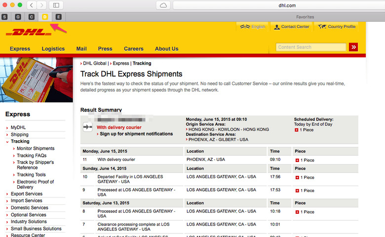
Safari caters better to power users, too, ticking off some of the most-requested features asked of the OS X team. I'm a big fan of pinning tabs, for instance: I use a number of web apps, from tracking shipments through to things like Cloze and Gmail, and now I can pin them so they don't close unexpectedly and, indeed, automatically open when you next load Safari.
Other tab management options include muting noisy webpages – you get an audio icon in the Smart Search box, too, next to the culprit tab, so there's no click-click-click between pages to figure out which is responsible – and there's now the ability to trigger AirPlay video mirroring from a single HTML5 video page, rather than sharing your whole display.
While that streaming is going on, you can continue to use other apps but not have them show up on the remote screen. That might be the new Notes app, for instance, which has had a comprehensive upgrade from a basic text-note list and now handles just about any photo, video, PDF, audio, document, spreadsheet, presentation, or other file you might want to drag to its hungry window.
Alternatively, Notes now gets a space in the Share menu of other apps by default. I generally live in Evernote, but being able to share directly to a new Notes page from Safari, or Mail, or Photos – and then have that synchronized with every device I have logged into the same iCloud account – is making me reconsider my loyalties. I especially like how Notes will show a thumbnail browser of every attachment.
Apple's options for navigation and for photo management have both been in receipt of some heavy improvements over recent months, and Maps and Photos in El Capitan each show signs of that attention. In Maps, for instance, there's now support for public transit directions, though in this particular beta it only covers New York, the San Francisco Bay Area, Toronto, and London, along with 300+ Chinese cities.
Baltimore, Berlin, Chicago, Mexico City, Philadelphia, and Washington, DC will arrive in the fall alongside the full El Capitan release, Apple tells me. As of iOS 9, meanwhile, you'll be able to shoot those directions straight over to your iPhone, something Google Maps users have enjoyed for some time now, and which really helps join up the overall experience.


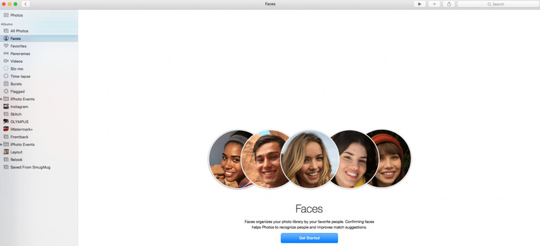
In Photos, the recently-released iPhoto replacement gets extension support for third-party filters and editing tools. They'll be released via the Mac App Store, and a single photo can have multiple tools applied. It's non-destructive, too: your original is a click away, which makes experimentation feel less risky.
Photos in El Capitan also support easy geotagging – if you didn't take the picture on an iPhone or something else which automatically records the location it was captured – and tasks like changing image titles and organizing faces are made quicker thanks to batch-processing support.
It's still relatively early days for El Capitan, considering this is only the first beta release, but it's been impressively stable over the week I've been testing it. Core apps have rarely presented any issues, and most third-party apps have been solid, too.
There are a couple of exceptions – Dish Anywhere's video player, for instance, doesn't even install – but I've no doubt that the developers responsible are already working on compatibility.
Many of the big changes are under the hood, in the underlying architecture of OS X. New in El Capitan is Metal, the CPU and GPU optimization engine familiar from iOS: it replaces things like OpenGL and OpenCL, which variously allowed the video chip to be used for graphics or general processing, with a single, more capable platform that developers should find simpler to tap into.
According to Apple, thanks to Metal and the other refinements, things like opening apps and file previews, and switching between apps can be anything up to four times as fast. Media apps, like Final Cut Pro and iMovie, should be speedier too, and indeed even with beta code they loaded faster than my Yosemite machine. If you're a gamer, El Capitan should be able to squeeze out more from the capabilities of whatever graphics chip you have.
Apple had supplied the El Capitan beta on a brand new 15-inch MacBook Pro, and so I wasn't particularly surprised by how smoothly it all ran. What I'm really intrigued by is how the latest OS X version boosts speeds on less-potent machines: the new MacBook, for instance, which I've been using as my travel notebook, or the entry-level iMac and Mac mini.
Fanless designs like the MacBook seem only likely to figure more in Apple's future, and balancing performance with heat and battery life when you don't have active cooling is another level of complexity. Early impressions suggest computers like the MacBook will get a new lease on life when El Capitan gets its official release later in the year.
Part of what I find intriguing about Apple's approach to software and services right now is how little of my information it seems to want access to. Spotlight searches, Mail indexing, and Photos face-recognition are all done on your own computer, not in the cloud: if the thought of uploading all your data to Google, or Facebook, or another company is unnerving, then Apple's stance on privacy may well come as a pleasant surprise.
It's no passing phase, either, it seems. Apple Music's personalization, for instance, will be done without passing personal data to Apple. Yes, you might not get quite the degree of customization as some services achieve, but you'll have the reassurance that you're leaving a minimal footprint behind.
Overall, El Capitan feels like a targeted upgrade rather than an all-encompassing one. Some of my own frustrations about OS X have been addressed, and some of the more raw-feeling features that Yosemite introduced have been tempered as Apple clearly responds to user feedback. The result is an altogether more usable platform.
Sure, Windows has had its own version of Split View for some time now, but piecemeal comparison of individual features is seldom how users pick an OS. I honestly doubt anybody is going to choose a Mac simply because you can easily arrange two apps on-screen now, but El Capitan undoubtedly streamlines the user experience, especially if you're dealing with a smaller display as on the new MacBook.

With a fresh install, and at this relatively early stage, it's hard to escape the idea that Apple is putting out a renewed call for people to stay within its own ecosystem: use Mail, and Photos, and iCloud, rather than the legion of email, image, and cloud storage options out there. It's a slightly misleading impression, though.
Thanks to a number of APIs, third-party developers will be able to latch their own apps and services into El Capitan in much the same way that Apple has. I'm looking at the native apps as a hint toward best-practice rather than a ruthless land-grab.
It's up to developers how quickly they react, though I'd expect to see plenty of movement before the public beta release in July. By the fall, when OS X El Capitan gets its full, free release, it should not only give Apple fans a more refined and user-friendly environment in which to work, but could have a significant impact on how slickly more modest Macs perform. That seems like a win no matter how you look at it.