Android Honeycomb Review
Google doesn't mince its words: the search giant told us that smartphone versions of Android weren't ready for tablets, and that we should wait for its slate-specific build, and boy have they delivered. Android 3.0 Honeycomb marks a significant shift from the Android 2.x we're familiar with on handsets, with a refreshed UI and functionality to make the most of tablets' expansive touchscreens. It debuts on the Motorola XOOM but we're already expecting it on the imminent Samsung Galaxy Tab 10.1 and LG G-Slate; check out the full Android 3.0 Honeycomb review after the cut.
User Interface
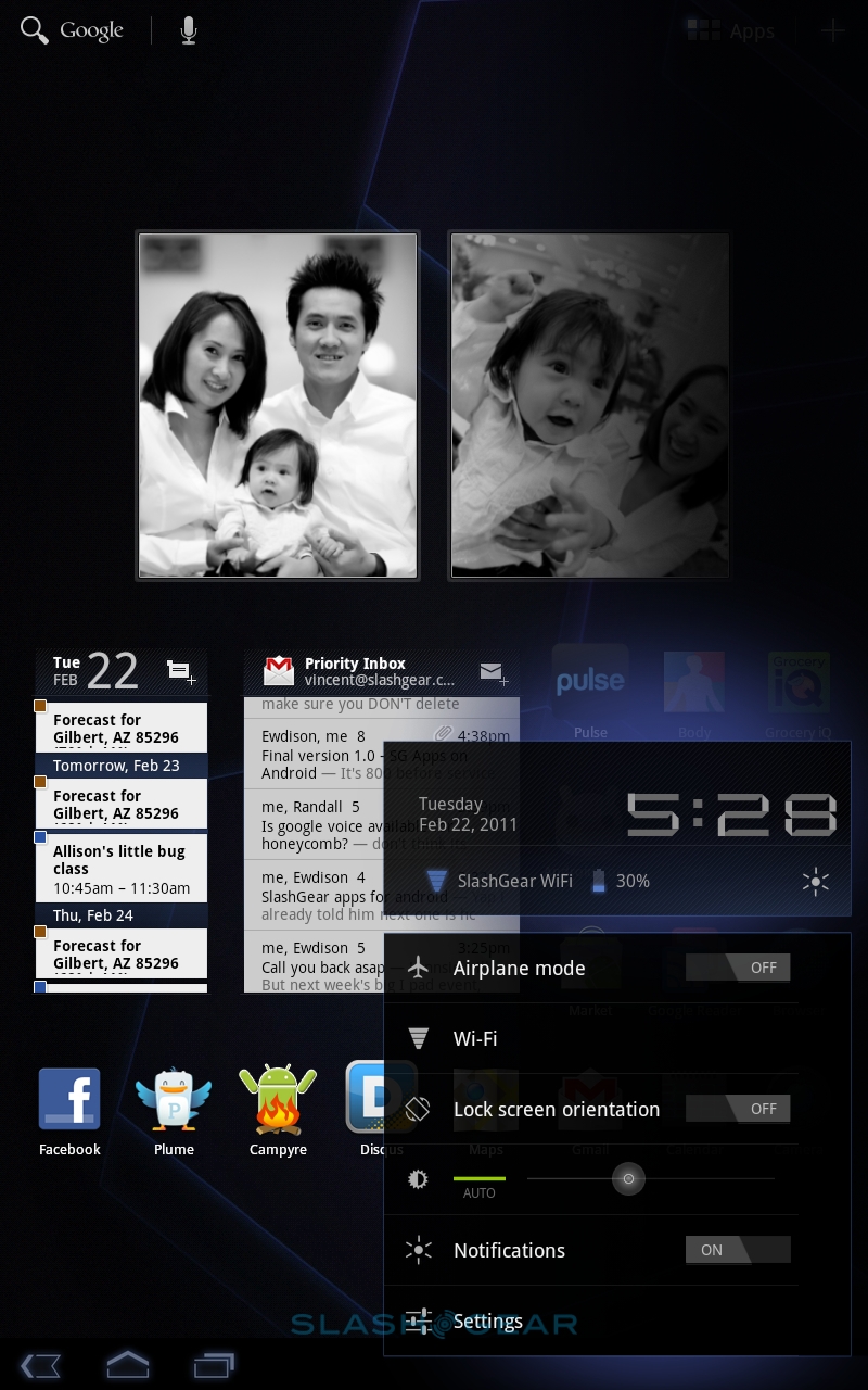
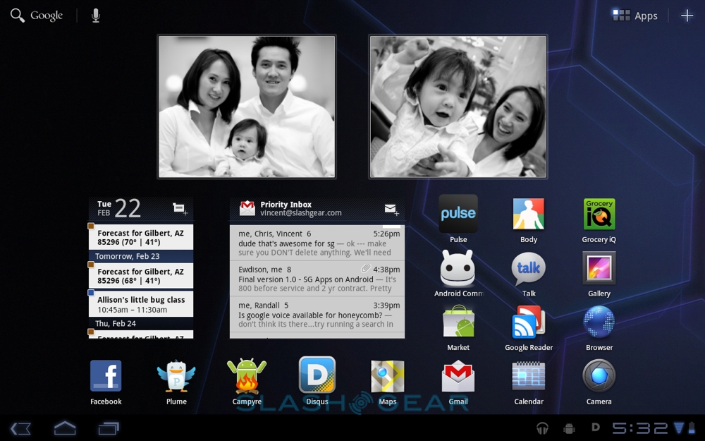
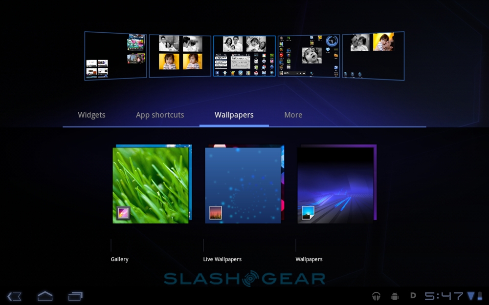
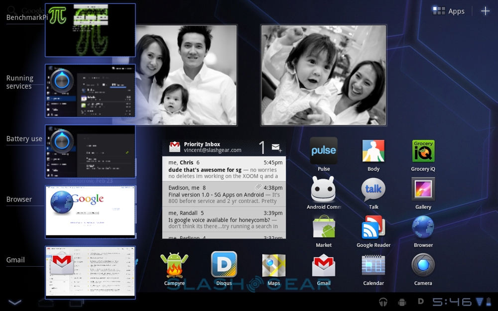
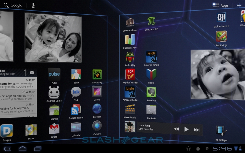
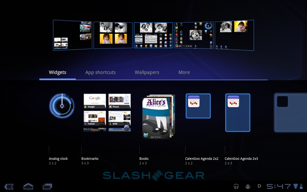
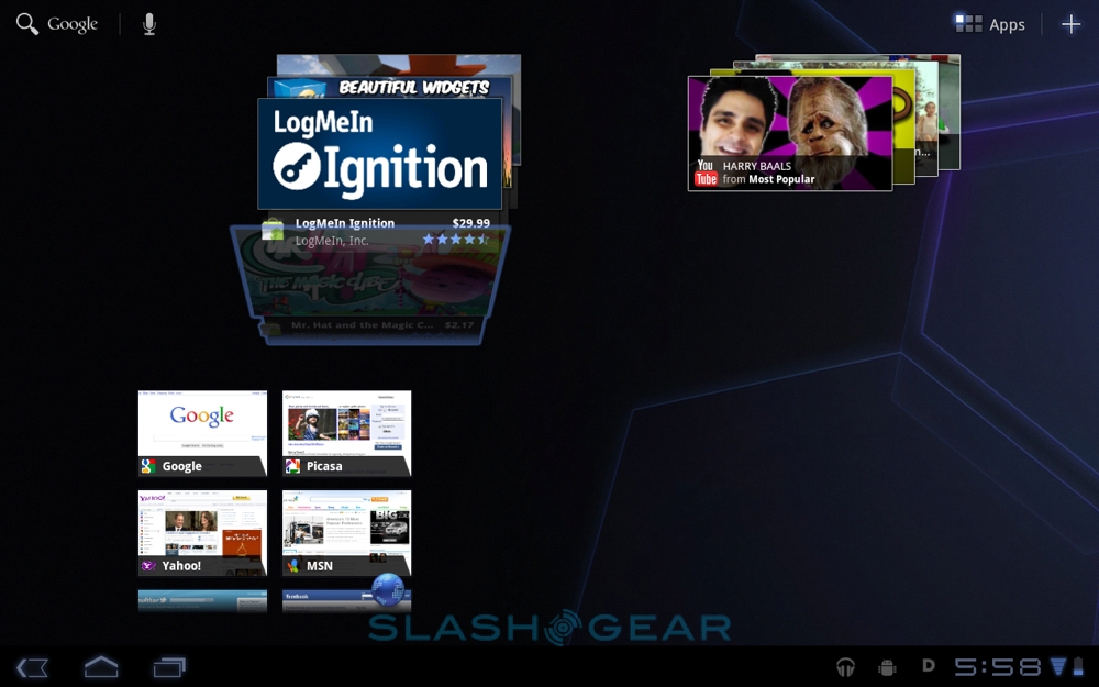
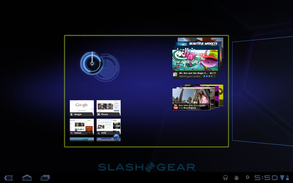
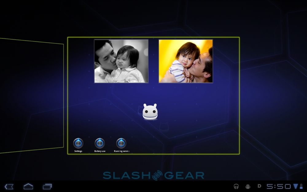
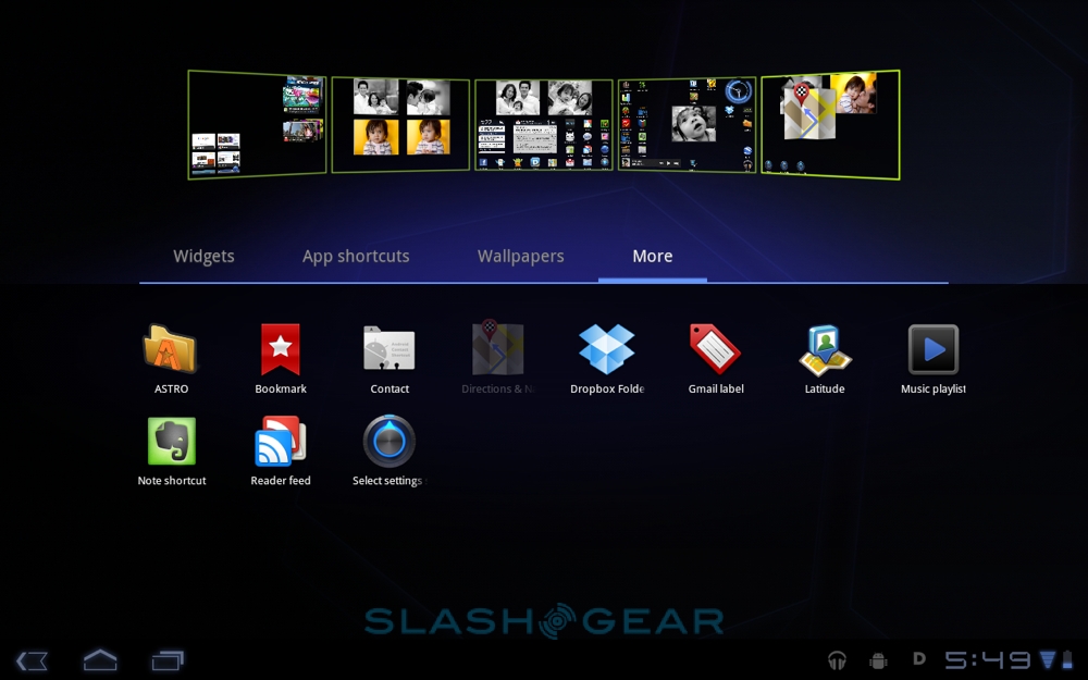
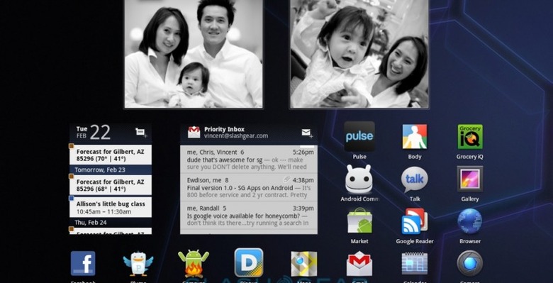
Android's UI has gradually evolved into the multi-desktop icon and widget layout we're used to on smartphones today, and Honeycomb pushes that paradigm to suit larger displays. The homescreen is a horizontally scrolling array of five panes, each accommodating an 8x7 grid of icons and widgets. As on handsets, the smallest icon is a 1x1 square, but various other sizes of widget are available, and usually offering greater interactivity than previously seen. So, for instance, the Gmail widget not only shows the most recent three messages (whether in your inbox or sorted by label) but can be scrolled to show older emails as well.

Gone are the hardware buttons for home, back, menu and search, replaced by on-screen controls on the persistent Action Bar (at the top of the screen) and System Bar (at the bottom of the screen). The action bar changes contextually depending on which app is in use; at the desktop, for instance, there's a Google search button, Voice Actions trigger, Apps menu button and homescreen editing button. Other apps can use the space for software-specific buttons, such as search or share in the YouTube viewer. If you highlight a word or sentence – in the same manner as you would on an Android phone, tapping a word and then dragging out the selection using pull-tabs at either end – then the copy, paste, share, web-search and local find options show up in the action bar, rather than in a floating menu next to the highlight. It's consistent, but it does lead to more reaching around the display.
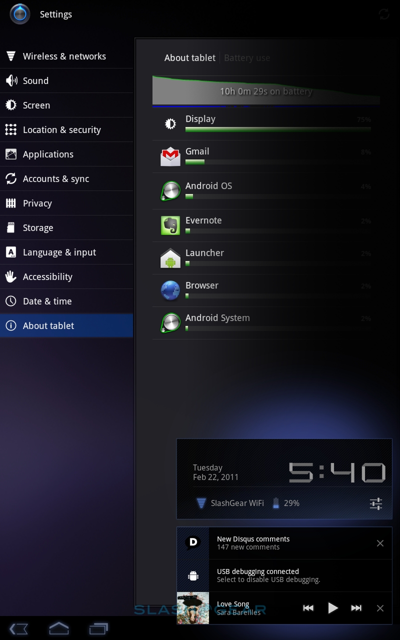
The system bar, meanwhile, replicates the functions of the hardware buttons on phones, with back, home and the app switcher on the left and notifications, statuses, clock, wireless status and battery on the right. Although always on-screen, it dims in a "lights out mode" during full-screen apps, such as video playback. Tapping pulls up a more comprehensive status display, showing date, which wireless network you're connected to, and a shortcut to volume settings.

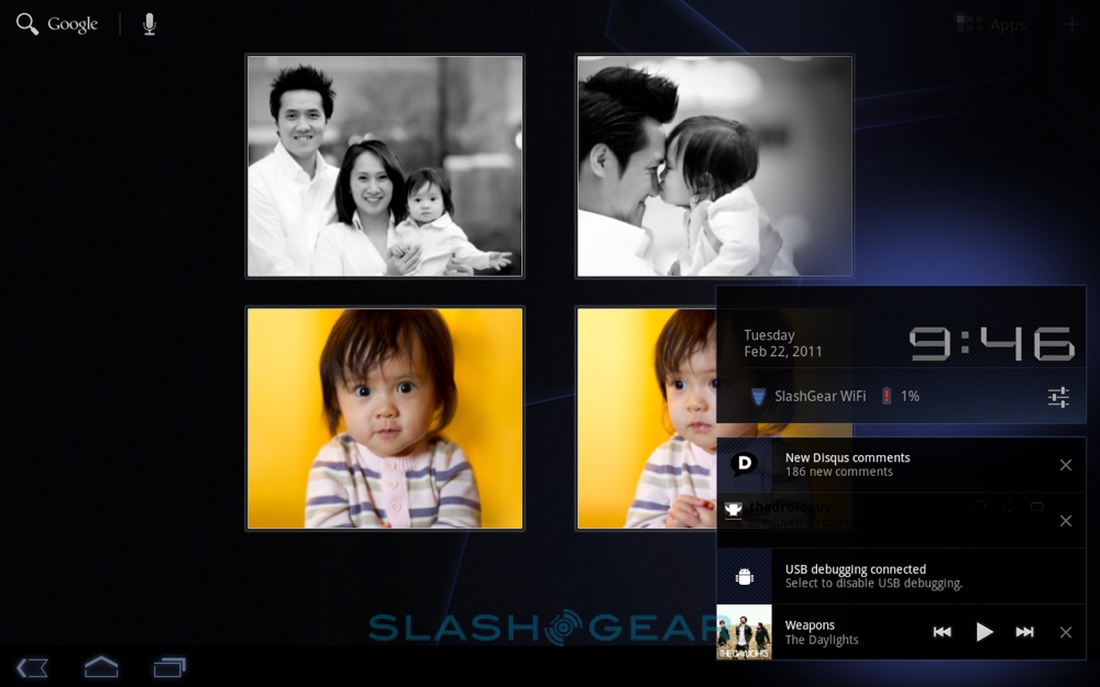
Android's notifications system has always been reasonably good, but the Honeycomb system is more comprehensive again. The extra screen space allows for more information in each alert, so messages and missed calls show caller ID as well as a contact photo if available, while music playing in the background has play/pause and track-skip controls so that you can navigate your tracklist without having to leave the app you're currently in. Notifications can be individually cleared, too, rather than Android 2.x's universal "Clear All" option. It's not as discrete as, say, webOS' system, but it's far preferable to iOS 4.x's clunky pop-up notifications on the iPad, and it fits in a lot more control and information than on the HP TouchPad.

The app switcher, too, is a solid improvement on Android phones and iOS, offering preview images of each app's status as you left it rather than merely icons. Tap the app switcher button in the system bar, and list of software pops up along the left edge of the screen, showing up to five titles at any one time, and scrolling to show others. Google is keen to point out that this is "true" multitasking, and as such apps continue running – unlike the iOS system – even when they don't have focus. That makes for an easier time for developers, who don't have to work with a specific set of background process APIs, but it does leave Android responsible for managing the polar demands of battery life and multi-app performance.
Text entry is via the new on-screen keyboard, following Apple's example of shifting the number row to a secondary layout, but managing to fit in a dedicated Tab key for shuttling between text boxes. There are also contextual keys depending on the app you're in, so the browser offers a dedicated .com button (which can be pressed and held for other suffixes) or emoticon button, depending. Thanks to the simultaneous multitouch display you can hold down one button – say, shift – and tap others; alternatively a double-tap on shift sets Caps Lock. We had no problems inputing text (you can pair a Bluetooth keyboard if you want to do more intensive entry) and the autocomplete system works well, suggesting URLs in the browser and words (with an easy to use method of adding to the dictionary) everywhere else.

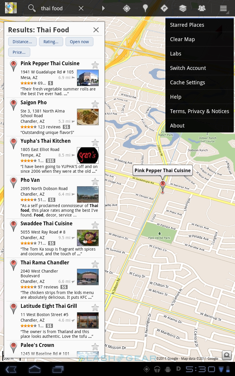
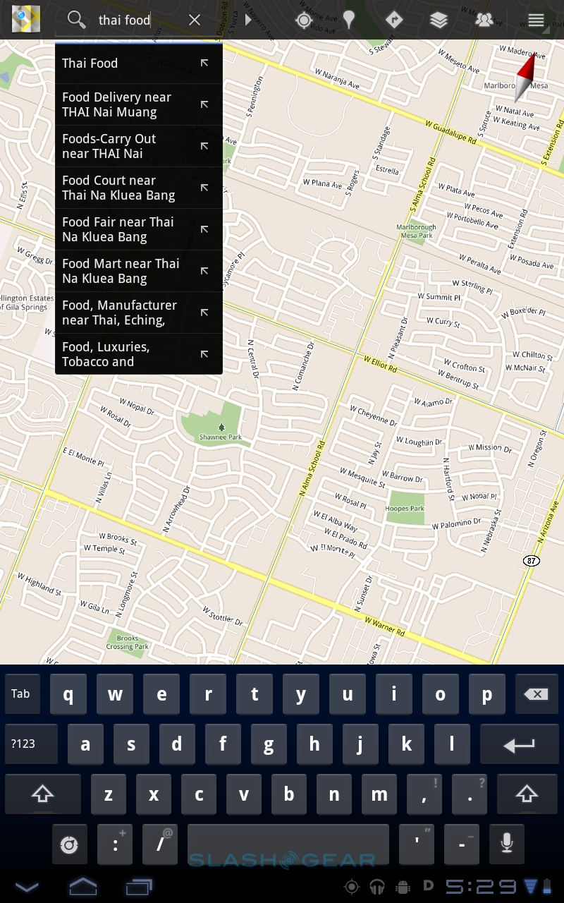
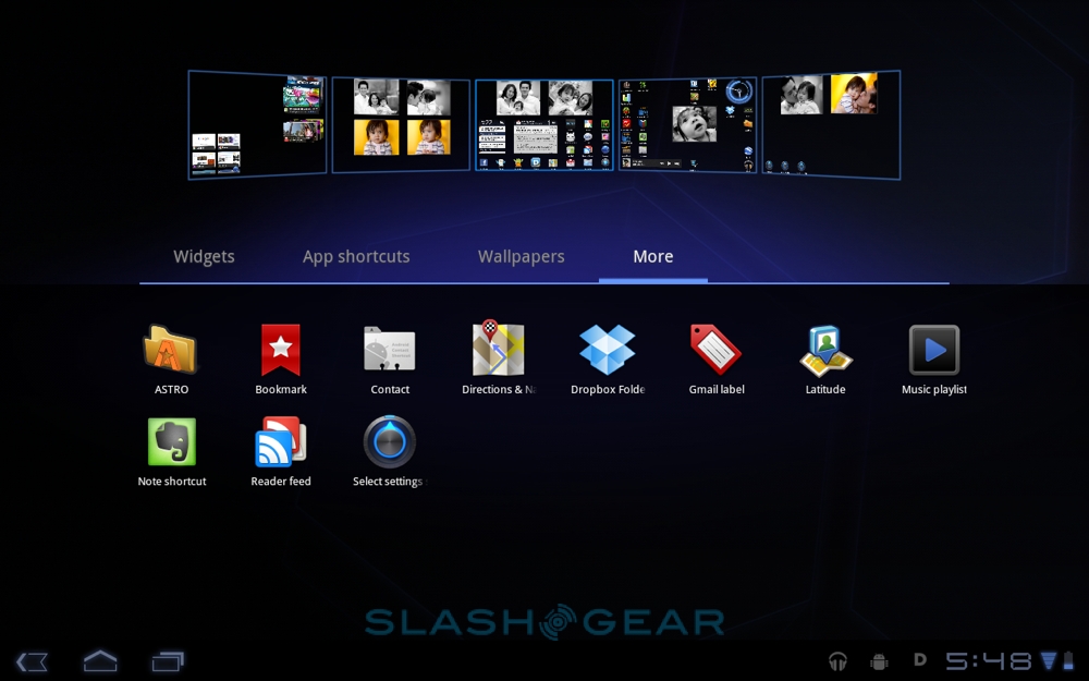
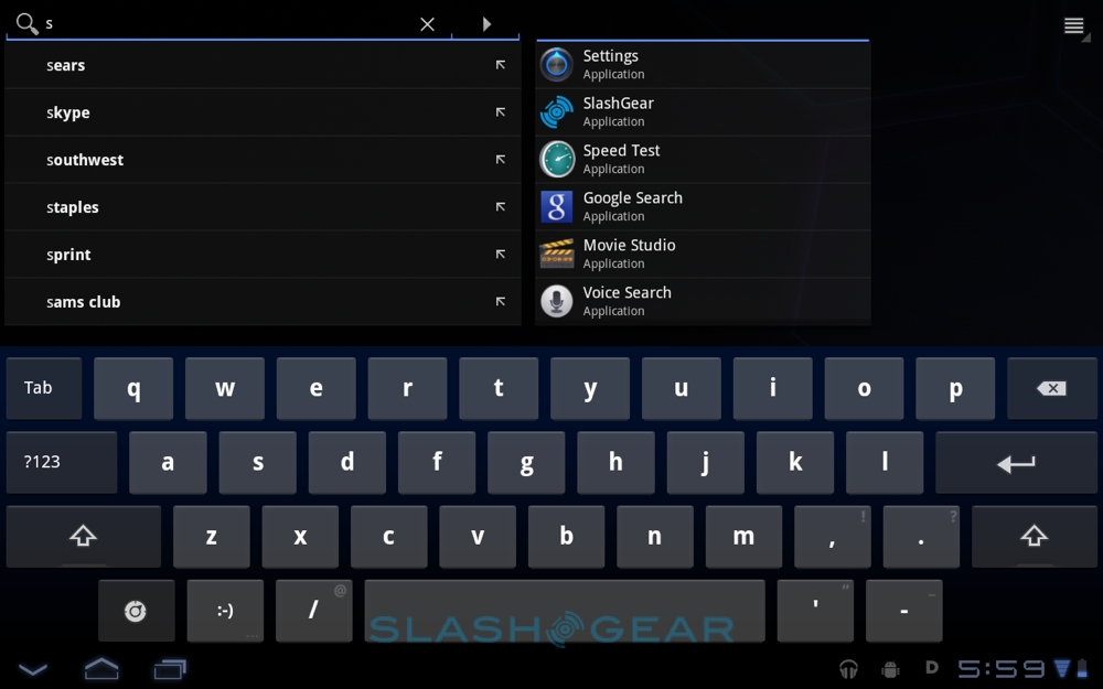
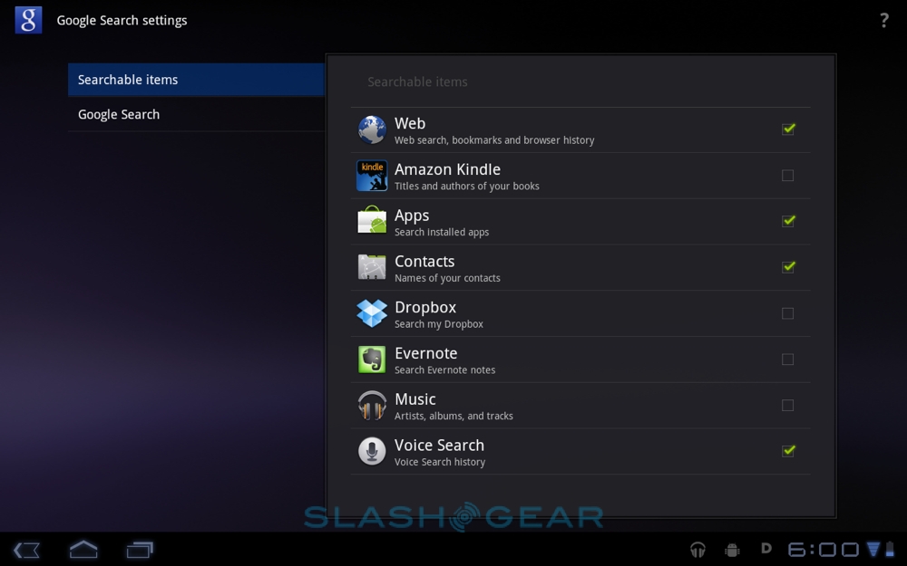
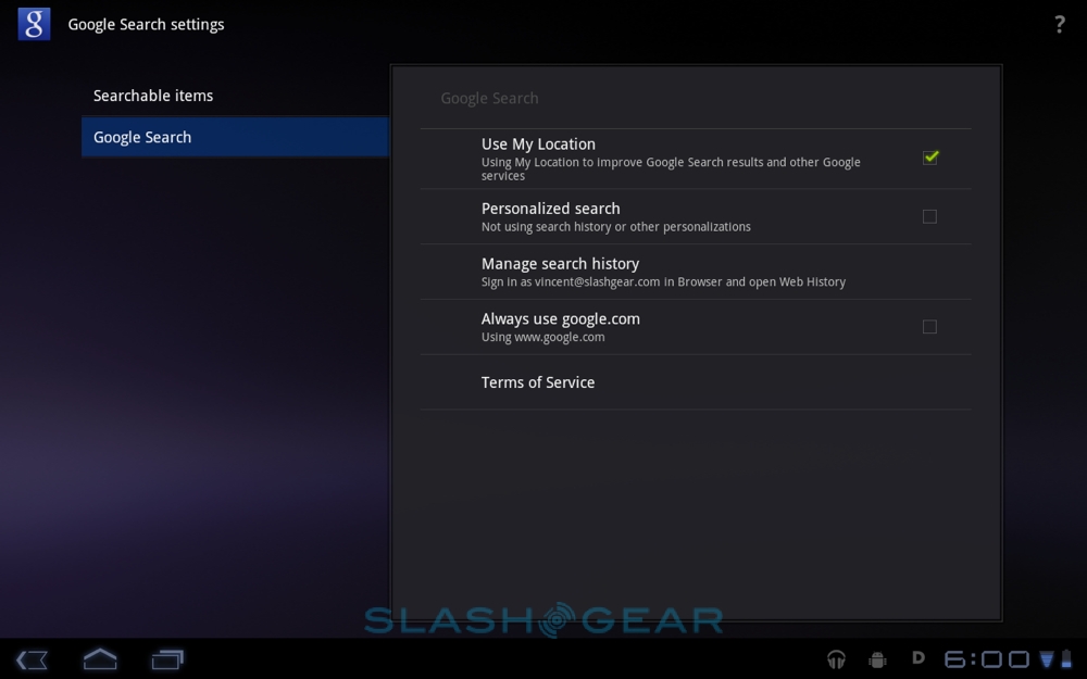
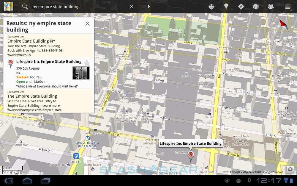
In most places, Google has stretched out the standard Android interface with some added extras. Searches, for instance, not only query your browser history, apps, contacts and music, but can look through third-party apps like your Kindle ebook library, Dropbox files and Evernote notes. Alternatively, you can tell Honeycomb not to search through any particular app, to bypass personalized searches, and whether or not to take into account your current location.
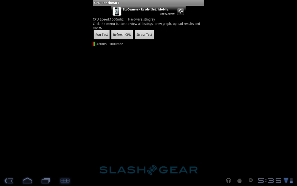
Searches themselves throw up results as you type, with a predicted list of auto-complete terms on the left and the apps, contacts, Google search and others on the right. On the XOOM's Tegra 2 processor there was no lag in waiting for results to arrive.

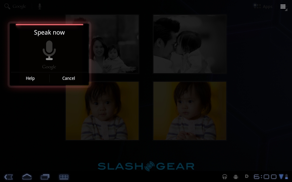
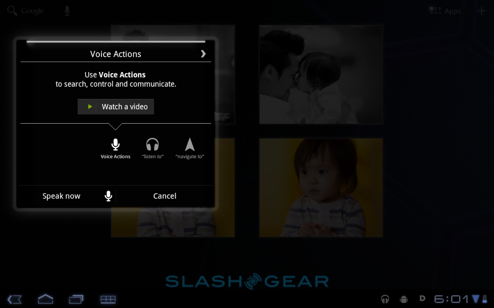
Voice Actions use the same system as on Android phones, and you can use the same natural commands to load apps as well as trigger basic searches. So, you can say "Listen to..." and then name an audio track for the media player to play, or "Navigate to... " and a destination for Google Maps to locate. As usual, the processing is done server-side, not on the Honeycomb tablet itself, and so you'll need a data connection if you want to use voice commands.

Everything is wrapped up in a slick, elegant theme, which doesn't dumb down the tablet experience but which isn't unduly intimidating for the first-time user. Buttons pop up as you need them and dash away when you don't, and the consistency between apps – even third-party titles, more on which later – should silence many previous criticisms of Android feeling disjointed in comparison to iOS. Animations and effects are neat, without delaying navigation, and there are little touches – like icons leaving their exact outlines behind when you're dragging them around the homescreen – which show Google has paid real attention to the overall feel of Honeycomb.
Browser
Most tablets will be predominantly used for web browsing, and so the Internet experience needs to be good. The Android 3.0 browser gains tabs rather than the smartphone version's windows, and supports the usual multitouch pinch-zoom gestures. On the XOOM's Tegra 2 it's fast, too, rendering pages with little delay and scrolling cleanly.

Some of that speed may be because of the absence of Flash, however. While Adobe has confirmed that Flash Player 10.2 for Honeycomb is in the works, it won't be available at launch. That means no in-page animations, streaming video or other Flash content, just as you find on the iPad. HTML5 is supported, at least, and Motorola says it will only be a matter of weeks until Flash Player is available for Android tablets. We'll update this review as soon as it's released.

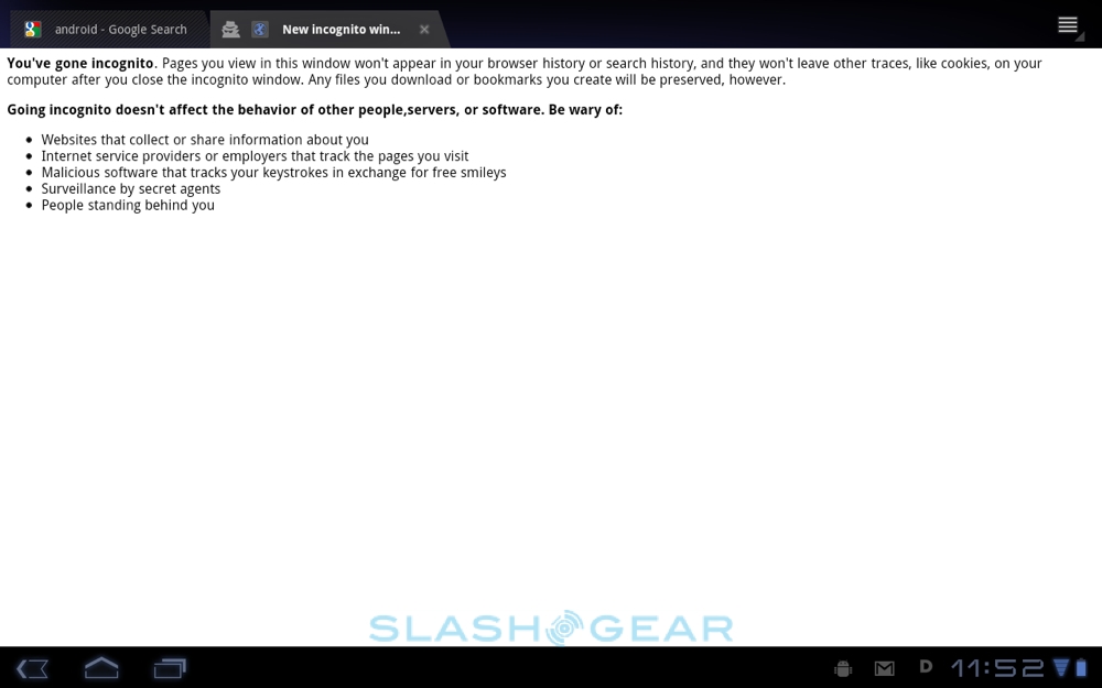
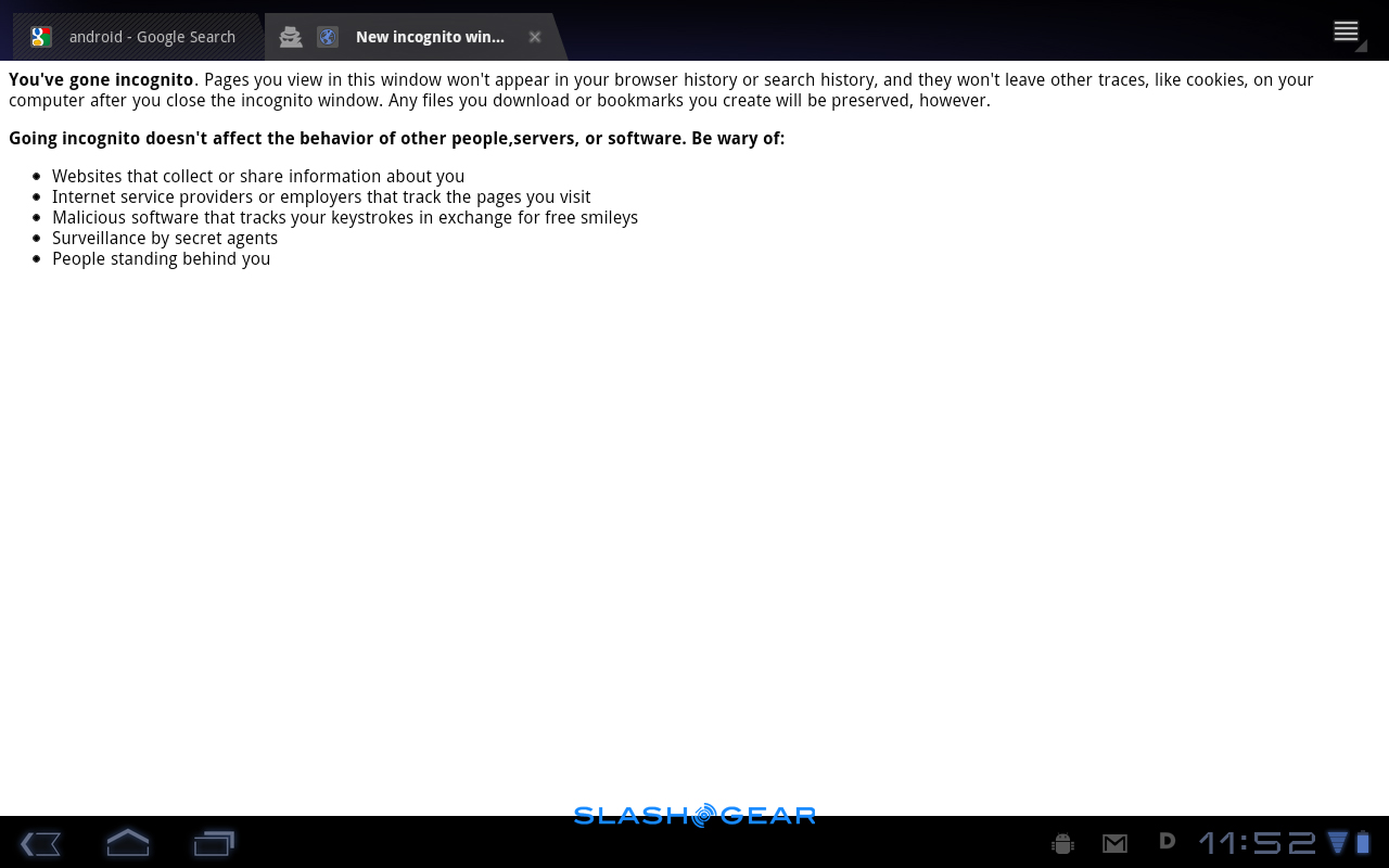
Private browsing with "Incognito" windows is supported, bypassing the combined bookmarks and history pane (as well as cookies), and there's the option for bookmark synch with Google's Chrome browser. There's also the option to automatically sign into pages requiring Google credentials using the user ID and password Android has on file, which can save time (though isn't much use if, say, you have separate Google accounts for business and home).

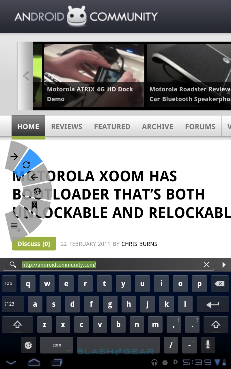
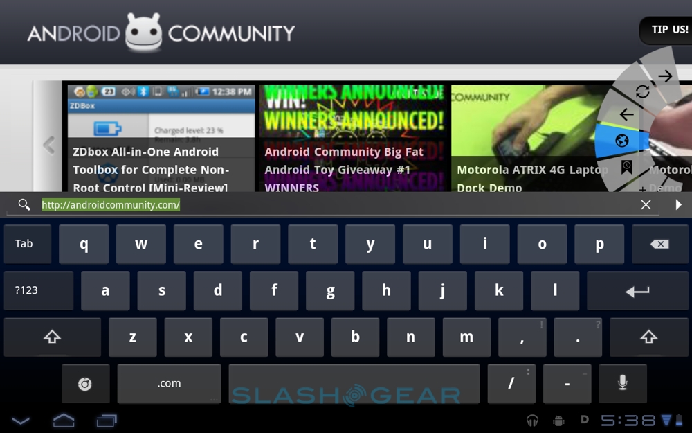
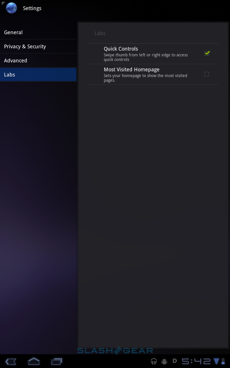
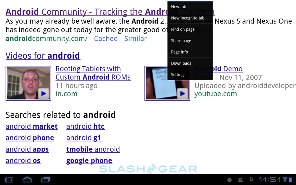
More useful are the Quick Controls, an option turned on in the browser's settings. Triggered by a finger-swipe from the left or right edges of the display, they're a crescent of shortcuts for easy access to forward/back, page refresh, Goto, menu, bookmarks and add-to-bookmarks. If your thumb is long enough, you can navigate back and forth through pages while still holding the tablet in your hand, though of course URL entry or picking from a list of bookmarks requires you to tap elsewhere on the screen. A set of directional arrows and a selection key would be a neat addition to the Quick Controls array.
Messaging and Calendar
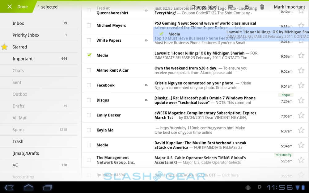
Android's potentially confusing dual email apps continue in Honeycomb, with Gmail getting separate software from all other email types. If you rely on Gmail then you can use the dedicated app, with support for push-messaging, labels and multiple accounts. The standard Email app, meanwhile, has POP, IMAP and Exchange support. Both get a multi-pane layout that's new to Android 3.0, splitting out the list of headers on the left and a conversation view of the messages themselves on right.

Liberal use of folders and labels is made, and there's now drag & drop support for pulling messages out assigning them to the different categories. Any sort of jerkiness or lag would be a real issue here, but thankfully Honeycomb coasts along slickly with no problems whatsoever. You can use both apps simultaneously, of course. Altogether it's one of the best interpretations of email on a tablet device that we've seen, bringing across some common-sense desktop behaviors but not losing the finger-friendliness a slate demands.
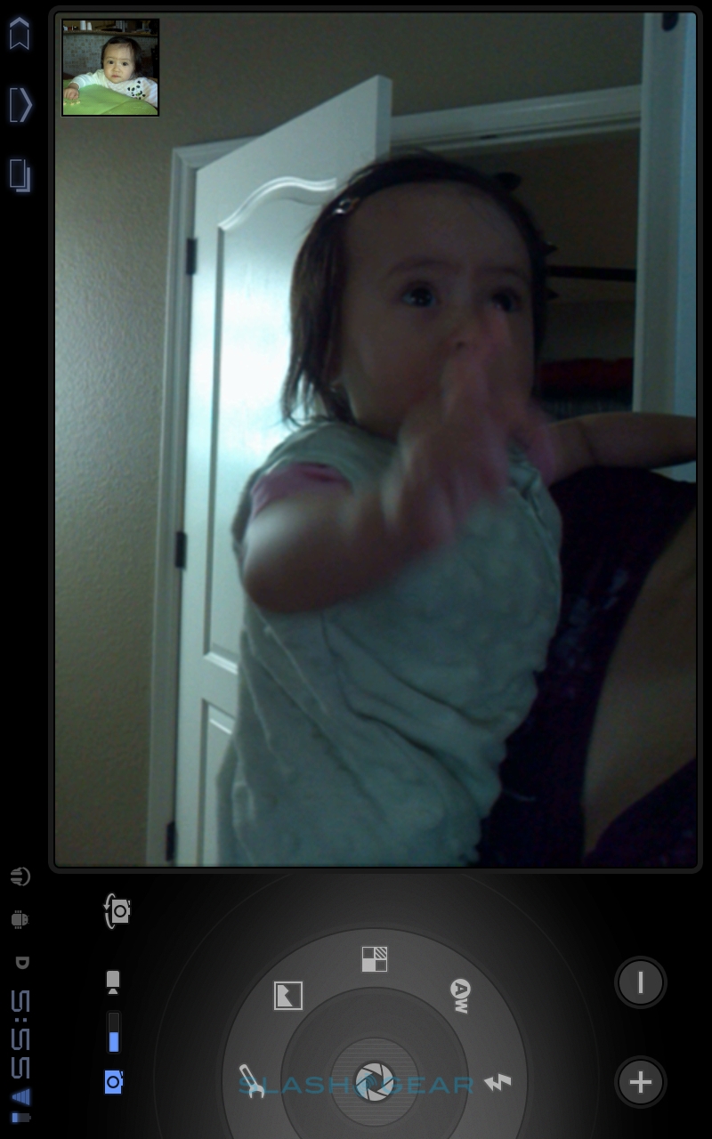
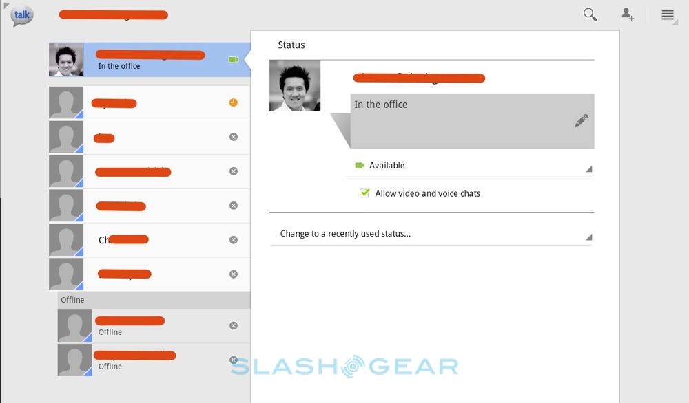
New with Honeycomb is Google Talk support for video calls as well as IM conversations, taking advantage of front-facing cameras such as the Motorola XOOM's 2-megapixel webcam. Individual contacts can be placed on the homescreen, with indicators showing their GTalk status. Calls are initiated from a text conversation; hit the camera icon and the video call rings.
By default Honeycomb uses the front-facing camera, but – assuming the tablet has one – you can also switch to the rear camera by tapping the screen and choosing the camera-flip icon. As well as Android 3.0 slates, GTalk video calls work with the Mac and PC desktop app, a free download. Picture quality was strong over WiFi and 3G connections (assuming the latter had a decent signal), though the call setup takes a few extra steps compared to Face Time on iOS devices.

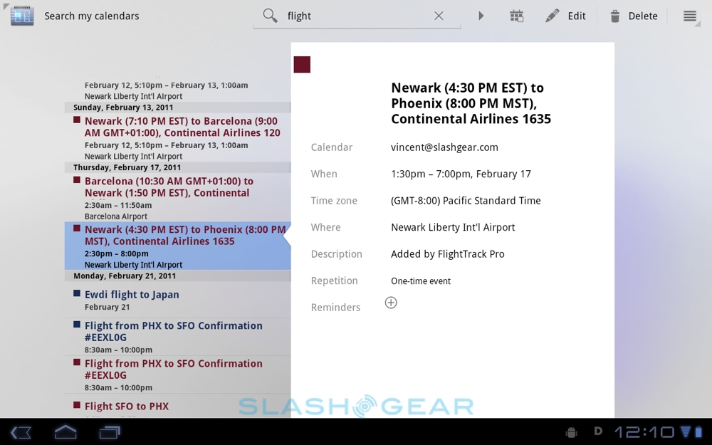
Like the email apps, the Honeycomb Calendar has been boosted to take advantage of the larger screen size. In day and week views, a pinch-zoom gestures changes the grid layout; multiple calendars can be synchronized with a single view. Even with a week's layout on-screen, there's still room for a date-grid for the entire month, with the different calendars listed underneath (and easily toggled on and off). It works just as you'd expect from Google Calendar in the browser. The one odd omission is an agenda view, all the more surprising given that calendar search results are pulled into a brilliant, comprehensive list with pop-out details. We're not sure why Google didn't offer this list as an alternative view.
Camera
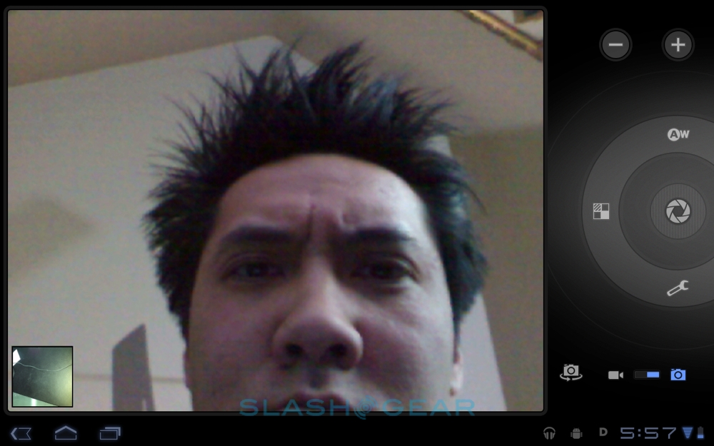
Android's smartphone camera UI is one of the less successful interfaces, so we're glad to see Google bringing Honeycomb up to date with a refreshed layout and controls. The preview window dominates the screen, with the controls clustered on the right hand side of the display. Zoom buttons are at the top, with a button to flip between front and rear cameras, and a toggle for photos or videos, at the bottom.

In-between is the new circular control wheel, with the shutter-release in the center, surrounded by a ring of effects, scene, focus and other settings. These include flash (on, off, auto), white balance (auto, incandescent, daylight, fluorescent), color effect (none, mono, sepia, negative, solarize, posterize), scene mode (auto, action, portrait, landscape, night, night portrait, theatre, beach, snow, sunset, steady photo, fireworks) and then a settings menu with controls for focus mode, exposure, picture size and picture quality. The most recent photo is shown as a thumbnail in the lower left hand corner; tapping it opens up the gallery.


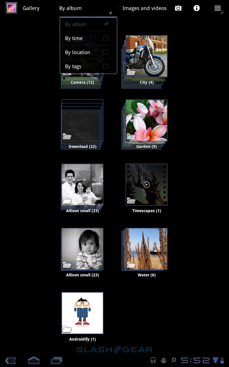
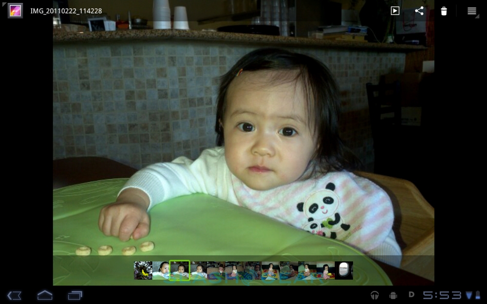
Image quality will of course depend on the camera itself, but browsing stills and video is a more enjoyable experience thanks to the updated gallery. As usual there's a folder view, splitting shots up into those downloaded, those taken with the camera and any particular sets you've set up yourself. Tapping into them gives you a full-screen view and a smaller timeline of shots along the bottom, which scrolls along in a suitably silky manner. Up on the action bar there are buttons to kick start a slideshow – useful if you've got a dock or stand of some sort – along with the Android sharing button to send out the current image via email, message or another route. If you have an Android 3.0 Honeycomb tablet with an HDMI connector – like the XOOM – then you can hook up the slate to your HDTV and browse content on the big screen. There's a mirroring option that replicates the display on both the touchscreen and the external screen for easier control.
Multimedia
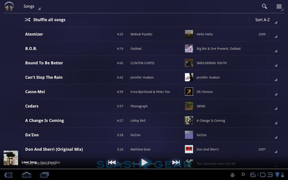
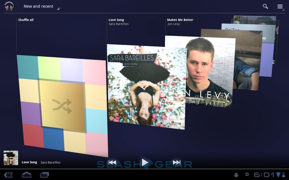
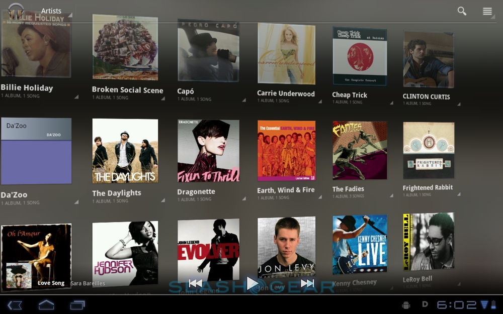
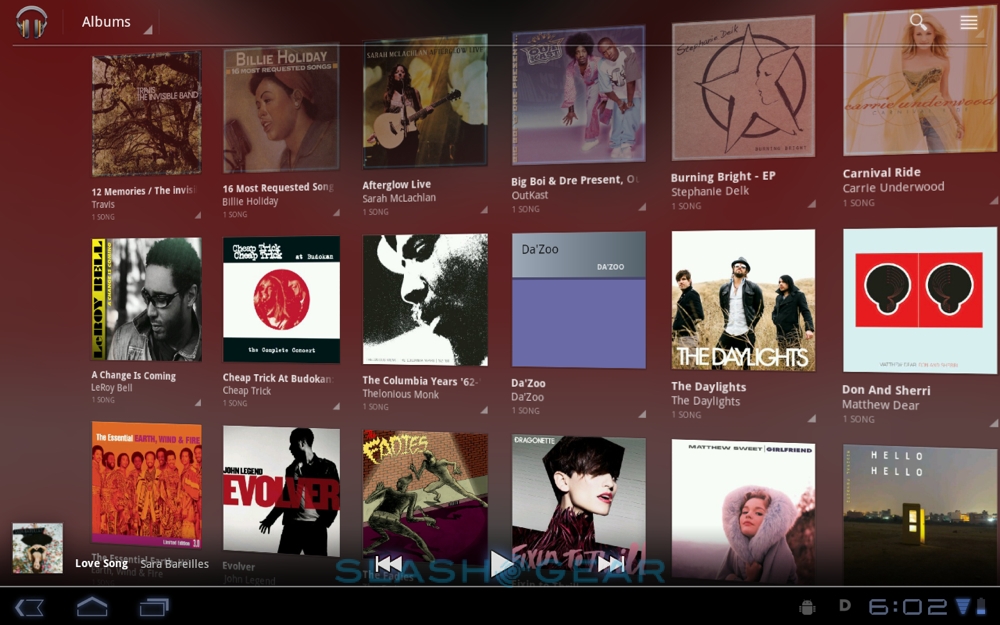
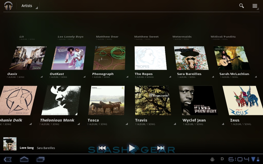
If the regular Android camera UI is unloved, then the music app has traditionally been even less appreciated. Happily Google's engineers have given it more than a fresh coat of paint for Honeycomb, with plenty of eye-candy that, thankfully, doesn't slow down actually browsing through tracks. There's a tilting, twisting 3D wall of albums and artists – flipped between with a drop-down menu in the top left corner – together with a New and Recent view with a timeline of the latest content you've loaded.

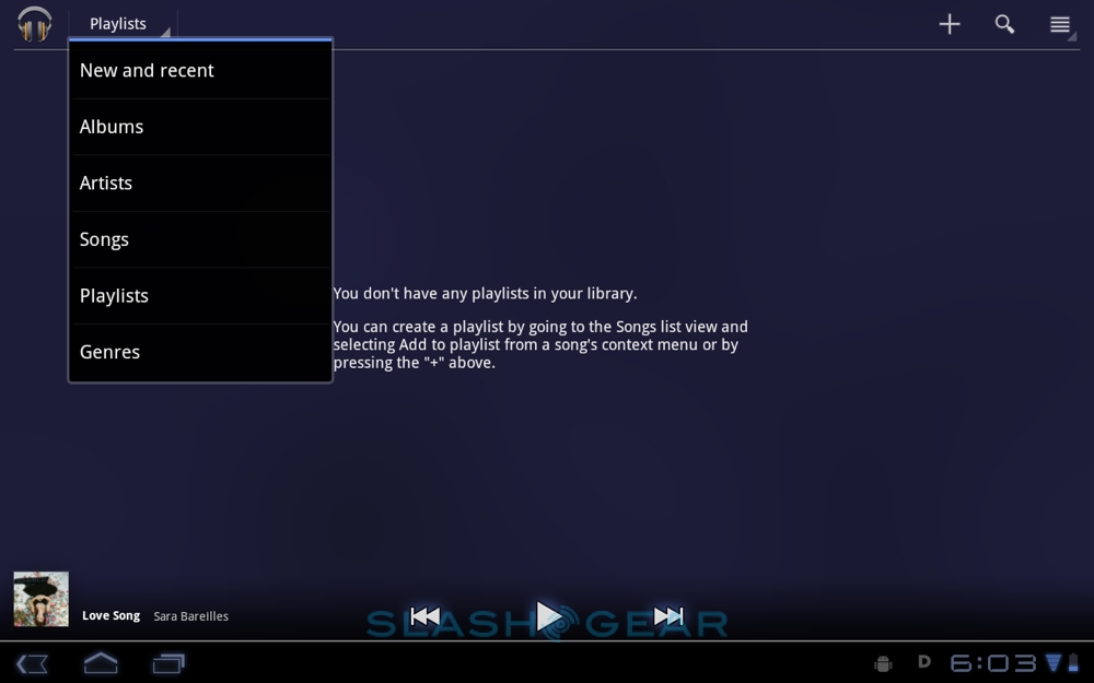
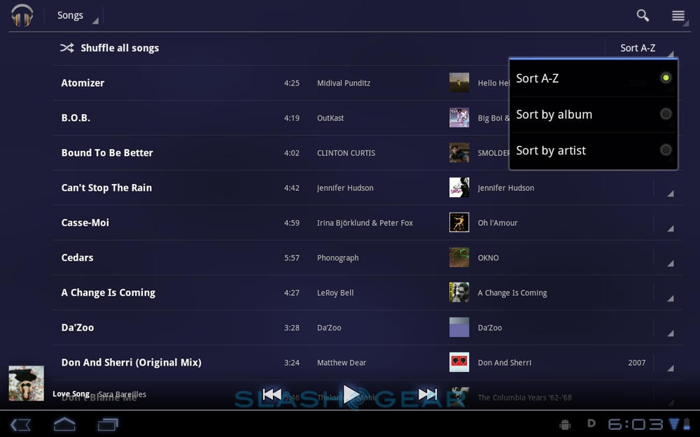
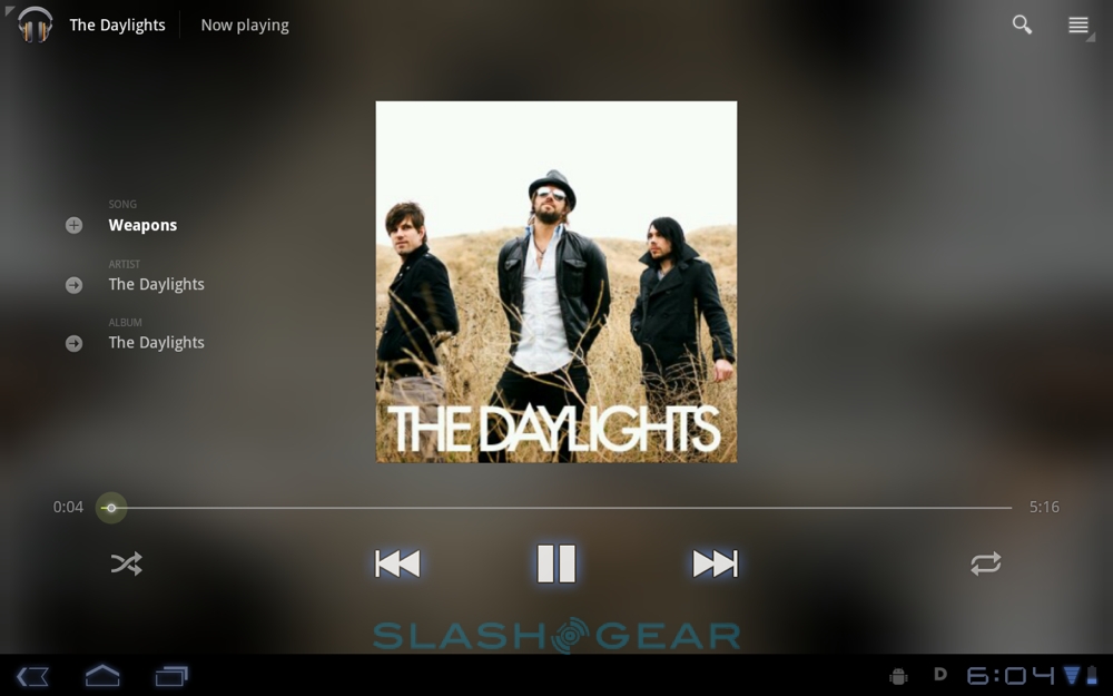
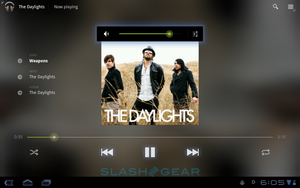
Alternatively there's a songs view – which presents tracks in a straightforward list, sorted alphabetically, by album or by artist – and a genre list, while you can also create playlists on your tablet. There are two ways of doing so: either by creating a blank playlist and then filling it with tracks, or by tapping the "Add to Playlist" option in any individual song's context menu. The now-playing screen shows album artwork, artist, title and album name, as well as a responsive scrub-bar and shuffle/repeat buttons.


Video playback works from a straightforward grid or list view of files, though Google is yet to significantly boost the list of codecs Android supports. In Honeycomb there's H.263, H.264, MPEG-4 and VP8, in .3gp, .mp4 and WebM containers, which is a pretty poor showing considering the multimedia ambitions – and capabilities – of the sort of processors to be found inside Android 3.0 tablets. We turned to RockPlayer and vPlayer, found in the Android Market, to fill in the gaps, and these worked well, playing full-screen on the XOOM and outputting high-definition video via HDMI.

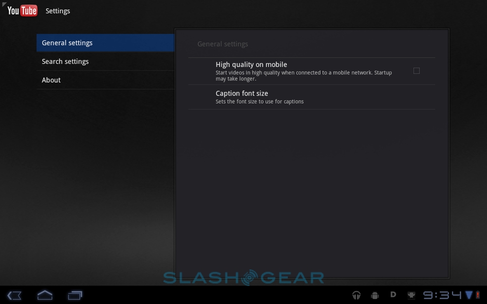
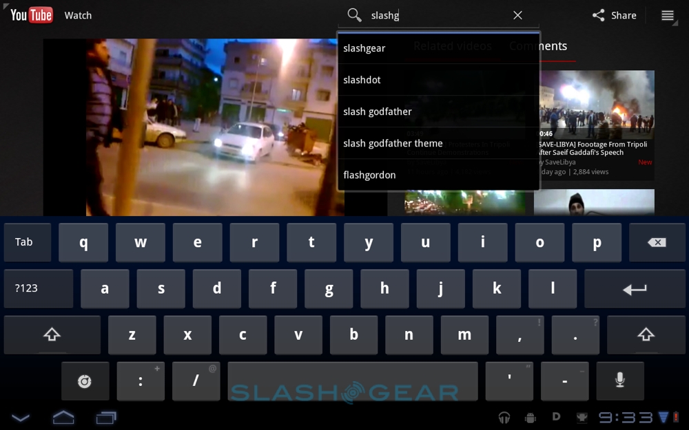
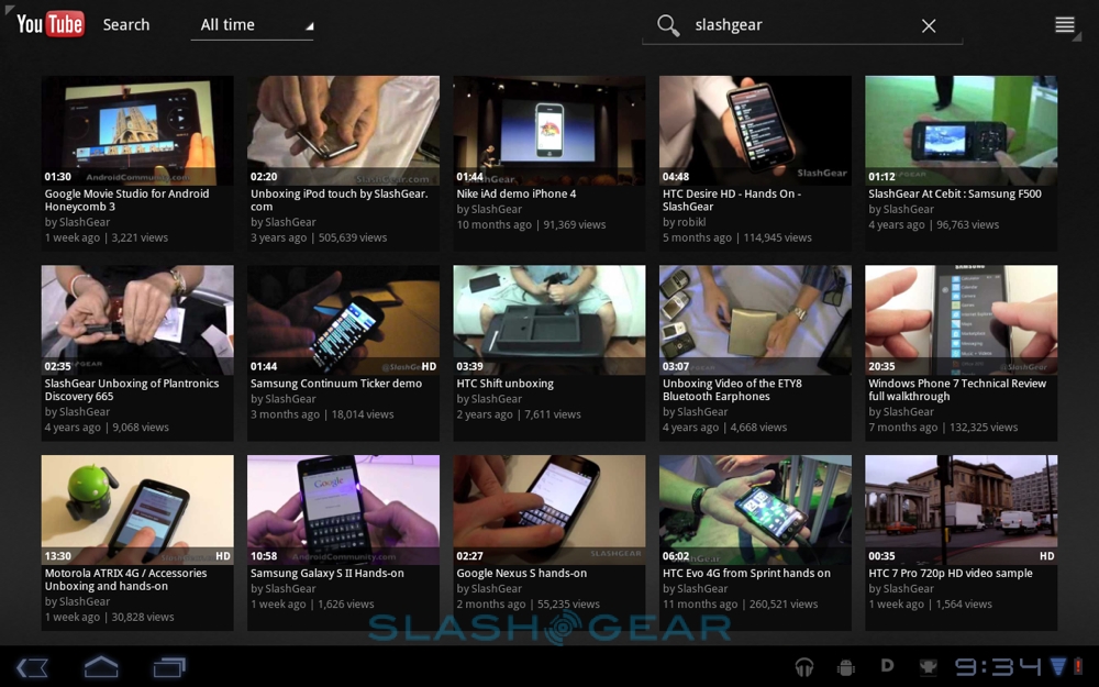
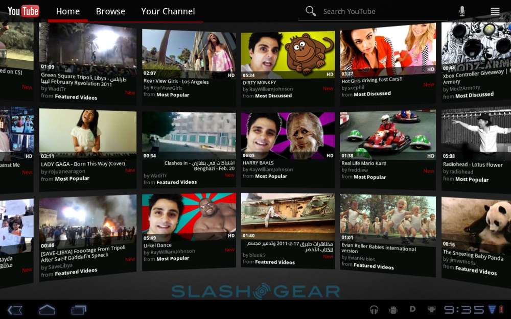
As on Android phones, there's a dedicated YouTube app for streaming video, useful given the lack of Flash support at launch. This has also had a makeover, with a new 3D wall of videos to choose from. It's more to show off Honeycomb's 3D acceleration than anything else, but it works and there's channel and search functionality along with options to filter by video age. Given the bigger screens, it's useful to be able to change the font size for captions; you can also force Honeycomb to stream in high quality even when on a cellular connection.
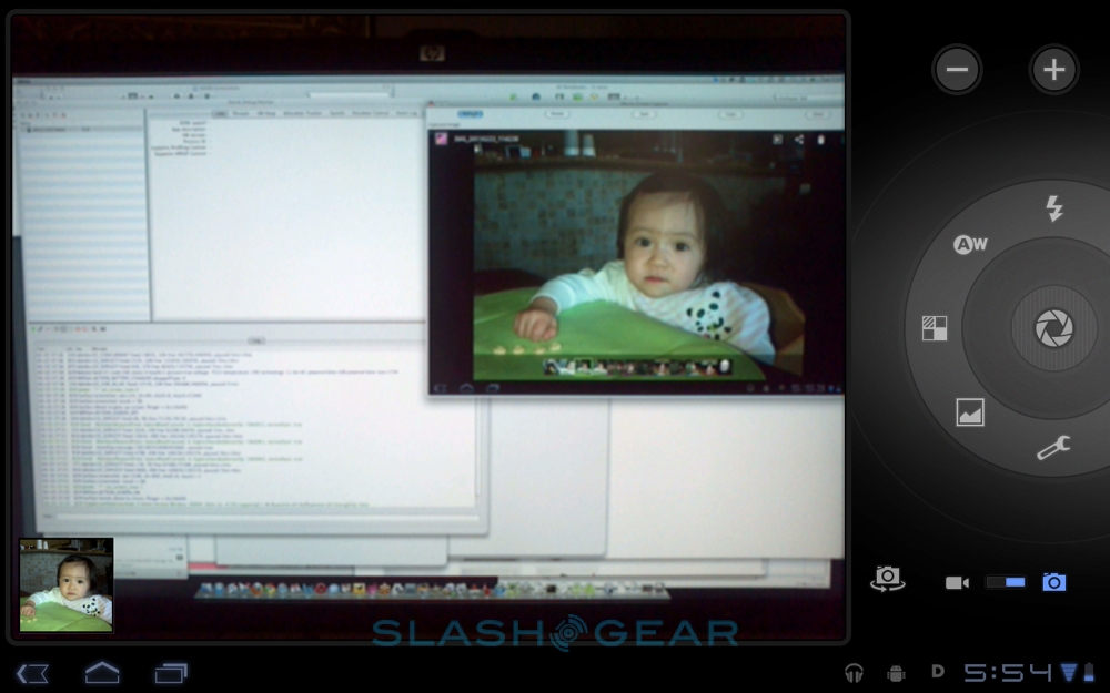
Plug an Android 3.0 tablet into a PC and it will show up as a removable drive for managing content, but as of Honeycomb there's a new OS X sync tool. Once installed (on OS X 10.5 and above systems) Android File Transfer loads automatically when you plug your Honeycomb slate in via USB, and allows you to browse files and folders, and copy content between computer and tablet (as long as they're under 4GB in size). It all works, but we can't help but wonder when Google will offer some sort of proper media sync app, similar to iTunes or Microsoft's Zune manager.
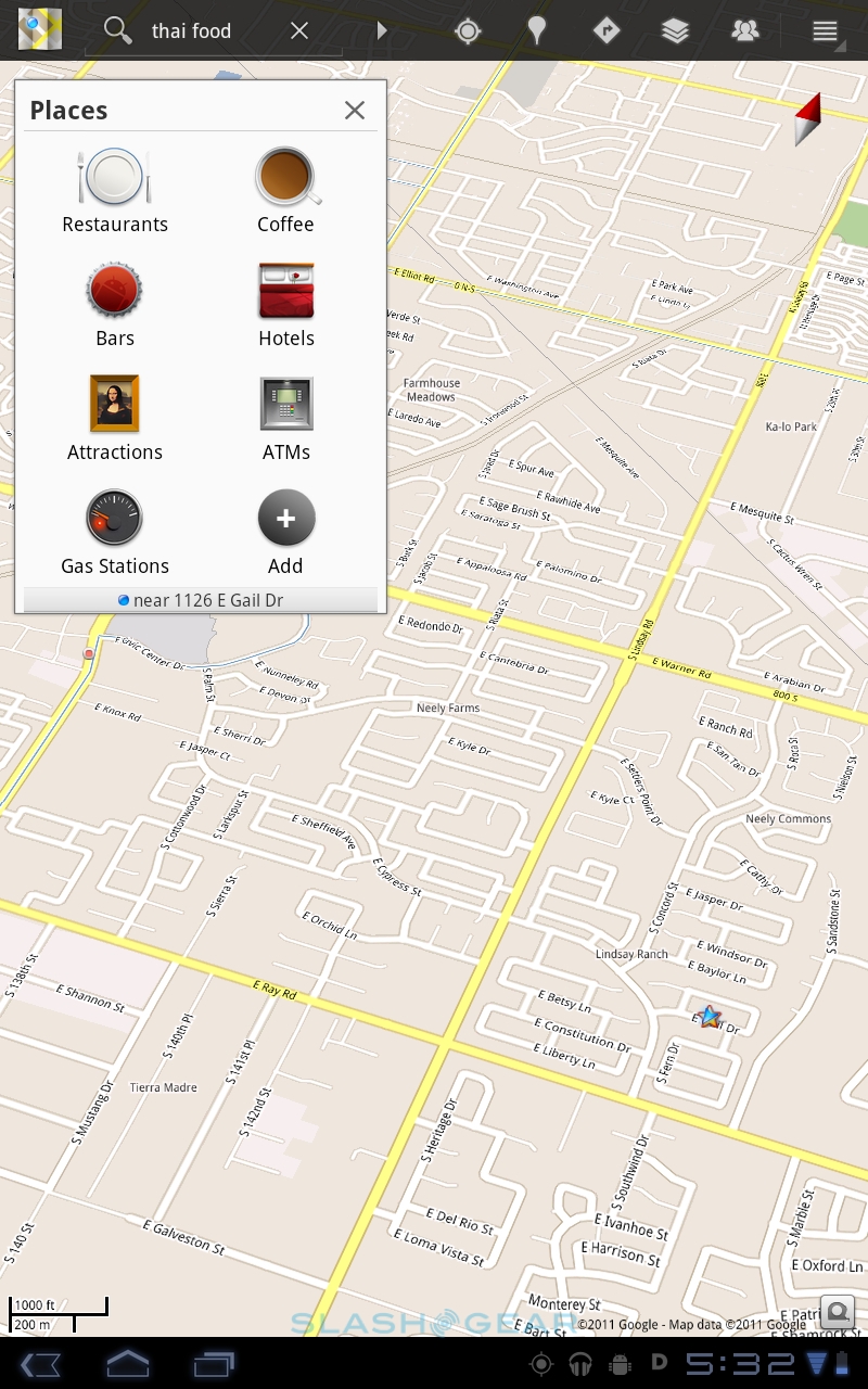
Google Maps
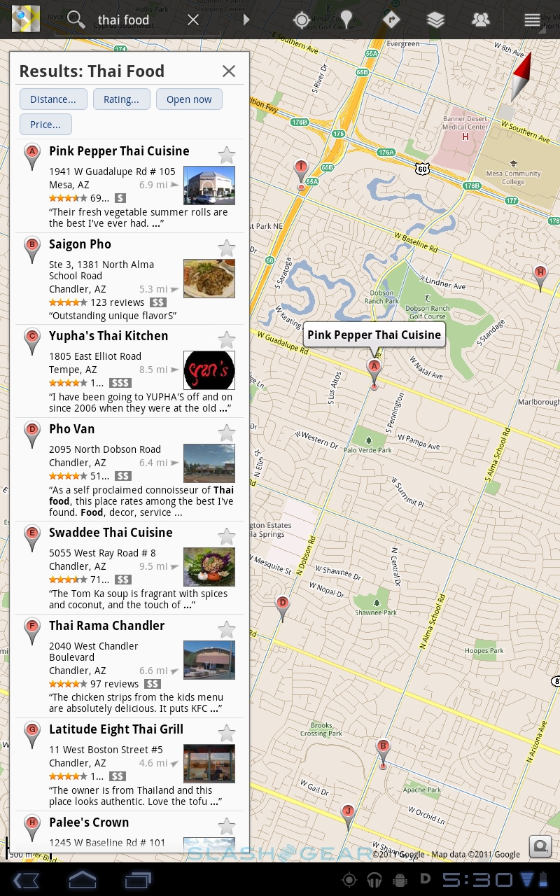
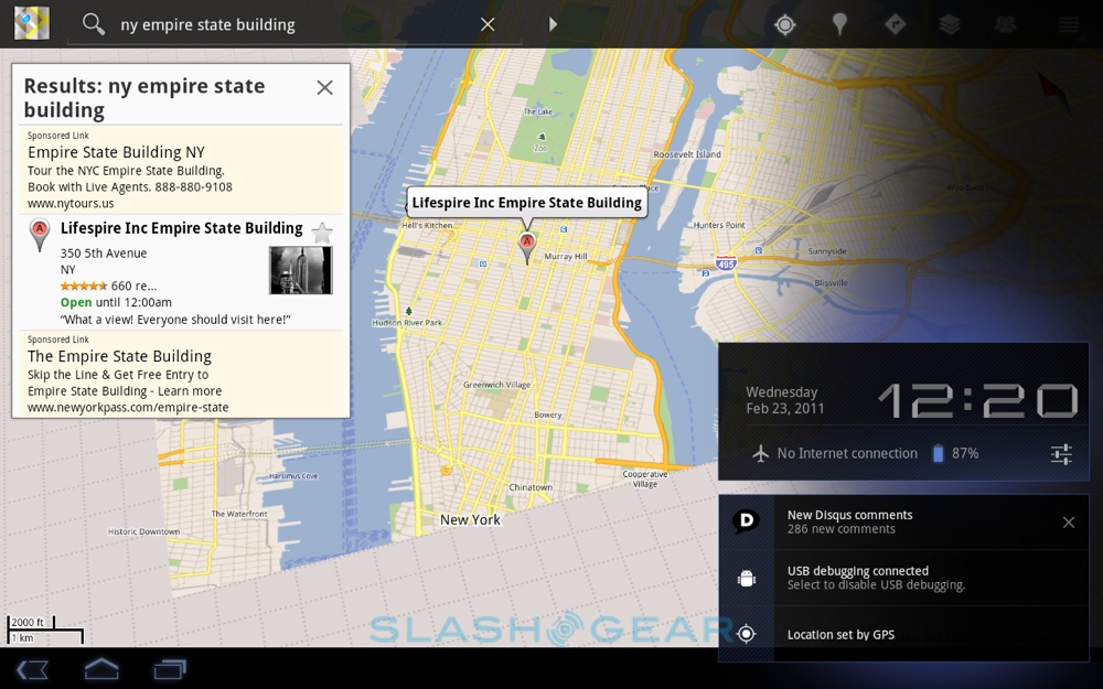
As we saw in the most recent Google Maps update on Android smartphones, Google has done a lot of work slimming down data use for its mapping app, and that's carried over to the Honeycomb version. The app renders dynamically, rather than using vector-based imagery, which adds up to quicker graphics and less data traffic. As a result, there's now room to cache common or frequently searched journeys, allowing you to browse those routes even without a data connection. It might not be so useful on a tablet as on a smartphone, but it still works well and Google's 3D buildings look great on a bigger screen.

Boosted gesture support allows you to tilt the map using a two-finger slide, and then rotate it with a chiral-twist movement. If your tablet has a digital compass – as we imagine they all will – then you can synchronize rotation to the direction in which you're facing. There's also far smoother zooming, and Street View looks incredible at this scale.
Apps
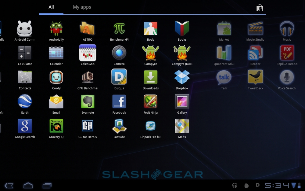
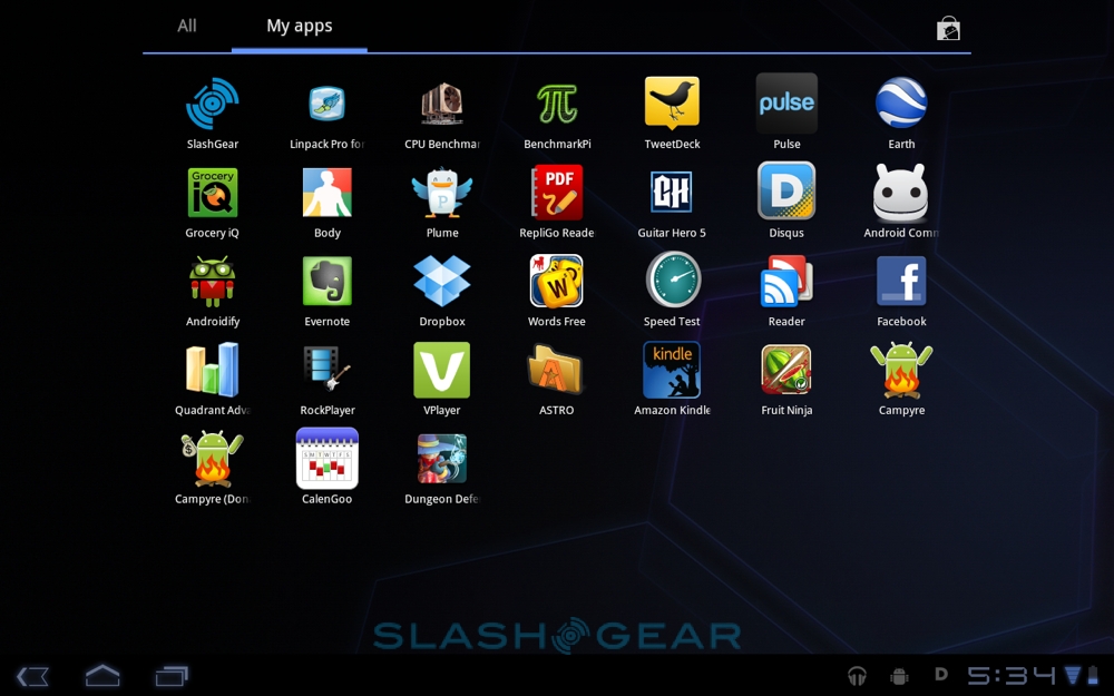
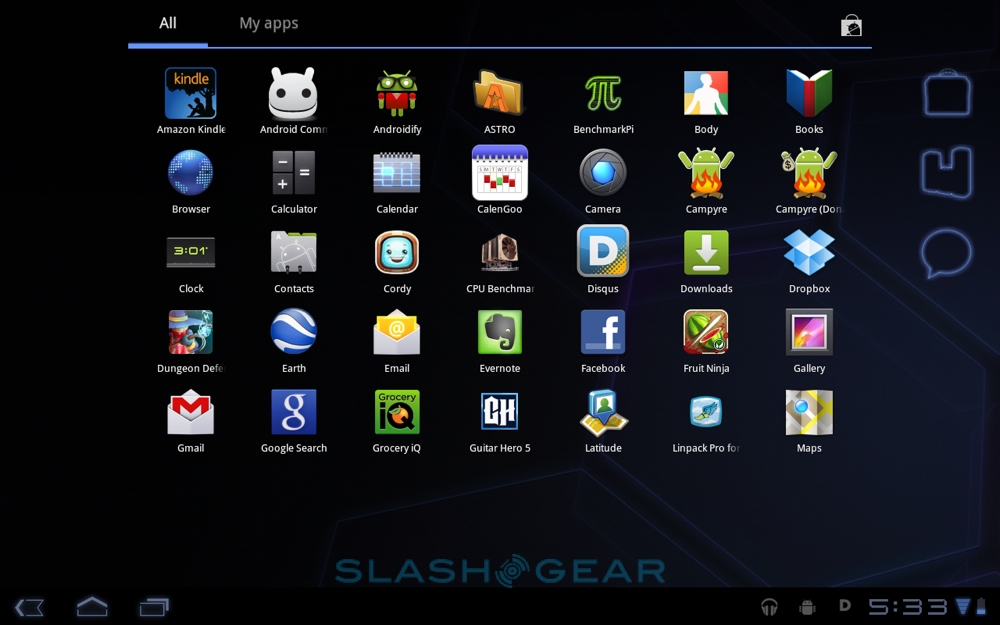
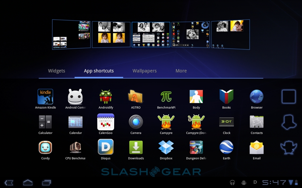
It's not enough to have a single platform now; you need to have a full ecosystem, with apps and an active developer community. Google has those for its smartphones, following only Apple in terms of the sheer number of titles available in the Android Market. The good news is that most existing apps should work on Honeycomb tablets, even if they were written for smartphones, just as long as the developer followed Google's guidelines for best code practice.

Unlike the screen doubling on the iPad, Android apps run full-screen natively in Honeycomb, and general usability is good. Most titles work just as you'd expect from a handset, though some graphics can be blocky. The bigger issue is layout and how software uses screen real estate: an app designed for a roughly 4-inch smartphone display doesn't make the best use of space when viewed on a 10-inch tablet like the XOOM. Developers will have to go back to the drawing board to create tablet-centric UIs, at least, even if their core software is functional. To help with that, Google released the official Android 3.0 Honeycomb SDK this week, complete with the final APIs, so we should start to see refreshed software coming through the pipeline soon.

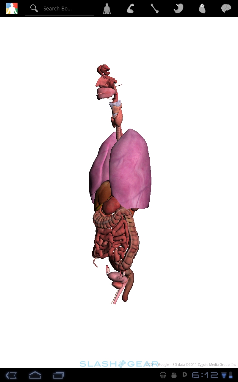
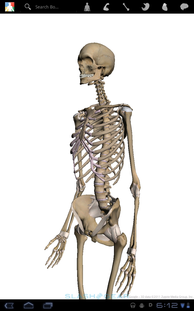
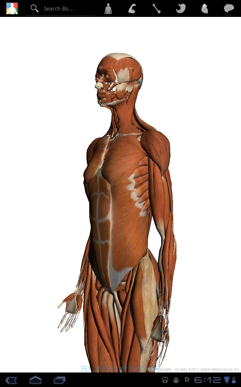
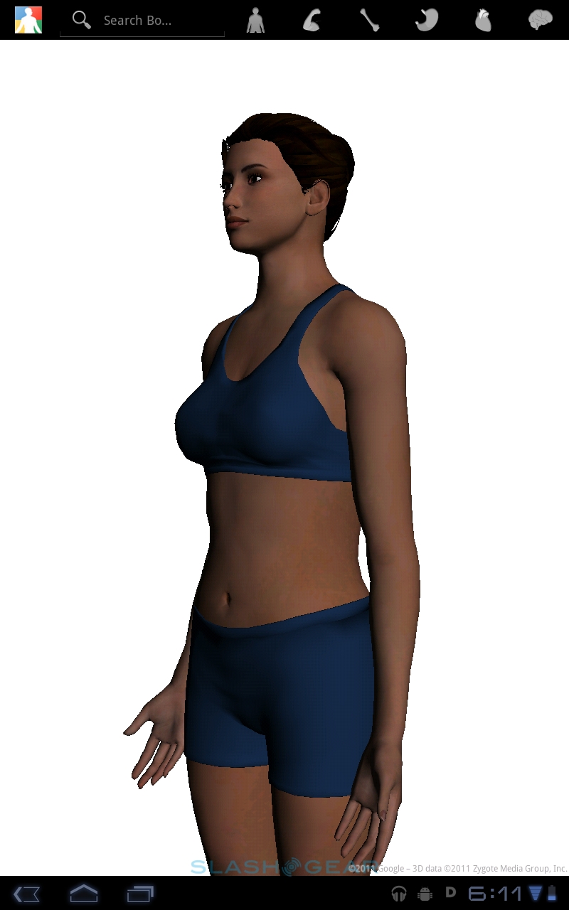
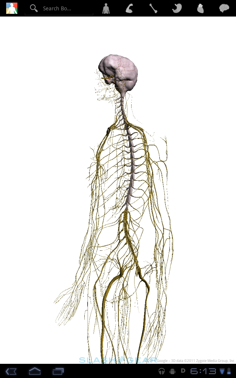
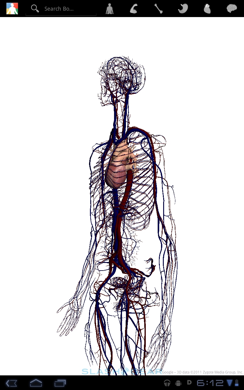
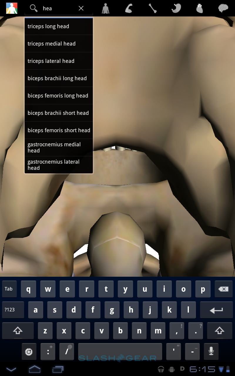
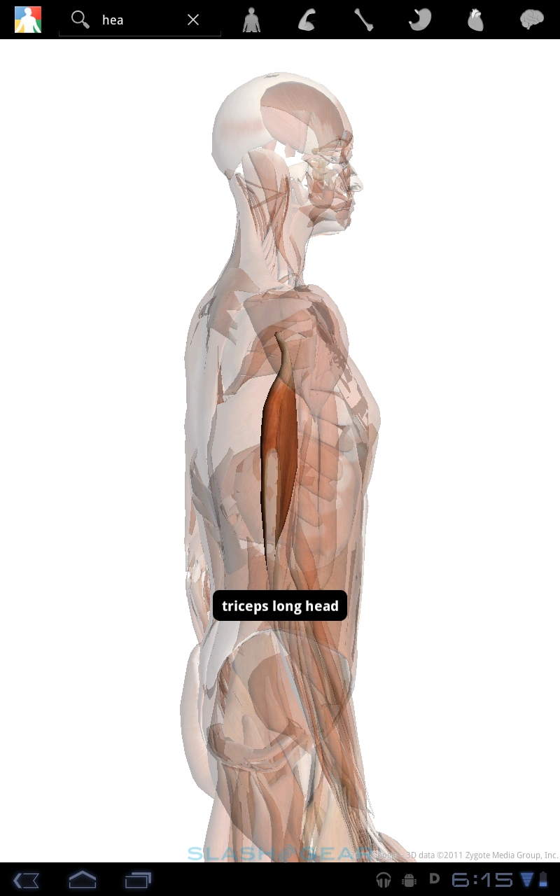
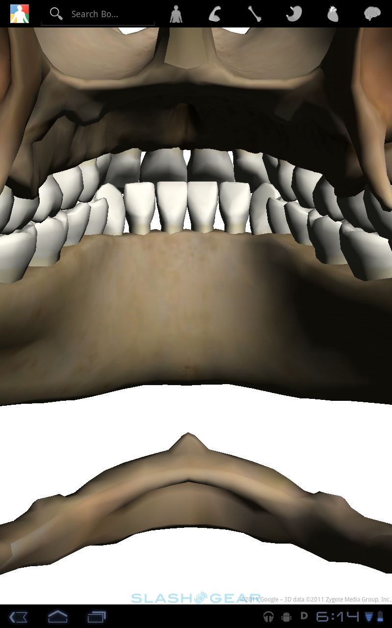
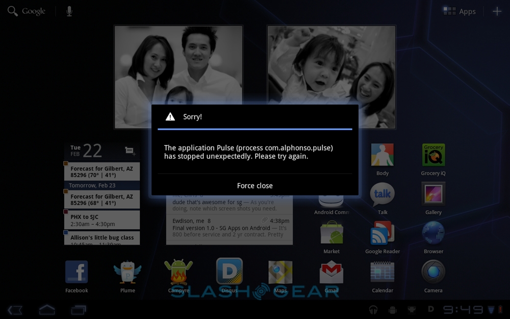
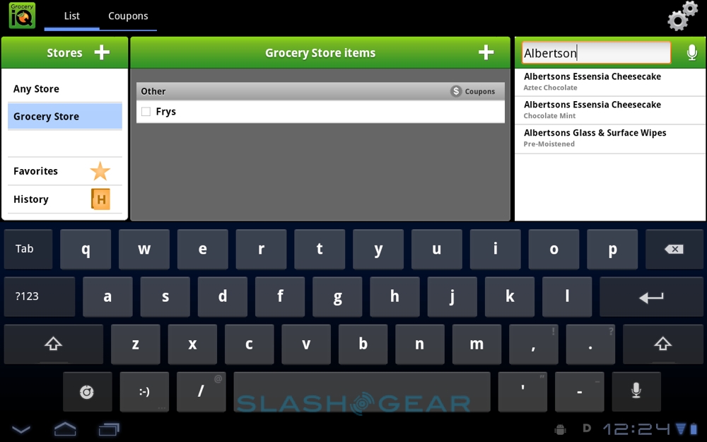
Google provided three Honeycomb-optimized apps for us to look at, the Body app demonstrated at the Android 3.0 launch, Grocery IQ from Coupons, and a new version of the Pulse news reader. Body is utterly amazing, an educational title that allows you to strip back the human form to muscles, organs and skeleton, with labelling and search functionality. Grocery IQ is much the same as the Android phone version, allowing you to create and manage shopping lists on your device and sync them with the web and to other phones and tablets.

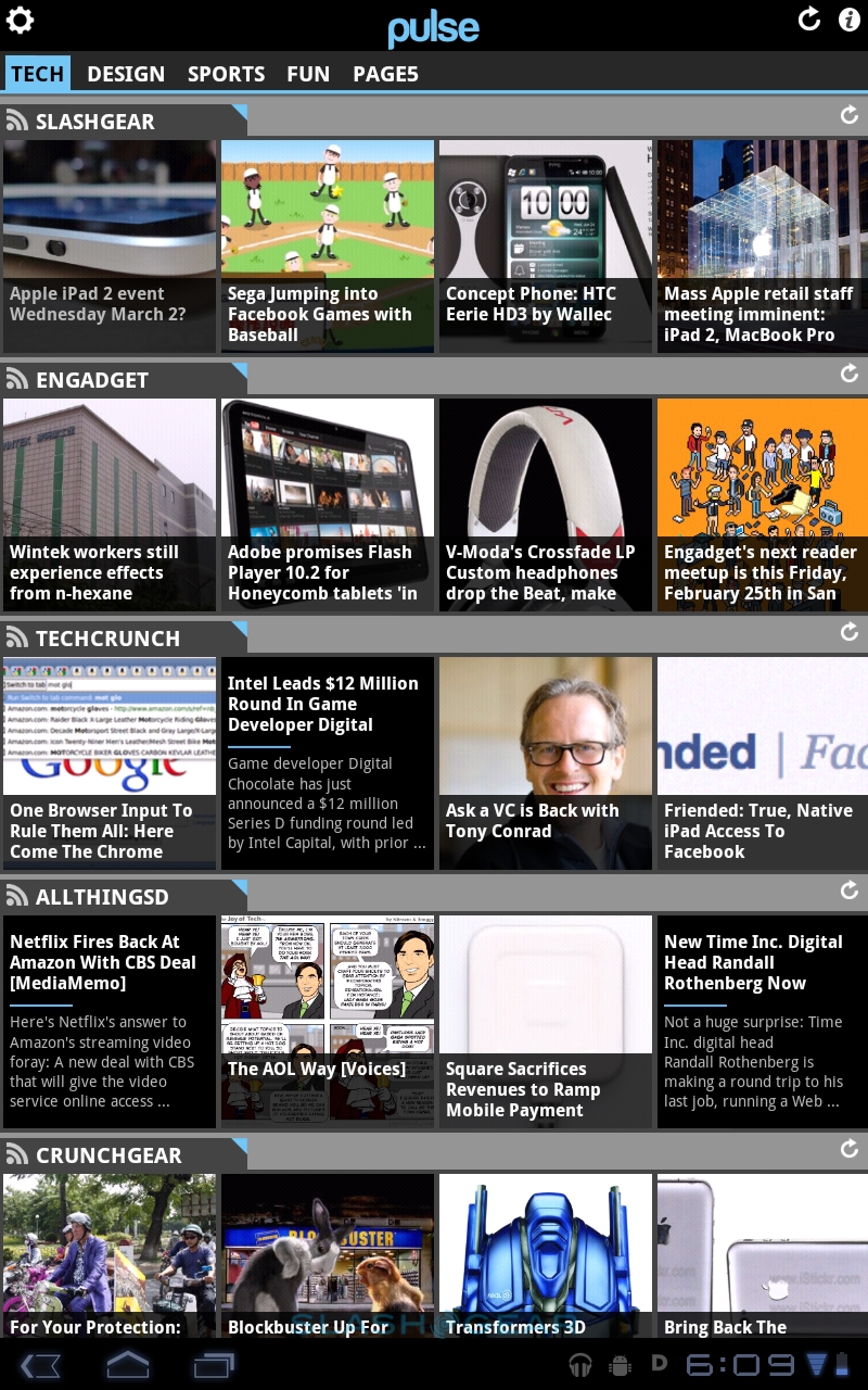
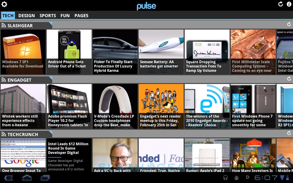
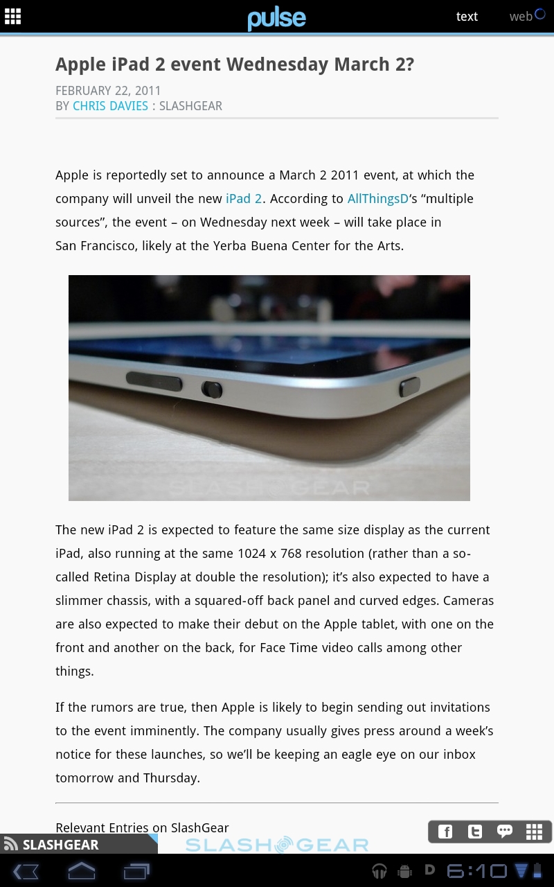
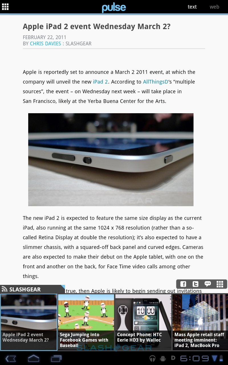
Pulse looks all but identical to the iOS version for iPad, with straightforward sharing tools that hook into Facebook, Twitter, email and other routes. However, it's actually a good example of Honeycomb's new Fragments addition to the API, which allows developers to build app UIs from multiple interchangeable and rearrangeable modular panes. In the case of Pulse, the preview window and the side-scrolling headline window are different fragments, with the blocks pieced together in different ways depending on whether you're reading in portrait or landscape orientation, or indeed on a smartphone or on a tablet. Fragments means developers will have to do less UI work to make apps that are usable on both platforms.

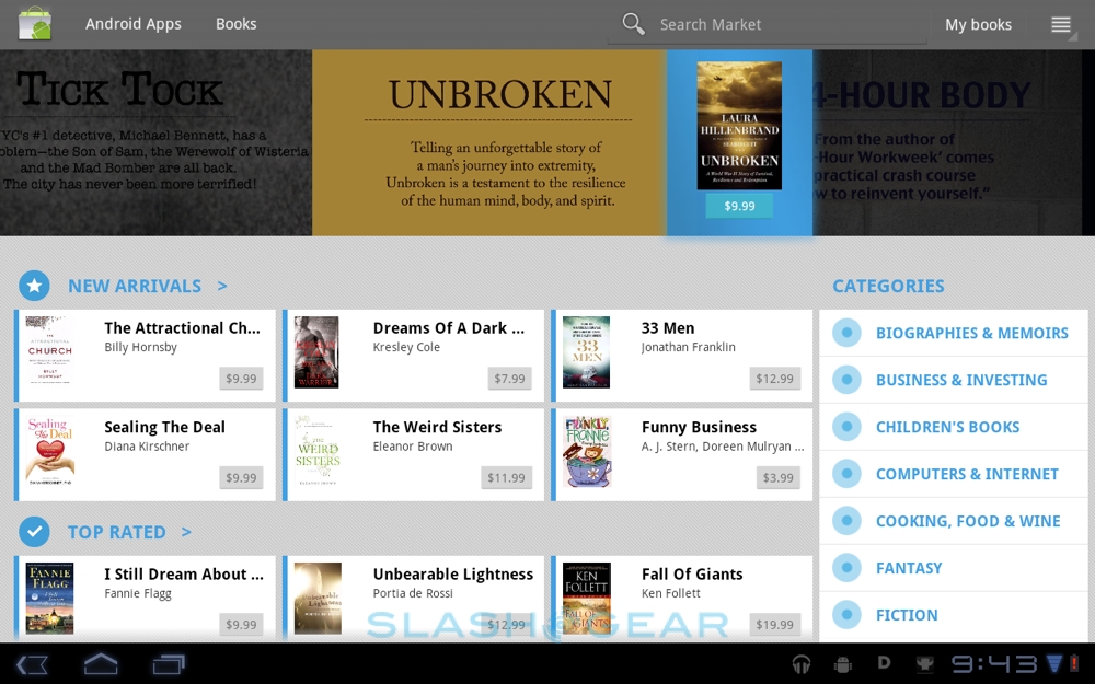
Finally, there's also a Books app, to manage your Google Books ebook collection, though we imagine most people will use Amazon's Kindle app or Barnes & Noble's NOOK app, which each worked as expected.
Security and Connectivity
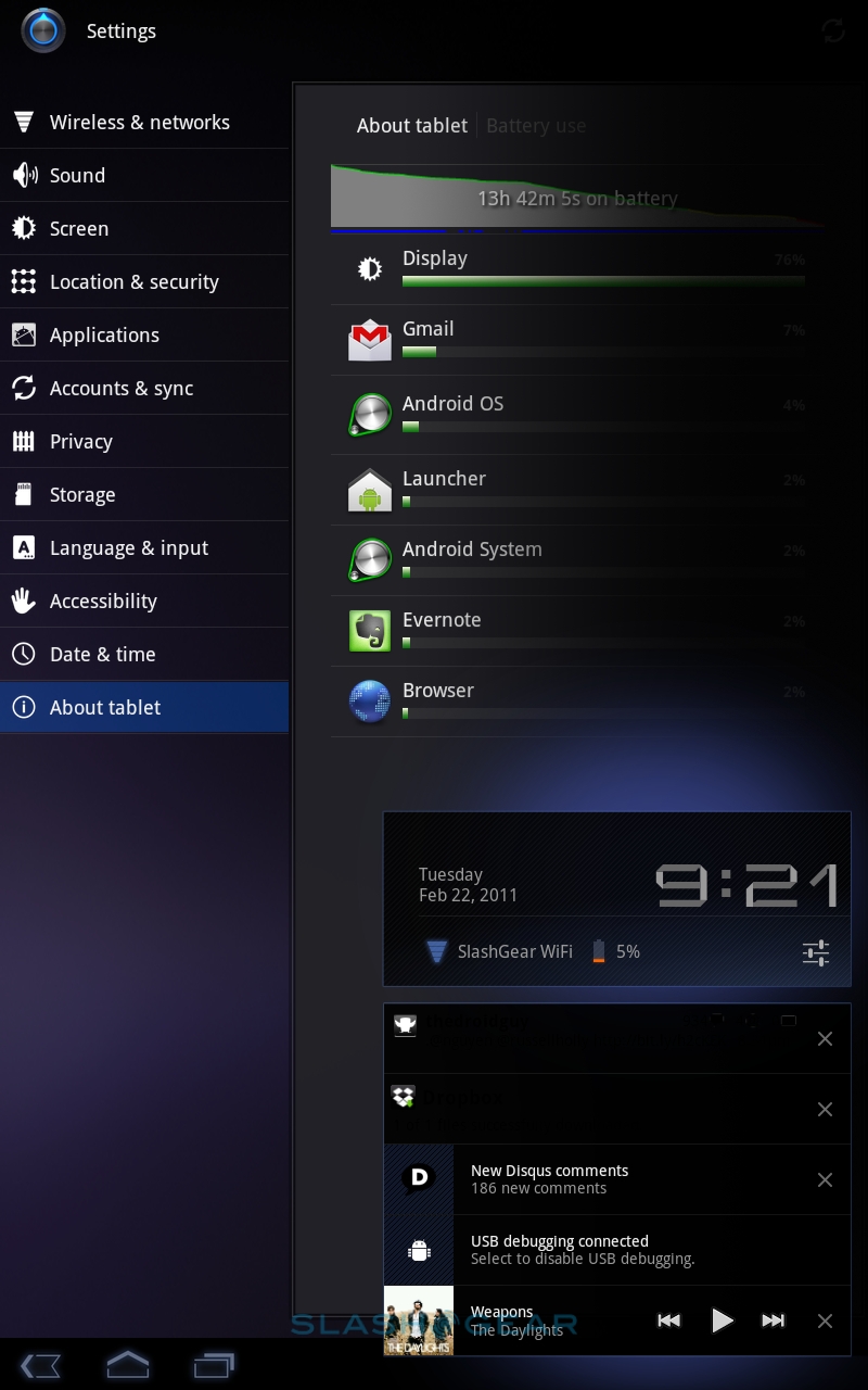
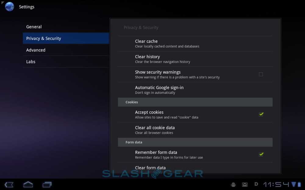
With tablets making increasing strides in the enterprise, it's little surprise that Honeycomb has at least a nod to business and security. As usual you can set a lock on the homescreen – though only with a passcode or PIN, since Google has done away with the pattern-based unlock from Android for smartphones – but now you can also encrypt the entire tablet. Google warned us it would take some time, and they weren't wrong: we hit encrypt as soon as we got the XOOM out of the box, and it took over an hour to complete. It's worth noting that, should you subsequently forget the PIN, the only workaround is a complete hard-reset (and losing all your data). There's also support for remotely wiping Honeycomb, should you or a member of staff lose your tablet.
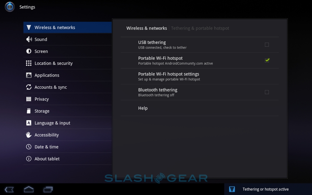
As for connectivity, Android 3.0 has mobile hotspot support for sharing 3G/4G data with up to five WiFi-tethered clients, thought you'll likely have to opt for a more expensive data package before the carriers will let you do so. There are three sharing options, USB tethering, portable Wi-Fi hotspot and Bluetooth tethering. As on Android phones, it works well, though battery life takes an inevitable hit.
Wrap-Up
To describe Android 3.0 as a significant division from the versions we've seen up until now is an understatement. Word from inside Google is that Honeycomb is one of the biggest undertakings for the Android engineers so far, and that effort demonstrates itself in the platform's consistency, completeness and efficiency. There's no sense at almost any point that functionality has been sacrificed for aesthetics, and yet the overall Honeycomb experience is still eased through with neat animations and all the gloss demanded of a modern platform.

It's also clearly not just a smartphone OS blown up to suit a bigger screen. All of the core apps – as well as the menus, homescreens and structures that fit around them – have been updated to suit the tablet form-factor. At times that can leave it feeling almost not Android-like – no familiar pull down status bar, the shift to all-onscreen navigation buttons – but everything works as you'd want it to and, when you dig in a little more, the same familiar dialogs and menus are there. Yes, perhaps a physical Home button might offer a lifeline to first-time users, but the onscreen version works just as well, and the straightforward layout and thumbnail app switcher makes Honeycomb one of the easier platforms for new users to get to grips with.
[vms 03d8252c9c4ba75ddbf6]
The consistency certainly helps there, and third-party developers have some work to do if they're to match the overall polish of what Google's coding team has produced. That will come in time, however, and until then regular Android apps work with few issues when downloaded from the Market. That puts a big fat tick in the backward-compatibility box, and should help keep Honeycomb ahead of webOS, QNX and other tablet upstarts.

Honeycomb's biggest strength, though, is the speed at which Google has demonstrated it can move. Considering Android 1.0 only hit the smartphone market in late 2008, and now the platform boasts a comprehensive and convincing tablet OS just a few years later, there's every reason to expect iterative updates to further polish the user-experience at a rapid pace. It starts that process at an incredibly strong position, passing the baton to manufacturers to match Android 3.0 with suitably class-leading hardware. The first batch of Honeycomb slates may have some wrinkles – the missing Flash and paucity of video codec support being two examples – but 2011 definitely looks to be the year that Android tablets will come of age.
NOTE: also take a look at our Motorola XOOM tablet review and a post by our sister site Android Community: a Q&A style review of both the tablet and the mobile OS!