Sony's Rejected, Crowdsourced Logo Redesigns From 1981
Japan's Sony is one of those rare companies that has had a nearly unaltered logo for more than 50 years, with the current design being used since 1956. But when Sony was riding high in 1981, a year and a half after the debut of the first Walkman, the company thought it would be a good idea to celebrate their 35th anniversary with a contest asking the public to redesign its logo. Thankfully, before it was too late, they realized it was not a good idea.
As part of the "Sony International Logotype Design Contest," the company received just under 30,000 submissions from all around the world. Using a committee, the submissions were narrowed down to 59 logos, which were then presented to Sony's directors, executives, and designers. Three finalists were decided upon, but the company ended up not using any of them. Masaru Ibuka, Sony's co-founder, "decided that none of the designs was better than the original one," says the company's official history.
Designer Greg Prichard recently came across an ad form a 1981 copy of Time that showcased Sony's top three picks. So the company commits itself to a public contest where the result is an amateur-designed logo that is to become their brand identity, but realizes what a mistake they've made. What do they do? They announce that the contest prize money will be divided equally among the three finalists; Vilim Vasata of Germany, Bruno Grasswill of Australia, and the U.S.'s Fred Burton.
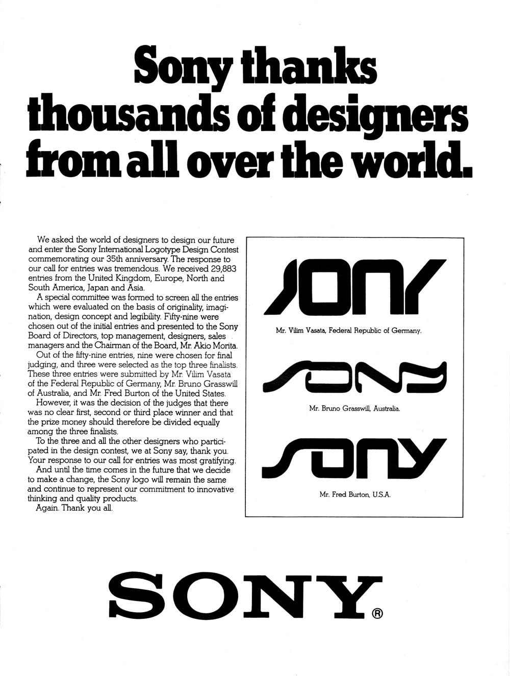
Looking at the three final choices, it's more than obvious they came from the '80s, and it was wise for Sony to stick with what they already had. Personally, I think the third design, by Burton, is the best of the bunch, but definitely not as timeless as Sony's current logo. Still, it must be pretty cool for the three artists though, to be almost responsible for re-branding one of the world's largest technology companies.
VIA FastCo Design
SOURCE Sony