Nokia Pure Revamps Typography For A More Modern Symbian [Video]
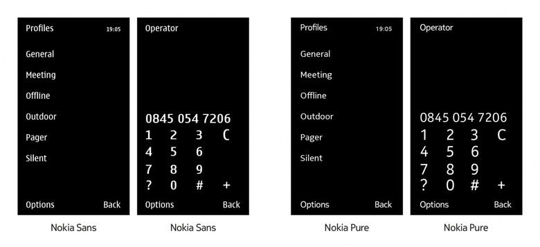
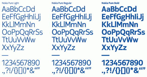
Nokia has unveiled its new typeface and branding strategy, dumping the old Nokia Sans font and adopting the new Nokia Pure both in their publicity material and on handsets. Designed to be "unfussy and modern, without being cold and machine-like," Nokia Pure also has the benefit of being usable at smaller point-sizes while still being legible.Video overview after the cut
It's the handiwork of Bruno Maag, a Swiss typographic designer, who designed the letters so that they almost seem "to flow into each other." No word on when we might see it show up on the first handsets, but Pure will make an appearance on promotional material later in 2011. It remains to be seen whether Nokia will also use the font on its Windows Phone handsets.
Now, we've not been short on Nokia reviews here on SlashGear – we've covered the E7, C7 and N8 in recent months – and one of the common criticisms we hear from potential smartphone buyers is that the core Symbian UI is a turn-off. While you can change and reskin that UI, Nokia tweaking it out-of-the-box seems a mighty sensible idea; in one fell stroke the whole interface feels a lot more modern and friendly.