Google's new 'Literata' font makes ebooks beautiful
You expect different fonts in the books you read than on the Web pages you read, and so it is common for some fonts to only be found in books — they're tailored for the long-form reading experience, and altogether visually pleasant. Apple will reportedly be switching up its system fonts for better readability, and Google is doing something similar with its Google Play Books specifically. The Internet giant has unveiled a new font specifically for ebooks, and it's called "Literata".
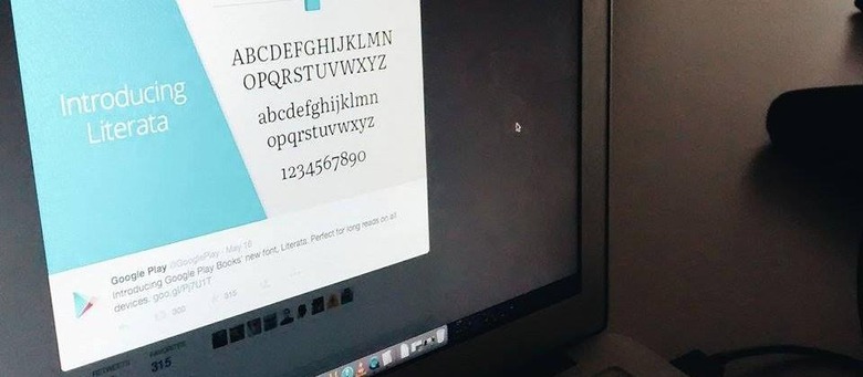
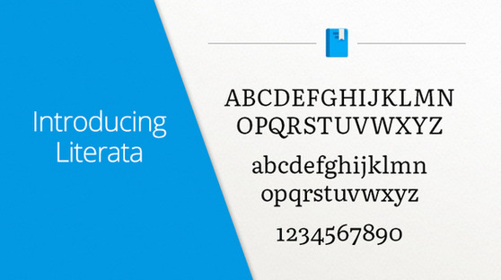
Google introduced the 'Literata' font on its Google Play Twitter account recently, saying it is for Google Play Books. This means the new font will be visible in any ebooks you get through the service, and judging by the preview it is a nice minimalist serif font. This replaces the previous Droid Serif font as default.
According to 9to5Google, Google actually first introduced this font back in Google Play Books version 3.4.5 earlier this month, but it has decided to make the change widely known at this point. Says Google, the new font is better for long reading sessions.
The font was made in conjunction with Type Together, which said in part that "the new Play Books type is meant to establish a recognisable visual identity for Google's native eBook App and stylistically distinguish itself from other eReader competitors."
SOURCE: 9to5Google