Facebook Redesign Launches 364 Days Later
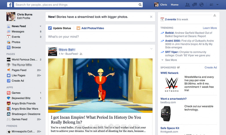
One year ago – minus one day – Facebook held an event in which they suggested a "personalized newspaper" redesign of the social network was coming. Fast forward 364 days later and we've got it! Today the redesign has launched, bringing on grays, hard lines, and what Facebook suggests is a change in which "Stories have a streamlined look with bigger photos."
Functionality has changed very little. While we've got blocks of content separated by a gray background, there's still a setup which includes your name, Favorites, Groups, Friends, and Games on the left, news feed in the center, and Trending items, People You May Know, and notifications on the right. Privacy controls are in the same place (upper right) and you can still search the whole Facebook universe right up top.
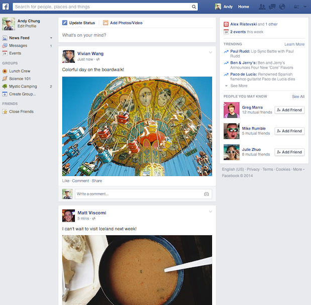
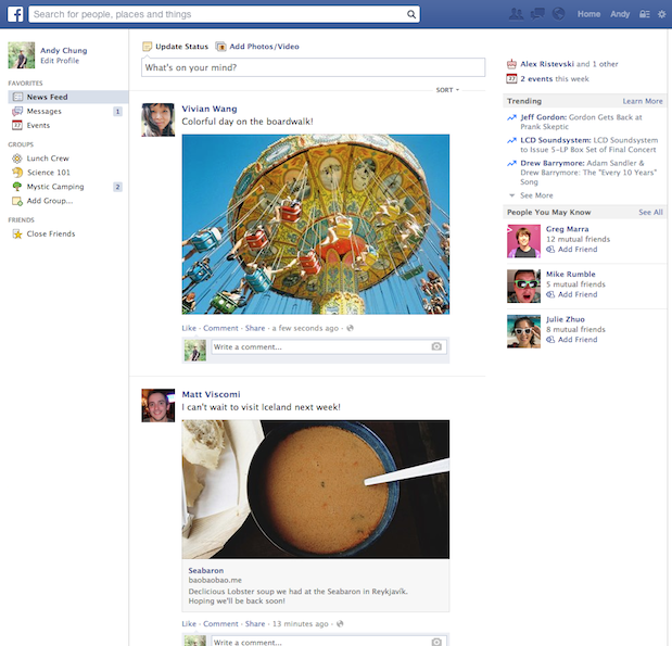
Above you'll see the old design (with mostly white) and the new design (with bits of gray). As Facebook suggests, "these changes are visual updates and do not affect how we surface content to people." Facebook also suggests that this change will not affect how stories are ranked in News Feed. Organic stories and ads, Facebook says, are the same size.
This change should not – on the surface – affect any marketer's aims with sizing, aspect ratios, and etcetera. In fact, it would seem that the only major changes – other than the over all impact of the design visually – are to the sizes of images and the new font.
Meanwhile there will be no changes to the mobile view of Facebook's app for the foreseeable future. Users in web browsers should see the redesign immediately if not soon – it's rolling out this week.