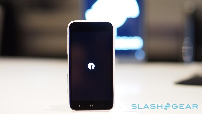
Facebook Home Review

Is your smartphone social? Facebook isn't convinced it is and so, in lieu of one true Facebook Phone, it wants to make over every Android smartphone in its image, courtesy of Facebook Home. The new launcher will start its spread on a select range of Android devices, as well as dedicated handsets like the HTC First, from April 12, but it demands a hefty commitment: gone is the usual, flexible Android homescreen, replaced by a new UI that puts sharing front and center. Walled garden or the place where social grows? Read on for the SlashGear review.
It's social, stupid
Home is a launcher and a partial skin, and it takes advantage of the flexibility baked into Android for third-party modification. Unlike iOS and Windows Phone, which have tight controls on UI, Android is set up to allow for different launchers: when you download it, you can choose to have it load just the once, or set it as your default, in which case it'll show up every time you hit the home button.

Arguably the easiest way to get Facebook Home will be to buy a handset with the launcher preloaded. Initially, that means just one device – the HTC First, which we've reviewed in full here – and one US network, AT&T, with the mid-tier First coming in at $100 with a new, two year agreement. Further partnerships with device manufacturers are in the pipeline, including Samsung and Sony among others.
A Facebook Home Program phone won't be the only way to get hold of the new launcher, however. In fact, those users are more than likely to be the minority; for those with a compatible existing phone, Facebook Home will be available as a free download through the Google Play market. The first crop of supported handsets includes the Samsung Galaxy S III, Galaxy S 4, and Note II, as well as the HTC One X, One X+, and One. Broader support will follow on in time, Facebook says.
Cover Feed
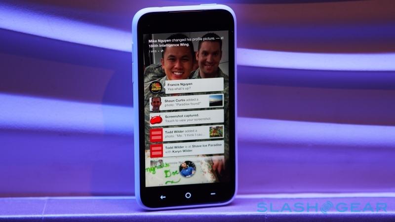
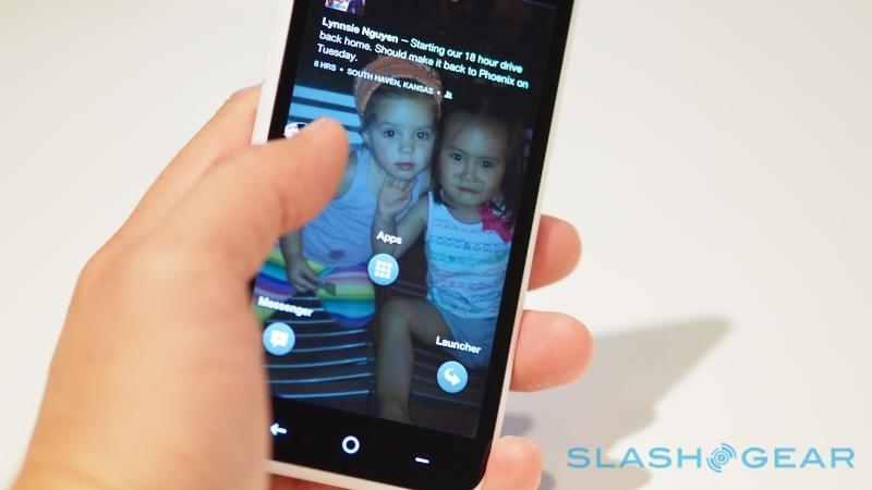
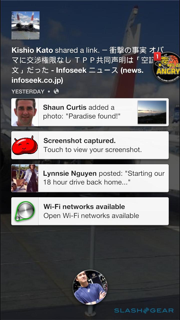
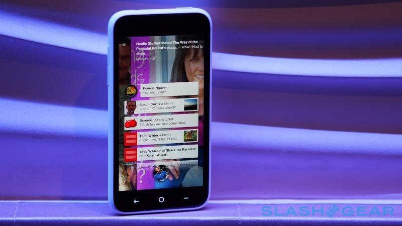
Facebook certainly gets its money's worth from Cover Feed: the social stream is both the lock screen and the homescreen for your device. At the bottom, in the center, is a single control – your profile photo in a small, circular bubble – which, if dragged, can be pulled across to launch the messenger, open the app launcher, or bring back your last-used app.

The bulk of the screen, though, is devoted to your Facebook friends. It's an edge-to-edge view of their latest status updates, photos, links, and Open Graph entries, cycling through the recent content with a splash of mild animation to keep things visually pleasing. Individual photos pan across the screen, behind the status text, name, date it was posted, and location, while there are also small buttons in the lower left corner for immediately liking the post or reading/adding comments.
Double-tapping a status update "Likes" it, while single-tapping opens the comments. Small text in the lower right shows how many likes and comments there are, together with a preview of who made them. Alternatively you can long-press on the photo, and it will zoom so that you can see the whole picture in one go.
It certainly looks impressive, as long as you have some photo-addicted friends. On the flip side, Facebook adjusts the resolution and number of new photos you see depending on whether you're using a mobile data or WiFi connection, to try to avoid hammering through your data allowance (you can also choose whether you want to see low, medium, or high image quality). Cover Feed is basically defined by who you're friends with and how exciting their lives are; if they post text-only status updates, all you'll see is an enlargement of their profile photo in the background.
Notifications
It also pays to have quite a few friends – though if you're considering a Facebook Home phone or even just the launcher, perhaps that's a given – since Home is quite an insular place. Too few and your Cover Feed will be relatively empty; on the flip side, however, with no way to filter out which groups of people feed the timeline, there's a frustrating lack of control over what you see day to day. This is particularly the case with notifications: on the HTC First, you get alerts for all apps and services, but if you're using Home on an existing handset, only Facebook notifications come through.

Either way, notifications bubble in as simple grey bars, with profile photos if they're of new status updates, messages, or Facebook check-ins, or app icons – such as email, phone or Instagram – if they're from elsewhere on your handset. You can tap them to open them, or swipe them away off the screen; long-pressing on one notification allows you to lasso multiple notifications and dismiss them simultaneously.
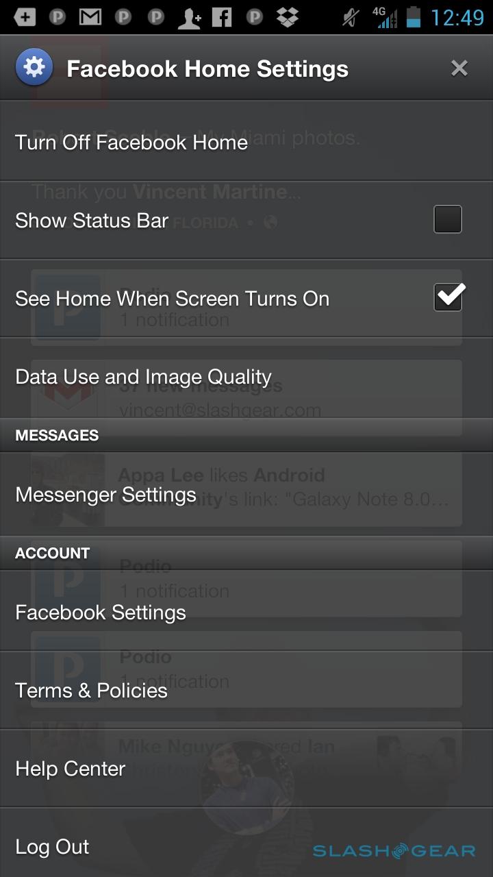
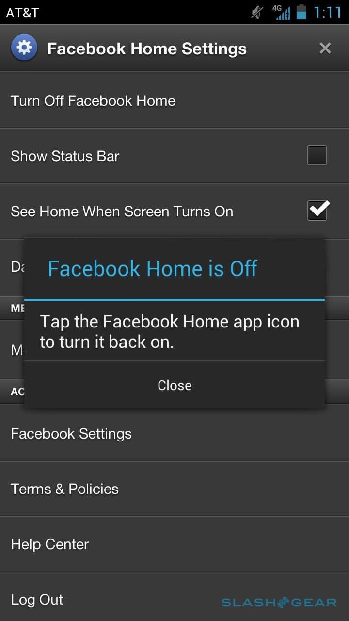
If you've got rid of them, though, you can call them back using the standard Android Jelly Bean notification bar, though it's hidden by default. A tap at the top of the Cover Feed screen makes it briefly visible – complete with the usual clock, network signal, battery status, and any notification icons – and then dragging it down opens it completely.

Again, as with Cover Feed, it all works well in the context of Facebook. Using Home on a device other than the First, however, hides a lot of Android's other glitz and features, not least any support for homescreen widgets. In fact, they're completely absent from Home.
Chat Heads and Messenger
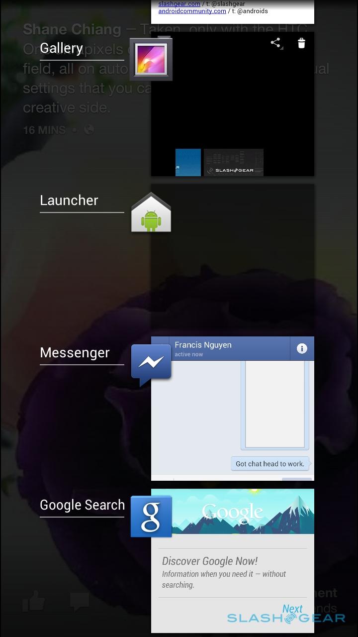
Passively consuming photos and links isn't the only aspect of Facebook Home: instant messaging is also heavily integrated into not only the launch, but the Android system as a whole. New messages pop up as circular bubbles showing either the user's profile photo or, in the case of group messages, a collage of those photos. By default, they bubble into view in the upper right corner, clustering across the screen as they stack up, but each can be dragged around (or, with a long-press and a lasso gesture, multiple Chat Heads can be grabbed) and either pushed to other areas of the screen or dismissed altogether.

That's important, as Chat Heads permeate all through the OS, appearing on top of whatever app you're using – Facebook or otherwise. It soon becomes second nature to snatch one up with your thumb and either open it or flick it away; however, you can also flick it to the side of the screen, where – after a little bounce – it will cling.
Tap to open it, and you get the usual Facebook messenger window on top of whatever you were looking at before, whether that be the Cover Feed homescreen, the Android browser, a game, or something else. You can also call up a Chat Head yourself, by long-pressing a person in the regular messenger list, and choosing to pop them out as a bubble.

Chat Heads works well, though again there's a walled garden effect that will frustrate anybody who isn't entirely committed to Facebook for their messaging needs. The latest iteration of the Facebook messenger app pulls in SMS text messages, but it doesn't support Google Talk or other IM systems, and so the overall usefulness of Chat Heads is diluted.
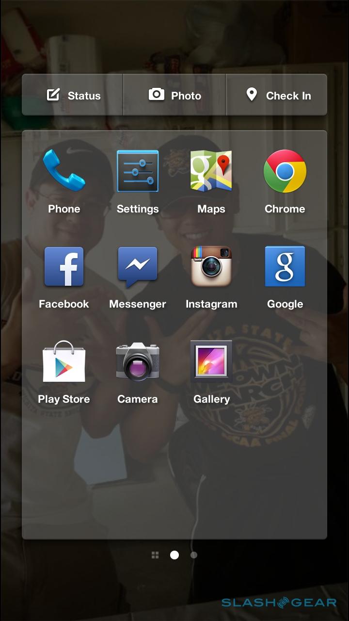
App Launcher (and everything else)
Facebook Home may be all about Facebook, but the social company does at least recognize that Android users are likely to want to access other apps. For that, there's the app launcher, a quick-launch hub from which you can jump to your most commonly used software.
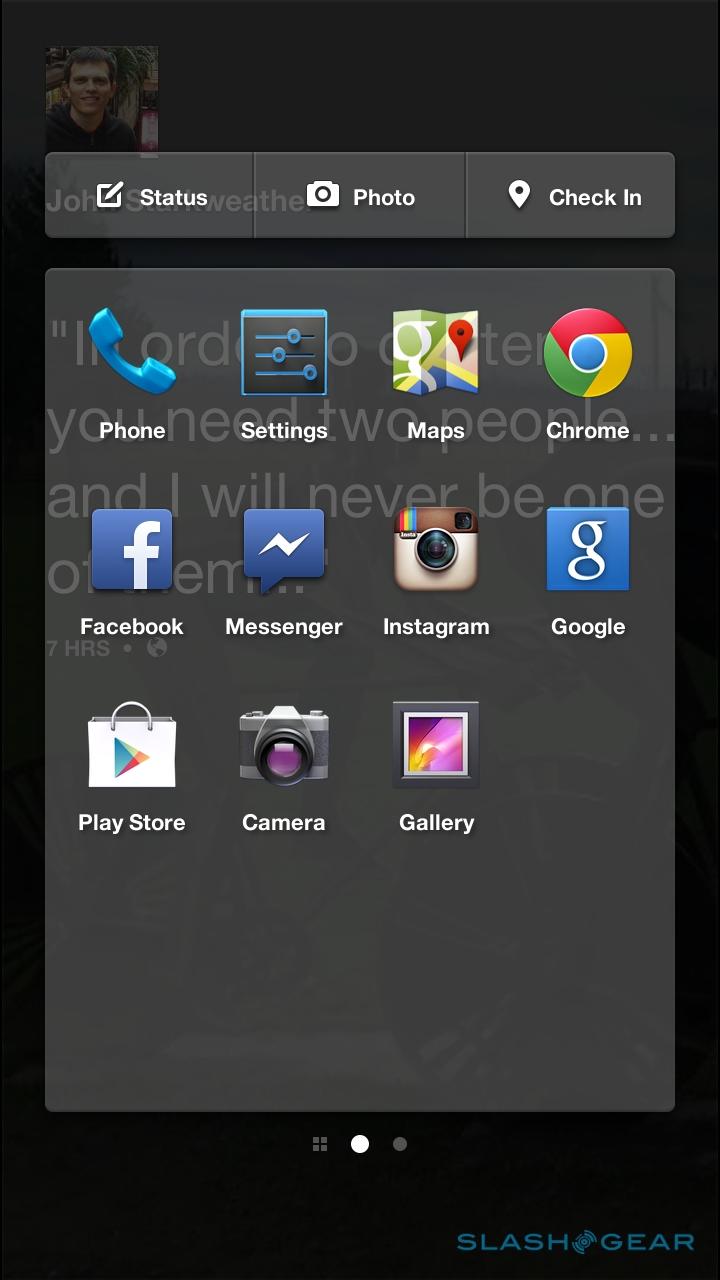
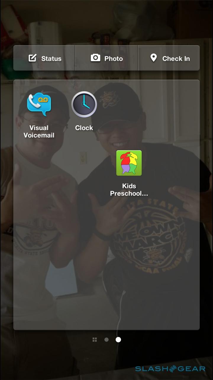
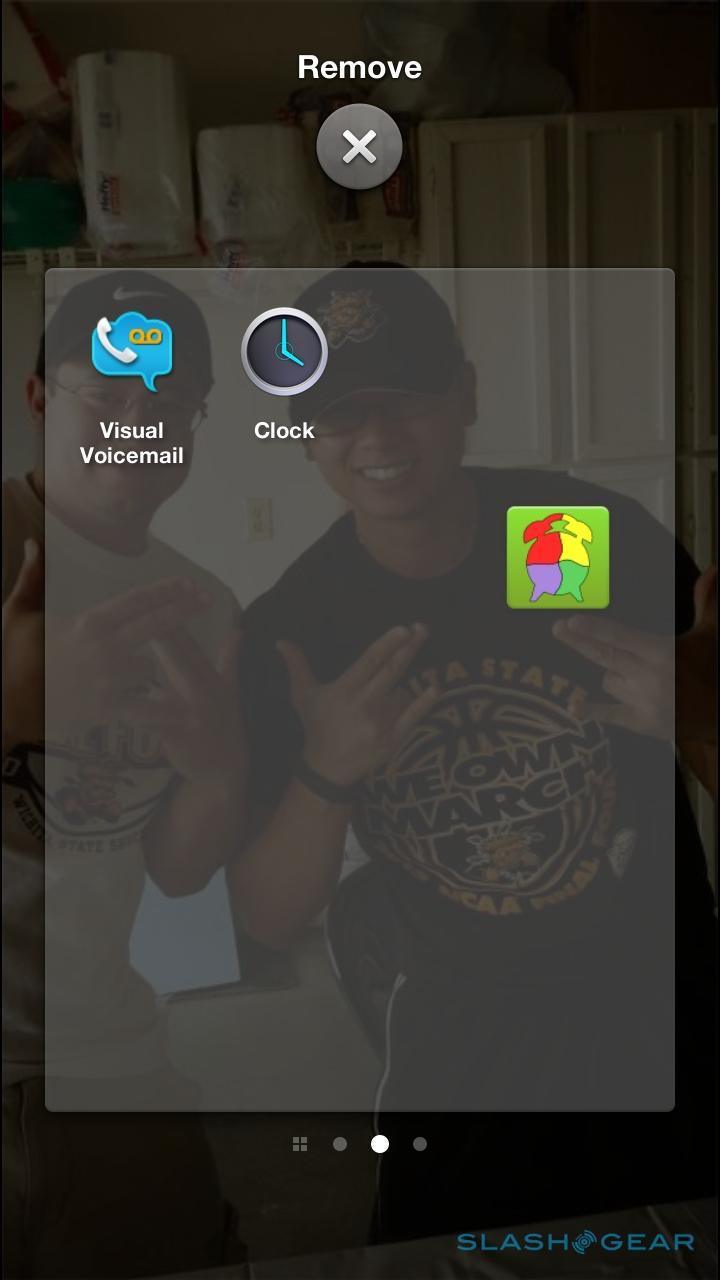
Drag the profile picture on the homescreen up, and the app launcher pane loads, a 4x4 grid of shortcuts that can be dragged and reorganized at will. Above it, there are buttons to post a new Facebook status message, a photo, or to check-in at your current location. Multiple pages of apps are supported, and you can drag new icons in by swiping to the left to open up the full app drawer and then bring them over to the main launcher pane.
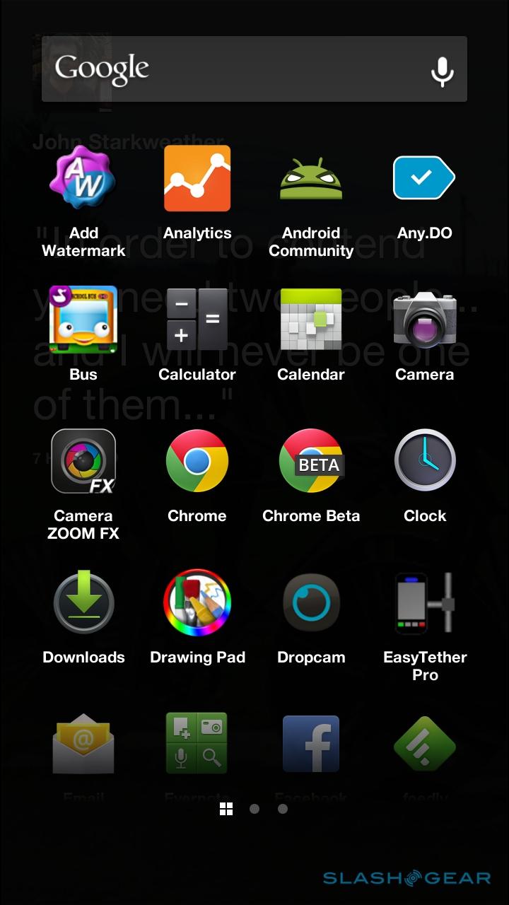
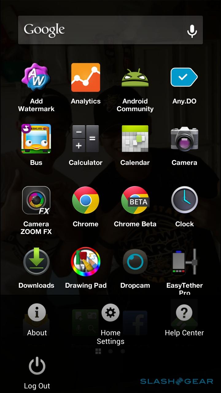

The app drawer also has a Google search bar at the top of the screen, but that's the only widget-style action you'll get. There's no support for any native Android or third-party widgets, and no way of accessing the regular Android homescreen, since Facebook Home replaces it completely. You do still get Google Now access, however, with a long-press on the home button calling it up; a double-tap opens the Android app switcher.
Wrap-Up
On the one hand, you can see the argument for Facebook Home. The social network is hugely popular, and there's no shortage of people who check in on the latest updates multiple times a day. It's become a way for old school friends to rediscover each other, family members to share the latest events in their lives, and for colleagues to collaborate more casually with services like messenger.

Nonetheless, in its first iteration, Facebook Home doesn't quite hit the spot. It feels like it should have been a beta; indeed, Facebook was keen to point out at its launch event that it's definitely a work-in-progress. The problem is, Facebook hasn't taken baby steps: it wants to be your new Android homescreen, and anything from third-parties is basically lost or hidden in the process.
Factor in things like the complete lack of support for widgets and the inability to tailor who gets included in Cover Feed, and Facebook Home stumbles out of the gate. As a result, it's difficult to recommend it to anybody other than those solely committed to Facebook (and even those most fervent users of the site were mixed when we showed them Facebook Home and explained what it offered), and if you're also a Twitter user, or a Google+ user, or rely on other messaging apps like WhatsApp, LINE, or others, for every advantage Facebook Home provides, there's a compromise to be made elsewhere.