You can now try out YouTube's new look for yourself
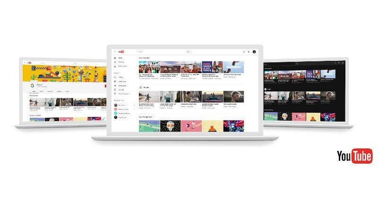
It wasn't too long ago that word of a "dark mode" for YouTube broke out. While it was technically possible to try it out before it launched, the process was a bit too involved. The new dark mode hasn't exactly formally launched yet, but YouTube is now soliciting public feedback for it. Which means you can now easily test out the upcoming changes to YouTube's design, which, it turns out, also includes a new non-dark theme.
What's the deal with dark anyway? For one, it reduces glare when staring at a screen for a long time, which is what you usually do on YouTube. For another, it puts the content into focus and makes them visually pop out.

But far be it for YouTube to make that the only new thing in its design revamp. It has, finally, switched over to adopting Material Design guidelines. Launched way back in 2014, along with Android 5.0 Lollipop, Material Design was supposed to be Google's overarching design language not just for Android but for all its products, including websites and services. Three years later, YouTube, one of Google's biggest properties, is finally getting into the game.
The primary material design is, however, not so dark. And unlike the materia design you might be used to on your Android phone, YouTube uses bold colors very sparingly. In fact, you could call it a rather flat and uber minimalistic design. It is, however, promised to be fast, because content is king and UI should get out of the way as quickly as possible.To that end, it uses Google's own Polymer framework that allows for quick website creation using Material Design elements.

To get a whiff of this new YouTube, you can simply head over to youtube.com/new and click on "Try it now". In case you don't like what you see, you can easily switch back to the classic from your settings. That is, at least until YouTube makes this the one and only look.
SOURCE: YouTube