Twitter splays out heat maps with geotagged Tweets
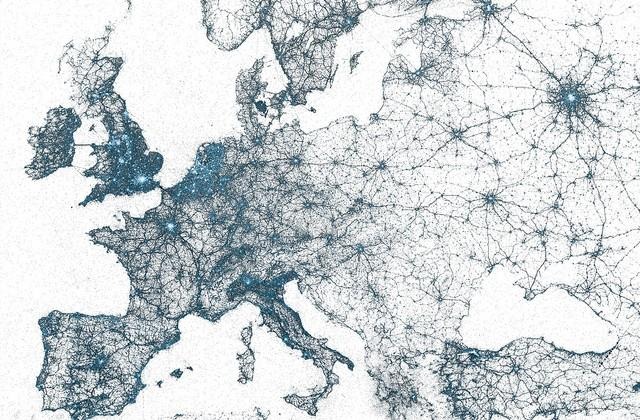
We've seen heat maps from Foursquare before, but we haven't seen anything from Twitter in a while. However, the micro-blogging service showed off a handful of heat maps today that map out all geotagged Tweets that make the maps look like a blue-and-white blotch of paint that spilled onto a canvas.
The maps are of Europe, as well as populous cities like New York, Tokyo, and Istanbul. What's perhaps most impressive is that the maps are only comprised of small blue dots for each Tweet, meaning that all those Tweets merely outline the city by themselves, and you can clearly make out roads and coastlines.
The maps incorporate every geotagged Tweet since 2009, which Twitter says are in the obvious "billions," with every dot representing a Tweet, the more Tweets there are, the brighter the blue is. The maps are really neat to look at, and they give you a sense at just how many Tweets have been sent over the last five years or so.

Twitter has a ton more of these heat maps on their Flickr page, including cities like Sydney, Boston, Seoul, Seattle, San Francisco, and Moscow, as well as the entire US and all of Puerto Rico, which are perhaps even more impressive. If you live in one of these big cities, be sure to check it out, because it's always fun to see your hometown lit up by Tweets.