Twitch drops a big redesign as TwitchCon 2019 draws near
On the eve of TwitchCon 2019, Twitch has rolled out a new design for its website. This brand refresh of sorts doesn't make a ton of drastic changes to the way Twitch looks, but those who are visiting the site today will definitely notice some differences from the Twitch they're used to.
Perhaps the most noticeable changes are found in Twitch's video player and chat. When you visit a streamer's page, you'll see that the video player now stretches edge-to-edge, taking up more of the webpage. Of course, the video player doesn't go completely edge-to-edge, as there still needs to be room for the followed channels listing on the left and Twitch chat on the right, but it definitely takes up more space in the video panel than it did before.

Speaking of Twitch chat, that's also undergone some changes. Twitch chat uses a new font called Roobert, which Twitch says is "modeled off the retro Moog synthesizer logotype." The font change is present across Twitch as a whole, but it's most noticeable when viewing Twitch chat. Thankfully, emotes haven't been changed at all, though Twitch says cryptically says that we'll be seeing more of them from here on out.

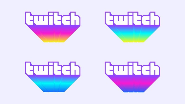
On top of all this, the Twitch logo and color palette have been updated as well. Purple is still the dominant color in Twitch's branding, but it's being joined by two dozen additional colors that are named after gaming and pop culture characters – Twitch calls specific attention to colors like Black Ops, Pika Pika, and DK. Twitch's dark mode theme has also been updated, with the company saying that this will allow it to "easily build additional accessibility features," in the future.

Judging from the reaction of Twitch users in various chats so far, the redesign seems to be getting mixed reviews, but as a frequent Twitch user myself, I think it looks pretty good. You can check it out for yourself by heading over to Twitch and dropping in a stream, as the redesign is now live across the entire site.