This is Android M: what has changed so far
Google has just released preview images of Android M, so naturally everyone tries to get their hands on the latest and would be greatest Android version, regardless of being in a stable state or not. And although this super early version is not yet in its final state, or even in its semi-final state, it is already showing some promise, some interesting changes, and even some rather strange ones. So buckle up while we take a cursory look at some of those changes to Android right now.App Launcher Style
Perhaps the most visible change that will greet you once you start up Android M isn't just the wallpaper, it's the app launcher. All though it is technically still Google Now Launcher, the list of apps itself has been revamped. Instead of app icons arranged in a grid and grouped into pages, the app list is now arrange in, well, a list.
There is only a single page, if you could still call it that, that flows vertically. Apps are still represented by icons with their names underneath, but now they are grouped alphabetically, with the initial letters on the left side. The four most recently used apps sit on a row of its own at the top of the list. The widgets list has also been revamped, now also in a vertical list and grouped according to their app.
One difference is that each group flows horizontally in case there are too many widgets of its kind to fit.
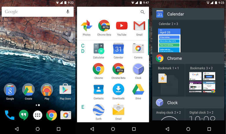
This change is both refreshing considering Android's default launcher hasn't changed much in the past years, but it is also somewhat jarring for those used to old conventions. This might be one of those changes that will continue to change over time.
Memory Usage
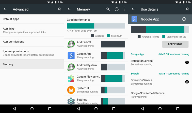
Battery usage, storage usage. Android already showed those, but for Android M, Google has added a new performance monitor: RAM. Now you can also monitor the memory usage per app, both in how much the use up on average as well as their maximum usage.
While majority of users might not see this metric, hidden behind the Advanced option of the Apps settings, power users will most definitely appreciate the added insight.
App Permissions
Google already announced that Android M would have fine-grained control over which permissions an app gets to use. And now we can see it in action. Like App Ops before, users can drill down into each app to toggle individual permissions on or off.
The one caveat at the moment is not all apps, have been built with this feature in mind. Some permissions will warn you when you try to turn it off that it could potentially break the app's functionality. though you can still continue with the action despite the warning.
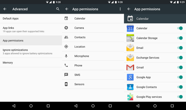
Installing a new app doesn't yet show that same control though we expect those to show up slowly after Android M's actual launch.
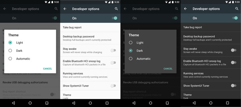
Light and Dark Settings theme
This one is purely aesthetic, though some might find one or the other an improvement on the eyes. Material Design on Android Lollipop enforced a light theme, particularly on the Settings app.
In the Developer options of Android M, however, you have the option to switch to a darker one. That said, only the Settings app really follows this, so it's kinda moot anywhere else.
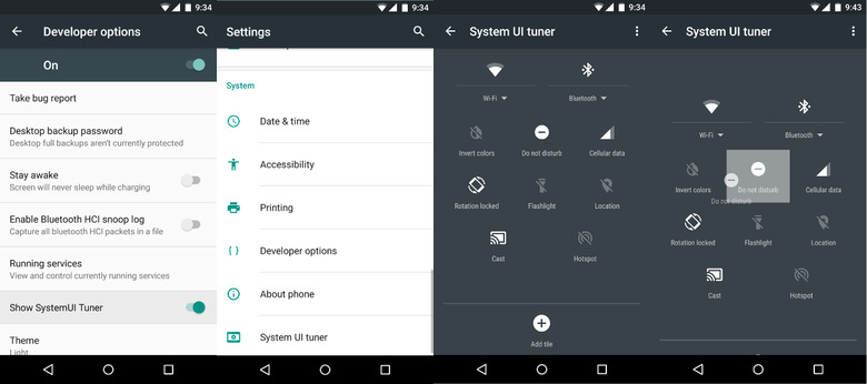
Quick Settings customization
Finally! Android implements what OEMs and ROMs have for ages. The Developer Option has an almost nondescript "Show SystemUI Tuner" that, once enabled, adds a SystemUI Tuner setting to the main Settings list. Inside this section, there is one lone entry: Quick Settings. Here you can move, remove, or add to the Quick Settings panel.
Granted, there isn't much to customize in the first place, but at least you have the freedom to do so. Hopefully there will be more coming in the months ahead. And hopefully, it won't be the only SystemUI that can be tuned.
Wrap-up
None of these features are set in stone, and some might even disappear quickly if the prove to be quite unpopular. Some, however, like the memory stats and SystemUI tuner, are bound to be highly appreciated, and Google would probably get no small amount of flak if they didn't make it to the final release.