This iPhone 8 "preview" will give you goosebumps
Both iPhone and Android phone users will get a kick out of the navigation for the iPhone 8 we've got here today. Straight from the imagination of the creator known as Andrea Cau comes this presentation of elements. Elements that'll work just fine when it comes to an iPhone 8 with a display that moves the home button completely out of sight.
This piece of work moves through quite a bit in a very short amount of time. It includes the homescreen, the lockscreen, and apps, showing how each of these major parts of the iPhone 8's software ecosystem will function. Primary to the concerns of this creator is the location and functionality of the home button – a home button he believes will still sit below the display in the same general location as previous iPhone devices.
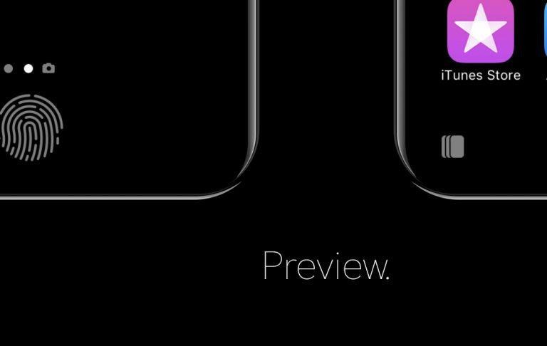
Each of the several main screens shown here include a number of basic elements that remain in play. The home button turns into a long pill shape, which can be used to "tap to home". It's at this point that I wish the UI would move just a BIT further away from the edge – especially if we're talking about a button.
Up top, the Wi-Fi and mobile connection, time, Bluetooth indicator, and battery level are all right where they should be. Particularly interesting here is how the mobile level icon tapers off to the left, allowing it to reflect the shape of the corner of the display. Like the icon were designed for this space, instead of independent of the device.
Also take note of the lack of navigation bars, and the graphic transition between lockscreen Touch ID icon and active home button.
Perhaps the best part of this conceptual work of design is its professional presentation. Graphics glide in and out, everything is presented in a friendly fashion, and Andrea Cau does a final execution in the Apple style that's so good it's almost spooky. Placement of elements in this UI come in part thanks to the Scott Hurff study on "how to design for thumbs in the Era of Huge Screens."