The Subjectivity of Natural Scrolling
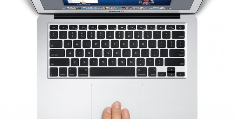
Apple released its new OS X Lion for Mac computers recently, and there was one controversial change that had the technorati chatting nonstop. In the new Lion OS, Apple changed the direction of scrolling. I use a MacBook Pro (among other machines, I'm OS agnostic). On my MacBook, I scroll by placing two fingers on the trackpad and moving them up or down. On the old system, moving my fingers down meant the object on the screen moved up. My fingers are controlling the scroll bars. Moving down means I am pulling the scroll bars down, revealing more of the page below what is visible. So, the object moves upwards. On the new system, moving my fingers down meant the object on screen moves down. My fingers are now controlling the object. If I want the object to move up, and reveal more of what is beneath, I move my fingers up, and content rises on screen.
The scroll bars are still there, but Apple has, by default, hidden them in many apps. You can make them reappear by hunting through the settings menu and turning them back on, but when they do come back, they are much thinner than they used to be, without the arrows at the top and bottom. They are also a bit buggy at the moment. If I try to click and drag the scrolling indicator, the page often jumps around, as if I had missed and clicked on the empty space above or below the scroll bar instead of directly on it. This doesn't always happen, but it happens often enough that I have trained myself to avoid using the scroll bars this way.

So, the scroll bars, for now, are simply a visual indicator of where my view is located on a long or wide page. Clearly Apple does not think this information is terribly important, or else scroll bars would be turned on by default. As with the scroll bars, you can also hunt through the settings menu to turn off the new, so-called "natural scrolling." This will bring you back to the method preferred on older Apple OSes, and also on Windows machines.
Some disclosure: my day job is working for Samsung. We make Windows computers that compete with Macs. I work in the phones division, but my work machine is a Samsung laptop running Windows. My MacBook is a holdover from my days as a tech journalist. When you become a tech journalist, you are issued a MacBook by force and stripped of whatever you were using before.
[aquote]Natural scrolling will seem familiar to those of you not frozen in an iceberg since World War II[/aquote]
I am not criticizing or endorsing Apple's new natural scrolling in this column. In fact, in my own usage, there are times when I like it, and times when I don't. Those emotions are usually found in direct proportion to the amount of NyQuil I took the night before and how hot it was outside when I walked my dog. I have found no other correlation.
The new natural scrolling method will probably seem familiar to those of you not frozen in an iceberg since World War II. It is the same direction you use for scrolling on most touchscreen phones, and most tablets. Not all, of course. Some phones and tablets still use styli, and these phone often let you scroll by dragging scroll bars with the pointer. But if you have an Android or an iPhone or a Windows Phone, you're familiar with the new method.
My real interest here is to examine how the user is placed in the conversation between your fingers and the object on screen. I have heard the argument that the new method tries, and perhaps fails, to emulate the touchscreen experience by manipulating objects as if they were physical. On touchscreen phones, this is certainly the case. When we touch something on screen, like an icon or a list, we expect it to react in a physical way. When I drag my finger to the right, I want the object beneath to move with my finger, just as a piece of paper would move with my finger when I drag it.
This argument postulates a problem with Apple's natural scrolling because of the literal distance between your fingers and the objects on screen. Also, the angle has changed. The plane of your hands and the surface on which they rest are at an oblique angle of more than 90 degrees from the screen and the object at hand.
Think of a magic wand. When you wave a magic wand with the tip facing out before you, do you imagine the spell shooting forth parallel to the ground, or do you imagine the spell shooting directly upward? In our imagination, we do want a direct correlation between the position of our hands and the reaction on screen, this is true. However, is this what we were getting before? Not really.

The difference between classic scrolling and 'natural' scrolling seems to be the difference between manipulating a concept and manipulating an object. Scroll bars are not real, or at least they do not correspond to any real thing that we would experience in the physical world. When you read a tabloid, you do not scroll down to see the rest of the story. You move your eyes. If the paper will not fit comfortably in your hands, you fold it. But scrolling is not like folding. It is smoother. It is continuous. Folding is a way of breaking the object into two conceptual halves. Ask a print newspaper reporter (and I will refrain from old media mockery here) about the part of the story that falls "beneath the fold." That part better not be as important as the top half, because it may never get read.
Natural scrolling correlates more strongly to moving an actual object. It is like reading a newspaper on a table. Some of the newspaper may extend over the edge of the table and bend downward, making it unreadable. When you want to read it, you move the paper upward. In the same way, when you want to read more of the NYTimes.com site, you move your fingers upward.
[aquote]Is it better to create objects on screen that appropriate the form of their physical world counterparts?[/aquote]
The argument should not be over whether one is more natural than the other. Let us not forget that we are using an electronic machine. This is not a natural object. The content onscreen is only real insofar as pixels light up and are arranged into a recognizable pattern. Those words are not real, they are the absence of light, in varying degrees if you have anti-aliasing cranked up, around recognizable patterns that our eyes and brain interpret as letters and words.
The argument should be over which is the more successful design for a laptop or desktop operating system. Is it better to create objects on screen that appropriate the form of their physical world counterparts? Should a page in Microsoft Word look like a piece of paper? Should an icon for a hard disk drive look like a hard disk? What percentage of people using a computer have actually seen a hard disk drive? What if your new ultraportable laptop uses a set of interconnected solid state memory chips instead? Does the drive icon still look like a drive?
Or is it better to create objects on screen that do not hew to the physical world? Certainly their form should suggest their function in order to be intuitive and useful, but they do not have to be photorealistic interpretations. They can suggest function through a more abstract image, or simply by their placement and arrangement.
[aquote]How should we represent a Web browser, a feature that has no counterpart in real life?[/aquote]
In the former system, the computer interface becomes a part of the users world. The interface tries to fit in with symbols that are already familiar. I know what a printer looks like, so when I want to set up my new printer, I find the picture of the printer and I click on it. My email icon is a stamp. My music player icon is a CD. Wait, where did my CD go? I can't find my CD?! What happened to my music!?!? Oh, there it is. Now it's just a circle with a musical note. I guess that makes sense, since I hardly use CDs any more.
In the latter system, the user becomes part of the interface. I have to learn the language of the interface design. This may sound like it is automatically more difficult than the former method of photorealism, but that may not be true. After all, when I want to change the brightness of my display, will my instinct really be to search for a picture of a cog and gears? And how should we represent a Web browser, a feature that has no counterpart in real life? Are we wasting processing power and time trying to create objects that look three dimensional on a two dimensional screen in a 2D space?
I think the photorealistic approach, and Apple's new natural scrolling, may be the more personal way to design an interface. Apple is clearly thinking of the intimate relationship between the user and the objects that we touch. It is literally a sensual relationship, in that we use a variety of our senses. We touch. We listen. We see.
But perhaps I do not need, nor do I want, to have this relationship with my work computer. I carry my phone with me everywhere. I keep my tablet very close to me when I am using it. With my laptop, I keep some distance. I am productive. We have a lot to get done.