Taylor Swift's Reputation album cover is a meme nightmare
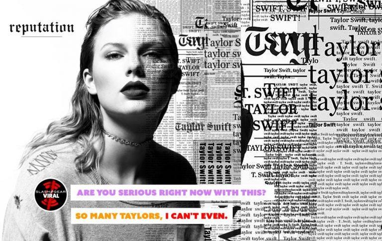
Today the new album from Taylor Swift, "Reputation", was revealed with cover design that encapsulates the era. The era of bad graphics, the era of album covers made to be shared with social networks, the inevitable worst age. When Taylor Swift is in the Seventh House, And Kanye aligns with Kasabian, Then social media will guide the organizational hierarchy, And "anyone could do this though" typography will steer the graphics. This is the dawning of the age of memes as album art.
Taylor Swift's social media presence disappeared over the past few days only to be replaced by a graphic of a snake and a video of a snake. Simple, strange, and effective. Today the snakes were followed up by a series of images which teased the coming of her next single and full album – and finally her album cover art. Graphic Designer Dlyan Lathrop summed up the design of Taylor Swift's "reputation" album cover soundly in a Tweet:
TAYLOR SWIFT
Swift
Swift
Swift
Taylor Swift Taylor Swift Taylor Swift
TAY
LOR
TAYLOR SWIFT
TAYLOR SWIFT
TAYLOR SWIFT
that ought to do it
— One Sip And Wooooo (@DylanLathrop) August 23, 2017
The cover of this album was crafted by designers/artists Mert Alas and Marcus Piggot, aka Mert & Marcus. They're known for their fashion work – covers of Vogue, Interview, W, and campaigns for Calvin Klein Jeans, Givenchy, and Versace. They've done better work than this – much better work.

I saw this cover today and realized it wasn't alone in its seemingly intentional badness. I'd seen other album covers recently that were also pretty much terrible – probably on purpose. As it turned out, I wasn't alone in this realization – I was just a little late.
I happened upon an article by the name of "Have we entered the era of bad graphic design?" This article was published by Creative Bloq and written by Sammy Maine back in May of this year. In that article, they interviewed several designers of albums that fit the meme bill. Several of the albums included in this bunch are posted below.

"The internet is the mega force driving the music industry right now," said graphic designer Marwan Kaabour. "Album art exists in the digital realm, usually at a small scale. It needs to look good both as a tiny thumbnail in the iTunes store and on a massive billboard somewhere."

Size has been a major factor in album art design for decades. The golden age of the vinyl album was replaced by the 8-track, the tape, and the CD, and big-format album design suffered. But those that adapted to the varied formats made covers that remain iconic today. They weren't intentionally bad – and they didn't all come before the internet was established.

Take Guns N' Roses "Appetite for Destruction" for example. Two covers – no, three covers – right from the start. They've taken the time to create a set of graphics that are entirely unique, and worthy of decades of inspired reactions and parodies aplenty. Here in these designs are type that's thoughtfully selected and placed. Here in these designs are a set of images which do not suffer as a result of their formatting.

"Social media – and the need for album art to be shareable, 'memeable' and likeable – is definitely another factor," said Kaabour. "The meme is staple in the visual language of now – you can't deny it," said Adult Art Club art director Jonny Costello, "and they have the potential to be spread like wildfire."

Taylor Swift's album cover could have done a lot more visually if it had less to work with. Or – consider an album cover just like this, but the text isn't plopped on top of the photo. Instead, imagine the newspaper-like arrangement of the names are actually printed on a full-size newspaper. Imagine that newspaper is used to implement a far less "I made this in 20 minutes" look.
The music is probably still top-level pop, and Taylor Swift won't be any worse off for the cover art. Her music and image are far too massive to be kicked down in the short run by a less-than-stellar album cover. But it could have been so much more. Of course, with a legacy of album covers that's mostly fanciful wisps of light around a signature, any design that goes a different direction must look better.

*1989 is the exception to the rule. That's the best Taylor Swift album cover so far. It's instantly recognizable and it's been blasted on so many surfaces that it's difficult to see a Polaroid of a torso without being reminded that it looks like this album graphic.

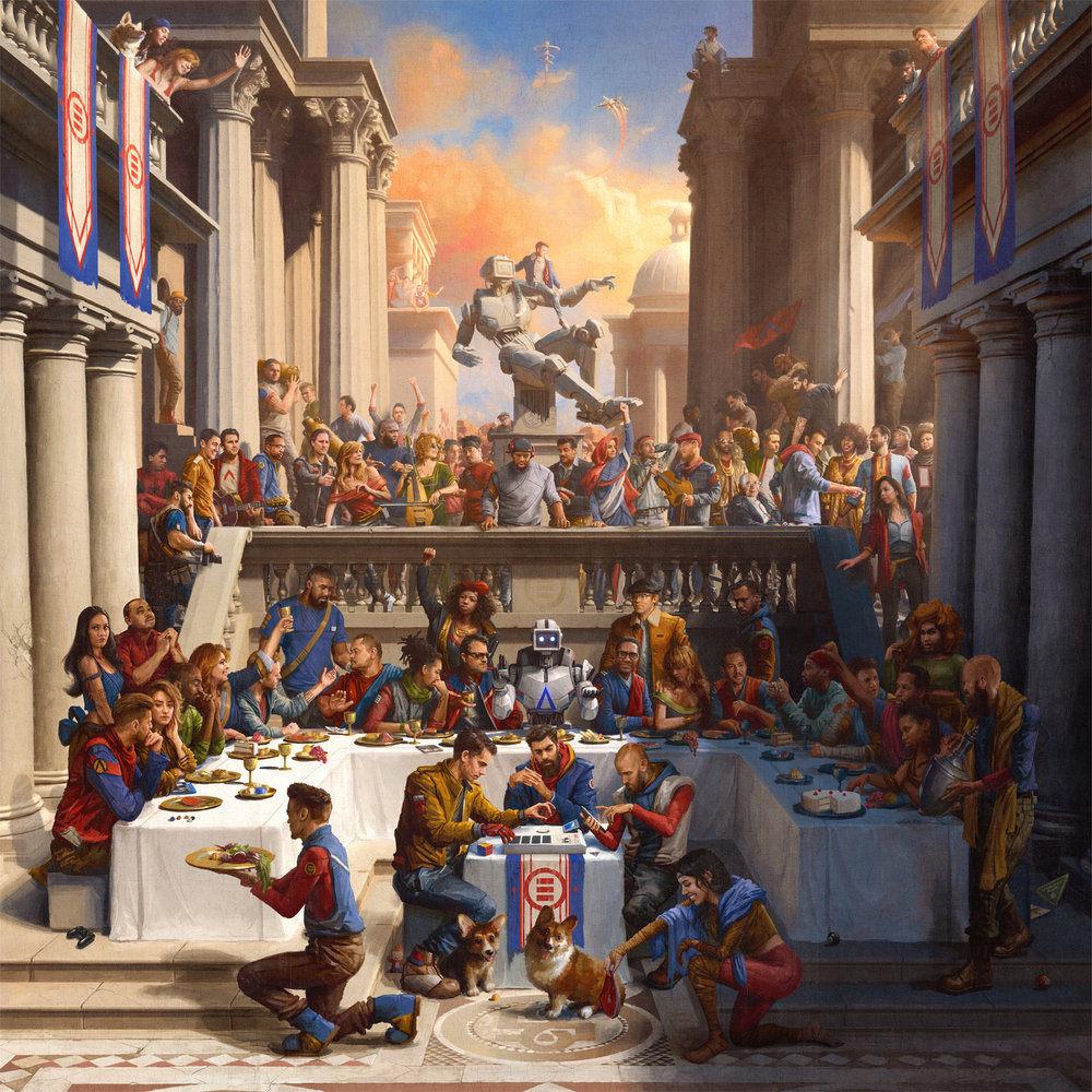
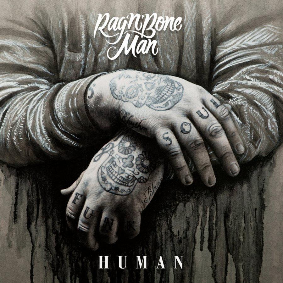
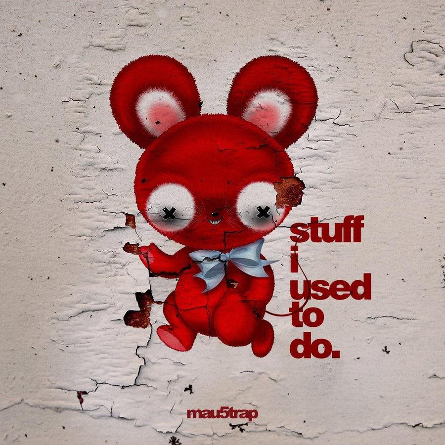
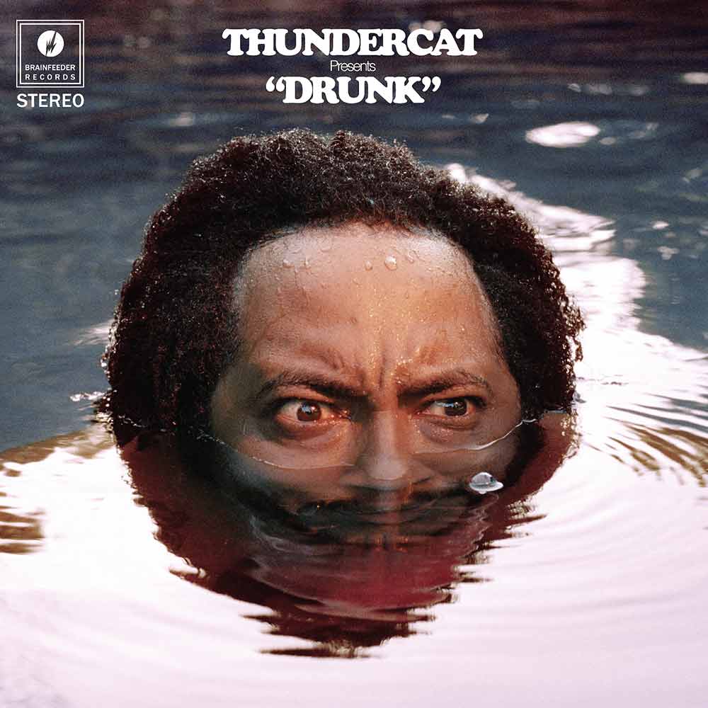
For the rest of the music graphics world, I'd like to be clear: not all album art in the year 2017 looks hastily implemented. Have a peek at the tiny gallery below to see some 2017 albums with covers that were crafted to succeed in our modern world without regressing to "Graphic Design: Fundamentals of Type" class (and failing).


Let me know on Twitter how you feel about these album covers and those posted above. I'd love to hear why Taylor Swift's album cover rings any sorts of positive bells from your perspective.