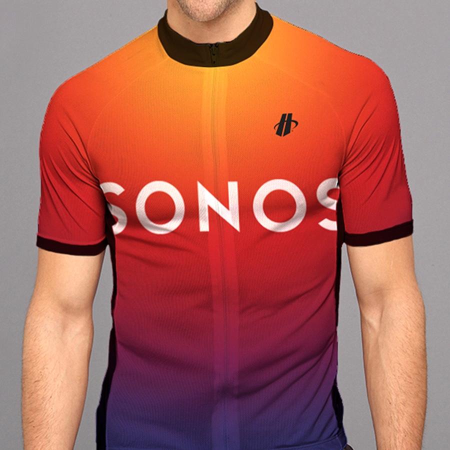
SONOS identity remixed by Bruce Mau Design for sound blasting
Graphic design group Bruce Mau Design have been commissioned to recreate the Sonos brand. Not just the logo – they've decided to keep that largely the same, after all – but the whole look and feel of the way Sonos projects itself. Instead of changing the way the letters in the Sonos logo are arranged, flipping up the font or putting speakers inside the letters, like chumps, they've decided to be smart. Instead of all that, the Bruce Mau Design team have "determined that we needed to push harder to signal Sonos' leadership, relevance, and dedication to the music experience."
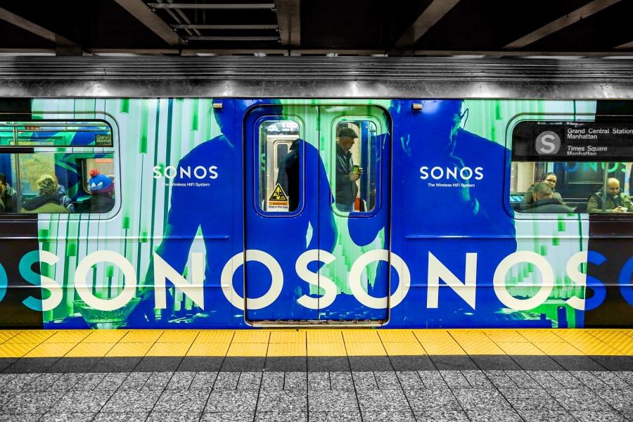
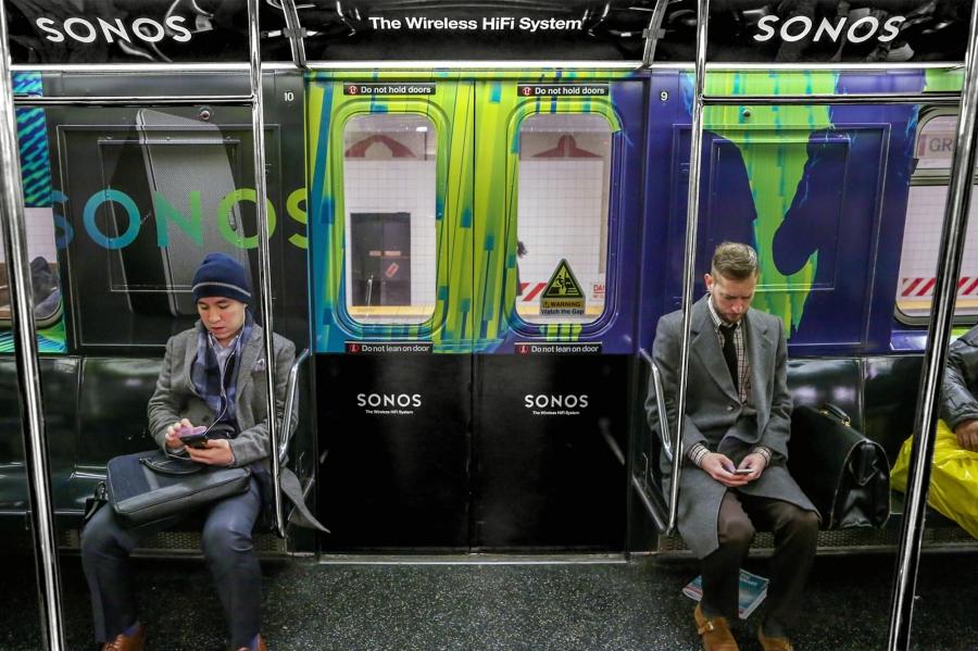
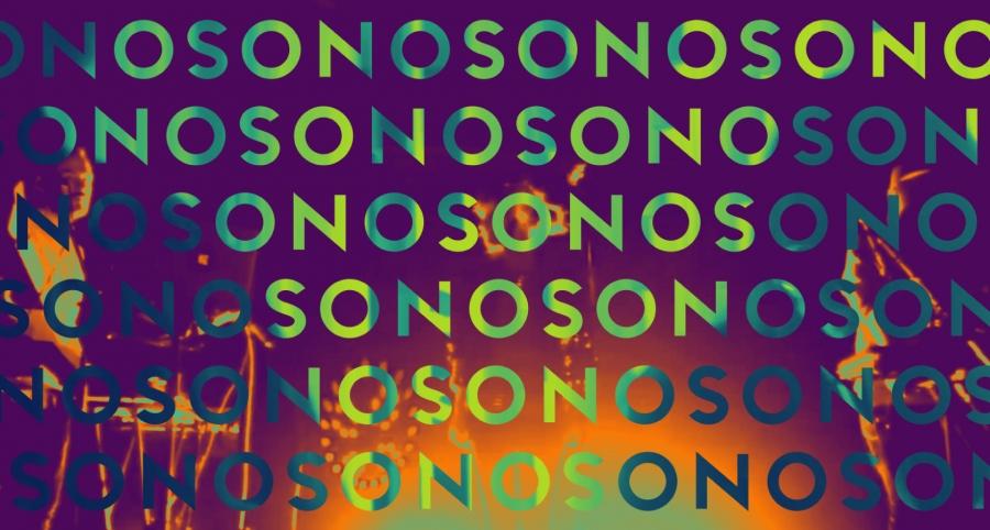
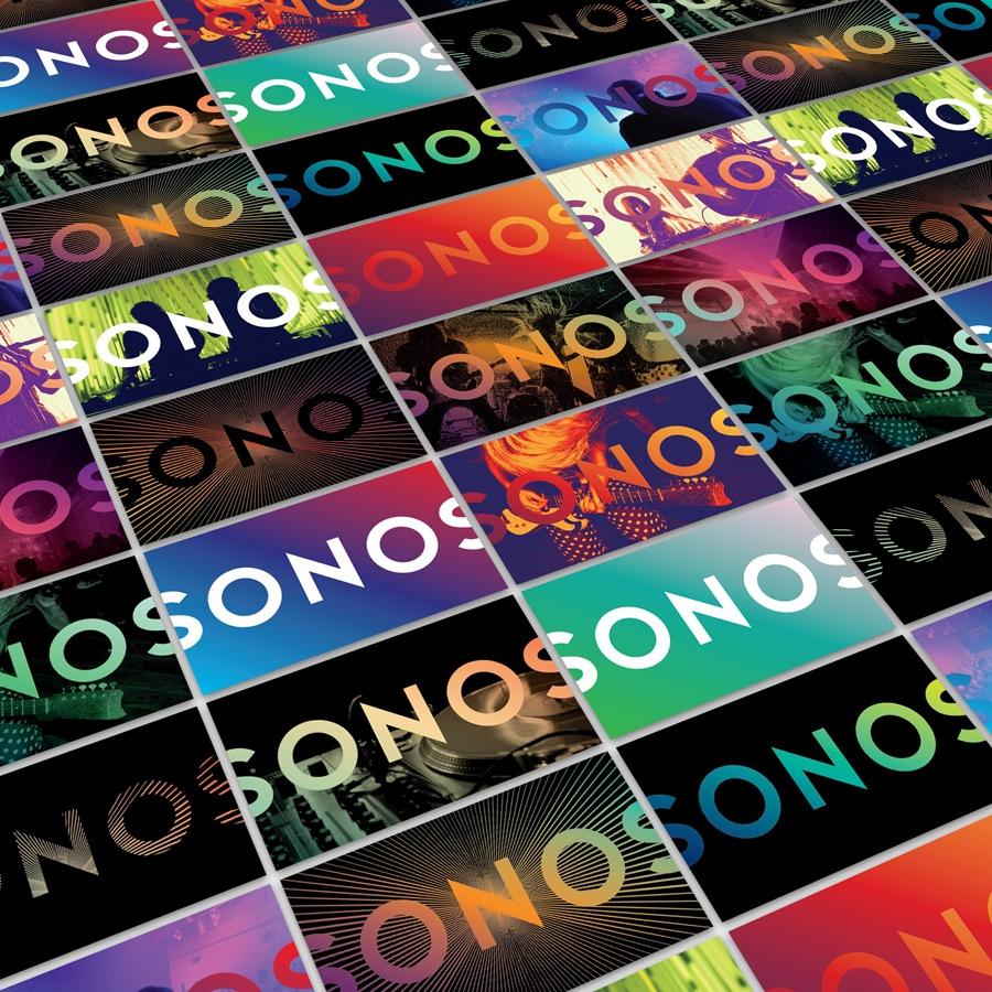
One very striking way in which the team have done this is to incorporate very closely aligned colors. Above you'll see a moiré pattern creating a moiré effect.
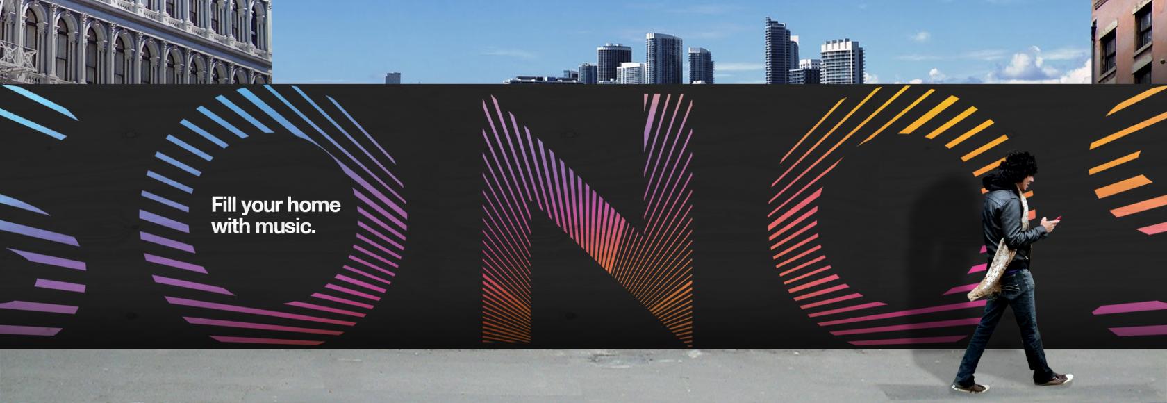
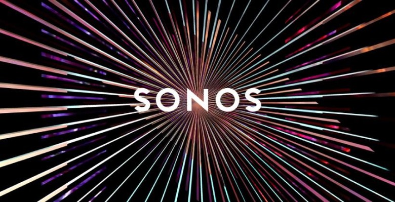
Movement without animation.
Music without audio.

Though Bruce Mau Design doesn't go into specific detail about their incorporation of this "blast" design, they use it several times throughout their new collection of Sonos brand treatments. It's evident here that it's meant to express sound.

"This new iteration of the Sonos visual identity advances the idea of the modern music experience – not singular or monolithic but a rich diversity of expressions." – Bruce Mau Design

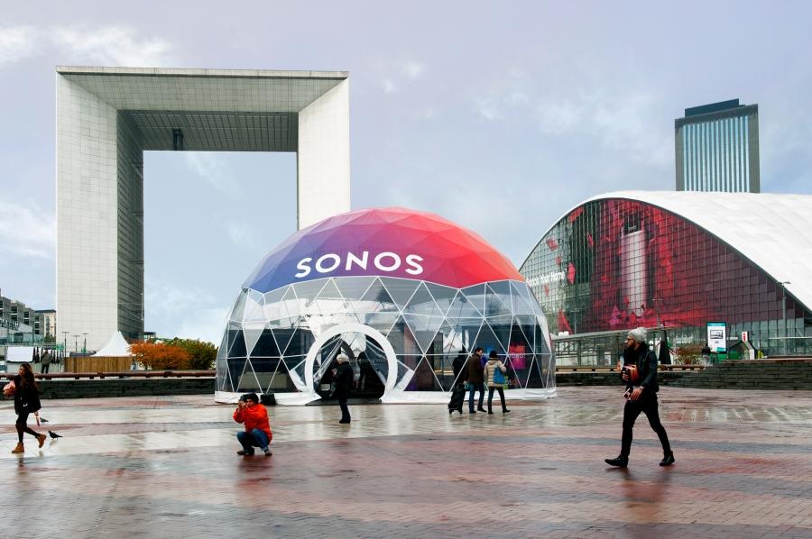
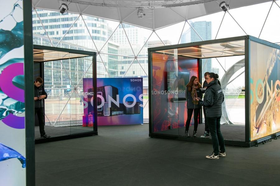
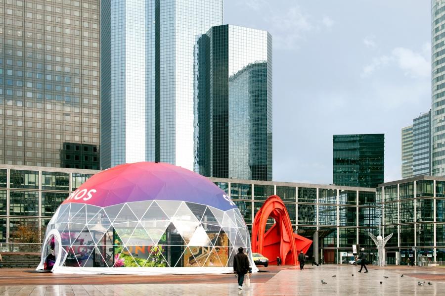
Below you'll see the construction of a pop-up showroom utilizing the new design language created by Bruce Mau Design for Sonos in full effect.
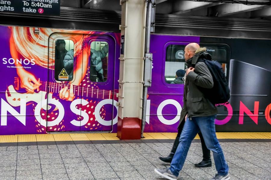
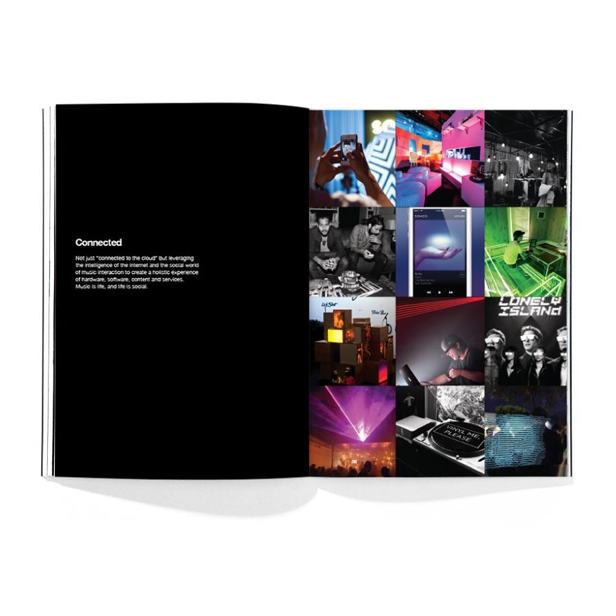
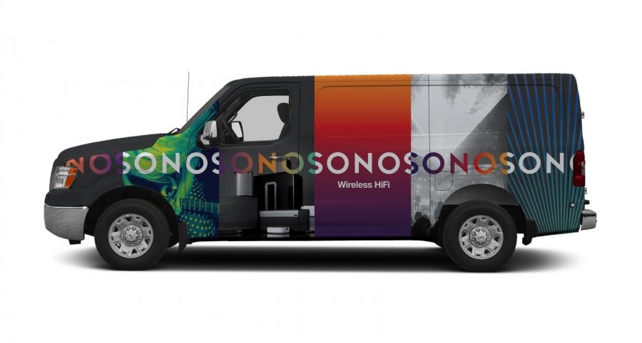
The full Sonos collection of speakers and wireless audio equipment can be found in SlashGear's Sonos archives. Have a peek at the gallery below to get a full understanding of the Bruce Mau Design remix of the Sonos identity.