Samsung One UI 2.0: Key differences you'll notice
"Stock Android" is a term often lauded in the tech world. Android the way Google intended it to be, without bloatware and other confusing modifications, seems to be a standard many users want. Diverging from that standard tends to draw some lukewarm reviews.
Yet Android's largest customer, Samsung, customizes the open-source OS every single year. Introduced in 2018, Samsung's One UI represents an overhaul of Google's vision. Ease of use is at the core of its philosophy, bringing buttons way down for easy one-handed use, text that is comfortable to read and plenty of space on the screen to make it easy on the eyes.
One UI is about to enter its second year running and Sammy's brought along some tweaks to refine the user experience. Its built on the new Android 10 and will come to Samsung Galaxy S10, S10 Plus, S10e devices first.
These are the changes you're sure to notice.
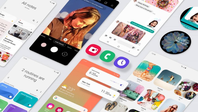
Changes to dark mode
Dark mode may be all the craze today, but not all devices have implemented it well. The dark aesthetic of much of its features can appear in great contrast to your wallpaper and other third-party apps.
One UI 2.0's dark mode dims your wallpaper, making it more comfortable on the eyes. It also helps make text on your home page and notifications more readable.
Smaller pop ups
The first run of One UI had pop ups with large buttons, as if we all had big fingers that needed more space. Samsung seems to have changed its mind, drastically reducing the size of pop-up notifications, getting out of the way of your entertainment.
Native screen recording
Features exclusive to the Galaxy Note series also finally come to its siblings thanks to One UI 2.0. One of these is screen recording with annotation support and the ability to include footage from the front-facing camera to put your expressions in the recording too.
It also includes media sounds with the option of the mic.
Accessibility settings
As the world's most popular phone manufacturer, it makes sense Samsung's phones should have settings for everyone. Samsung has put much consideration into its visuals, making them friendlier for users with difficulties with sight.
High contrast visuals like the optional loud yellow keyboard weren't the prettiest features, but it comes as great help for users who would otherwise struggle to see text on screen. 2.0 brings these options front and center.
Vision aside, users with small hands can also quickly shrink the screen for one-handed use with a swipe on the corner.
Digital well-being
Google's made it mandatory for all Android OSes to have a digital well-being suite, helping users manage the way they use technology. One UI 2.0 allows you to set timers on apps as well as a focus mode that stops you from using your phone for a set time.
Icons and stickers
Icons now move with the latest update. The gear of the Settings app icon may rotate to indicate a notification is due; Bluetooth devices you're connected to like a vacuum cleaner may move about in place while its in use.
You can also stick stickers on to the Samsung Calendar and other local apps.
Camera changes
The stock camera app gets a bit of a redesign too, though not necessarily for the better. Samsung removed the camera modes that used to be above the shutter, such as Pro, Panorama and Slow-Mo modes. These are all bundled up in a "more" button, while Photo, Video and Live Focus remain above the shutter. That's going to be inconvenience for frequent users of the modes now bundled up.
The zoom slider now incorporates all two-to-three cameras, switching between them seamlessly.