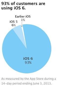
iOS fragmentation pie chart follows in Android's footsteps
We're no stranger to Android's iconic pie chart that shows the percentage of what OS version is currently out there in the world. As expected, Android has a lot of versions that are scattered around, with Jelly Bean, Ice Cream Sandwich, and Gingerbread being the top three that are in use, with older versions like Honeycomb, Froyo, and Eclair still out there on some devices. Apple is now taking a page out that back and is demonstrating their own iOS pie chart to show which iOS versions are roaming around.
Apple announced last week at WWDC that 93% of users were running iOS 6, and the company just updated its public developer portal with a pie chart to show the numbers off visually. iOS 5 makes up just 6% of devices, while there are less than 1% using older iOS builds. iOS fragmentation exists, but certainly not to the scale of Android.
Apple's pie chart proves that almost all iOS users upgrade to the latest version, while it's kind of a mixed bag with Android, but mostly because different manufacturers use different Android versions on their devices. Apple, on the other hand, sends out the latest iOS version on every device, save for the older models that wouldn't be able to keep up.

Surprisingly, according to the pie chart, Google says that the largest segment of Android devices are still running Android 2.3 Gingerbread with 36.5% of the version market share. Gingerbread is well over two years old, so it's a bit surprising to see a lot of users still on Gingerbread, which means a handful of Android owners are still using older devices.
What's perhaps even more disappointing is that over two-thirds of Android users don't have the latest features of the OS, including Google Now, improved notifications, Project Butter enhancements, and more. Plus, some carriers are still selling phones that have Android 2.3 Gingerbread installed, and these are devices that aren't able to upgrade because they're too old.
VIA: AppleInsider
SOURCE: iOS Dev Center
