How will a larger iPhone 6 stretch iOS 8?
Today we're having a look at a rather nicely produced demonstration of what it'd look like to see iOS 8 on an iPhone 6, and it got us wondering. What will Apple do with iOS 8 as far as stretching for a larger display? Between the iPhone 4 and the iPhone 5, the display became tall enough to fit another row of icons, making the answer obvious.
With the iPhone 6 in a couple of different sizes, the answer is not quite so obvious. Instead of simply making the display taller, a 4.7-inch display released after the iPhone 5's 4-inch display would require some new stretching.

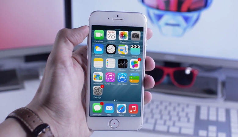
Will Apple simply pull the edges of the display out, continuing to work with a grid of icons that's four across, 6 down? What's what Tom Rich suggests will happen. He's produced the video you'll be watching below. He's taken the display of an iPhone 5 and stretched it (rather convincingly) across the 4.7-inch panel of an iPhone 6 dummy model.
At this year's WWDC, Apple spoke about "one storyboard to rule them all", a new kind of app design that'd have developers working in an arena that'd allow them to see how their app would change based on screen size. Better than that, this environment would allow the developer to change based on screen size.

Apple seems ready to move around here – not just keeping the exact same placement of elements for all iPad sizes and all iPhone sizes. It's a matter of changing for the unique device.
While it's difficult to see Apple adding a whole new row of icons to the homescreen for any new iPhone, it's easy to assume some changes will be made. A loosening of the reigns, if ever-so-slightly.