Here's what Android L will look like
Google's mobile operating system Android has been given an upgrade this week, moving from codeword "KitKat" to Android "L". Today we're exploring what's involved in Android L, showing especially what this new version of the software will look like to you, the end user. Android L is built with a new Google-made aesthetic called "Material", this replacing the "Holo" aesthetic present in the last several versions of the software.
Material
Right out the gate you're going to want to have a peek at Google's "Material design" video shown to the public during the main Google I/O 2014 keynote. This video should give you a good idea of what it'll look like to browse with Material design in Android L in a a very basic way.
According to Google's Matias Duarte, the first design principal in Material Design is "metaphor." A "form of knowledge transfer that depends on shared experience," is what Duarte suggests metaphor has to do with Material in Android – if you already know about the materials your working with to complete a puzzle, you're able to skip over a large part of learning how to put that puzzle together.
Android L has Material using paper as the most basic element in its user interface. Since you already know how paper moves, you'll know how to move through Android L. Above and below you'll see Matias Duarte explain this concept in brief.
Color
In Android L and with Material you're going to see color, as Google puts it, "inspired by bold color statements juxtaposed with muted environments, taking cues from contemporary architecture, road signs, pavement marking tape, and sports courts." Google furthermore suggests that developers "emphasize bold shadows and highlights" and that they "introduced unexpected and vibrant colors" in their app designs.
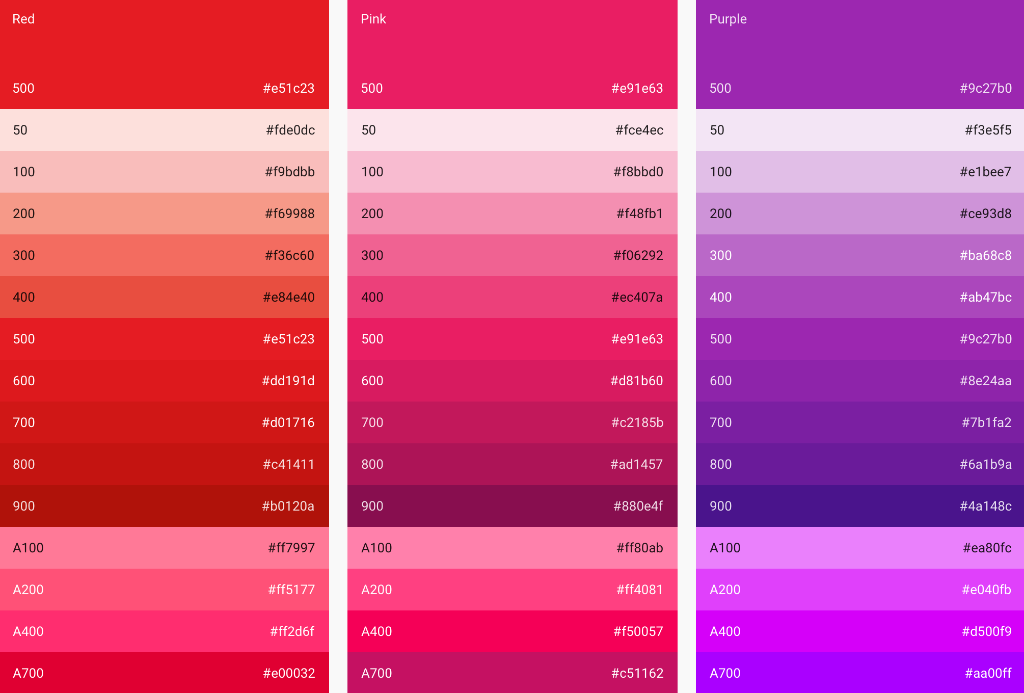
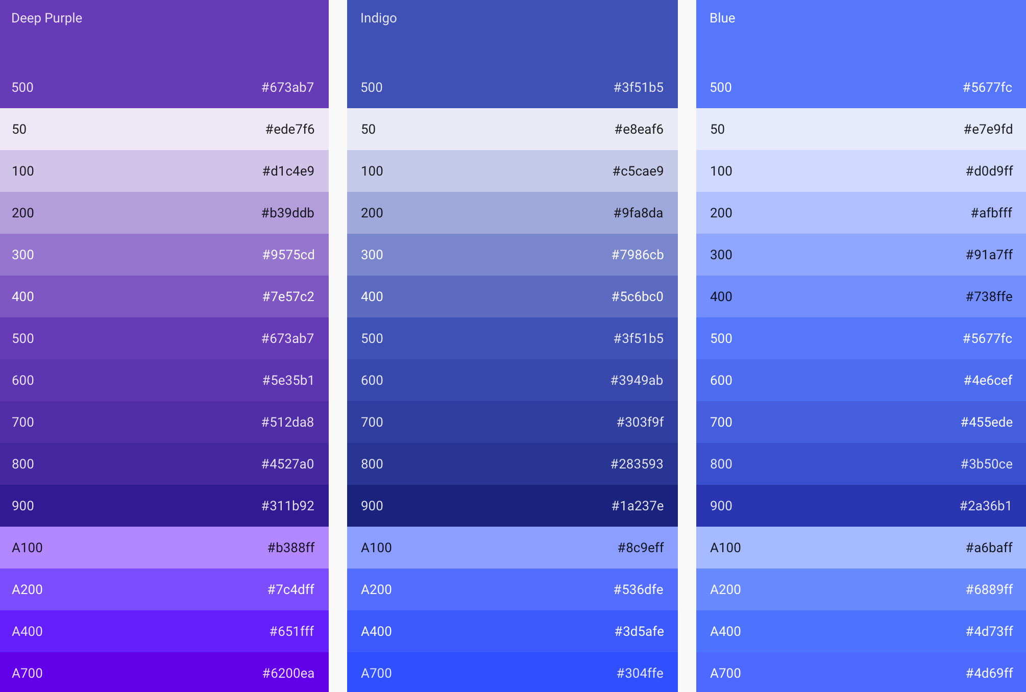
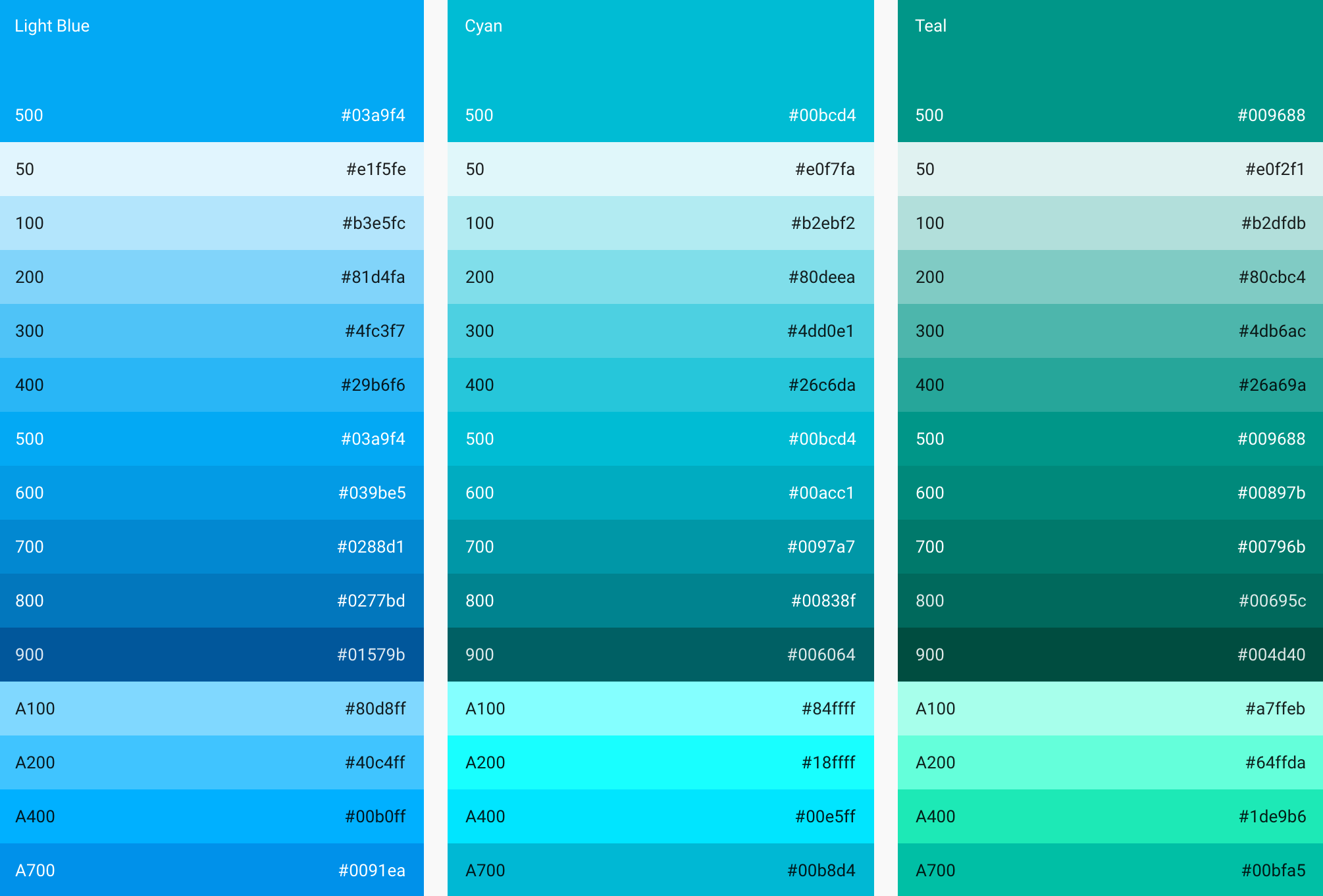
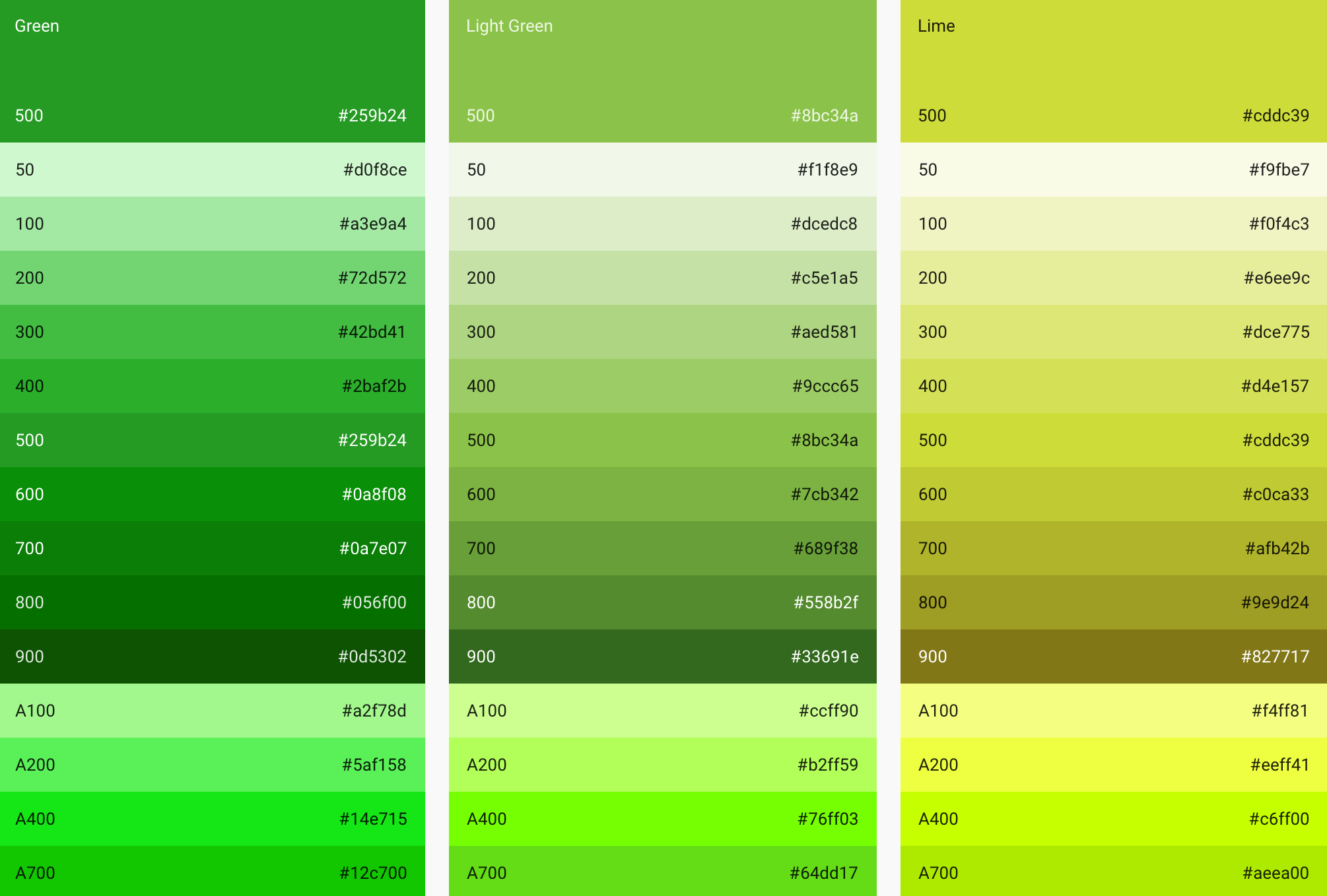
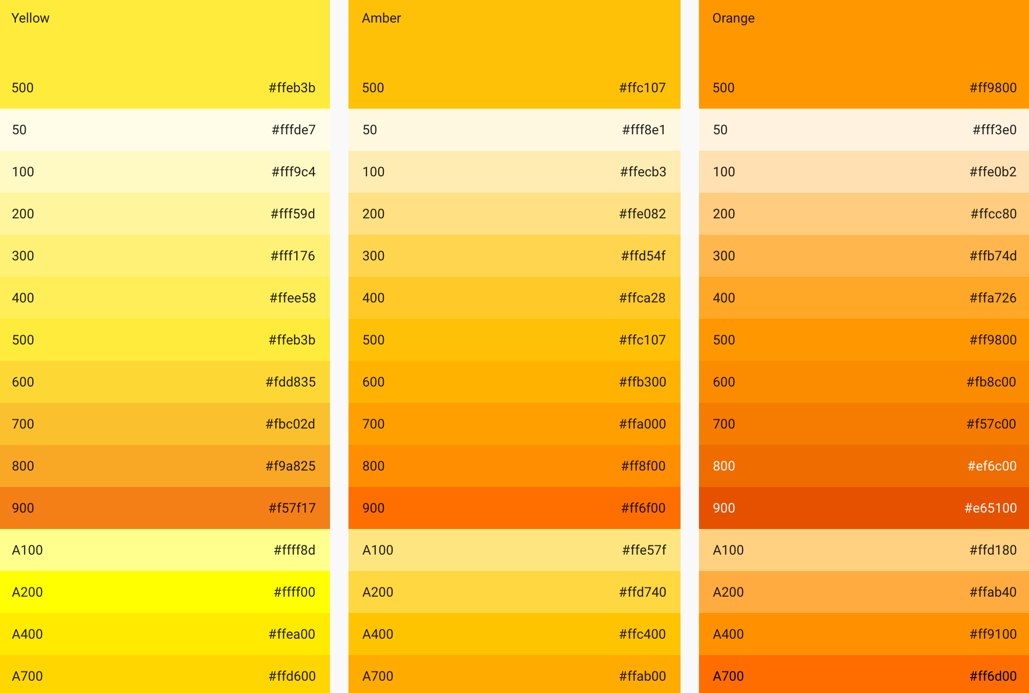
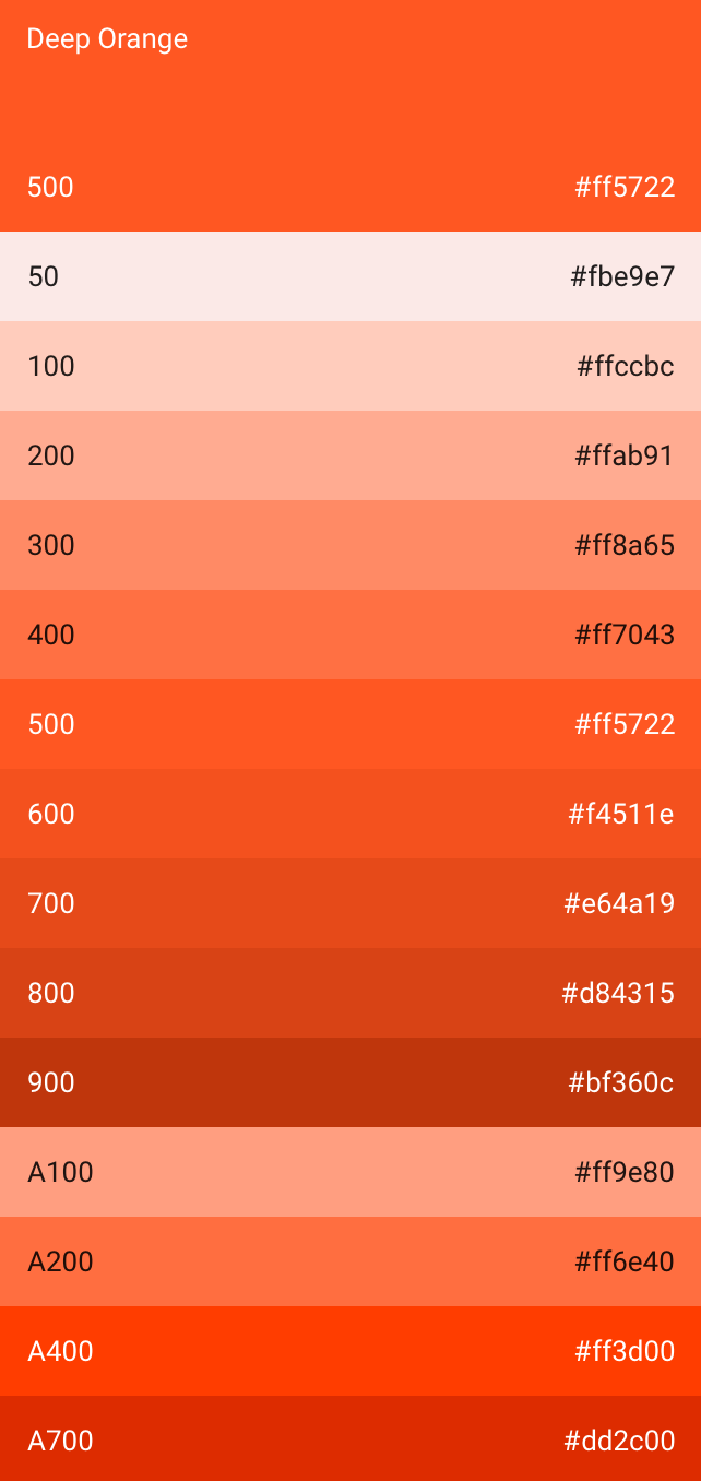
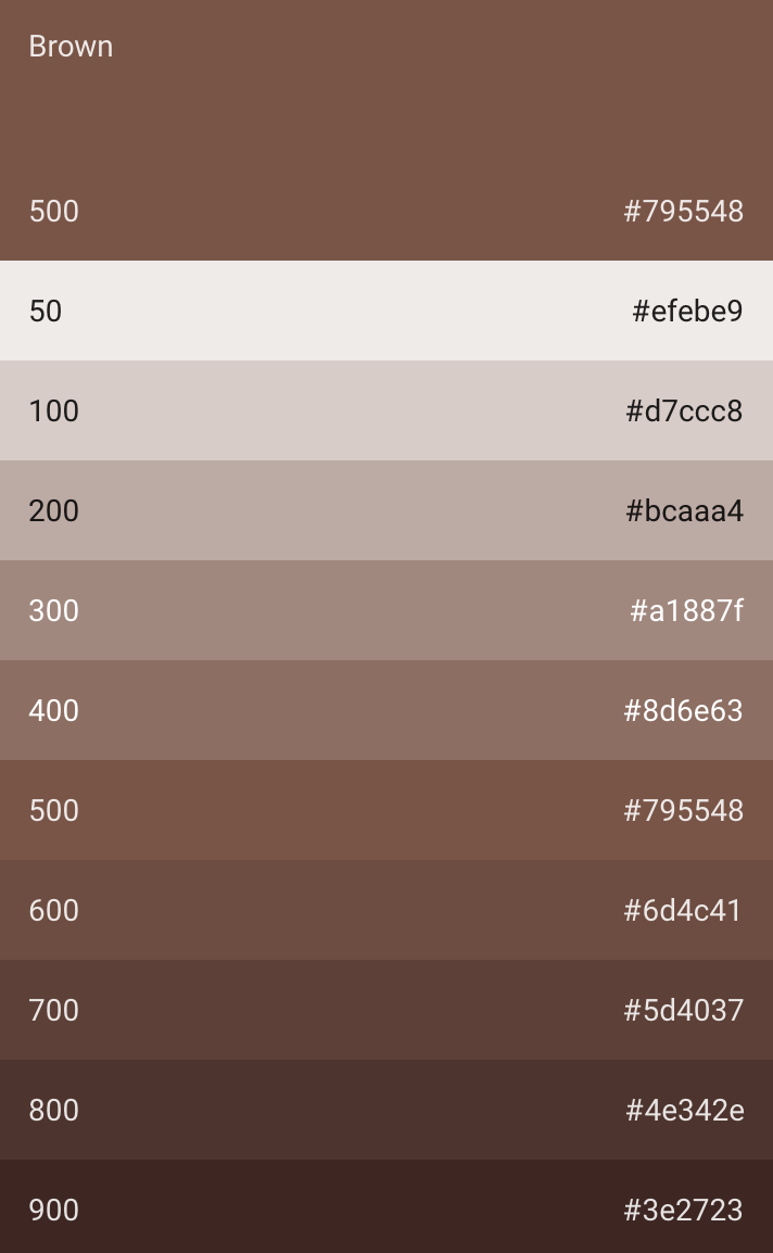
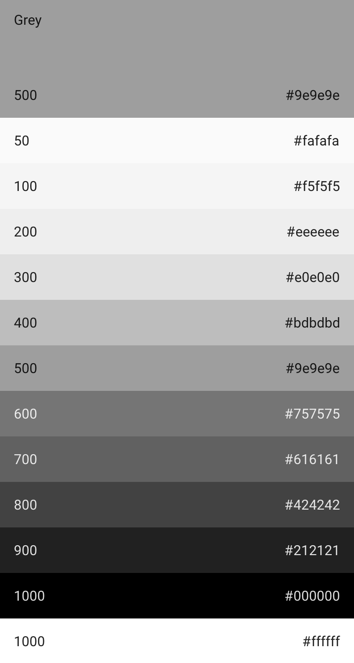
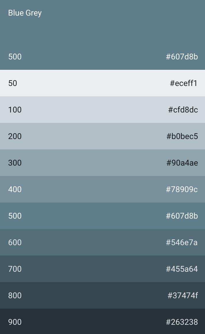
Above you'll see a gallery of color swatches shared by Google for developers. This is the wide range of colors Google is designing Android L in and also the range that they hope developers will adopt as well. Next you'll see "accent colors" which Google says will be used for "primary action buttons" and sliders.
Color Themes are also part of Google's suggestion collection for Material and Android L. The two main themes are Light and Dark, both shown here:
Typography
Google sticks with Roboto for this release, the same font they've used since Android Ice Cream Sandwich. Roboto has been updated in this release, however, with a "wider and rounder" set of features to make it seem "more optimistic" than it has been in the past.
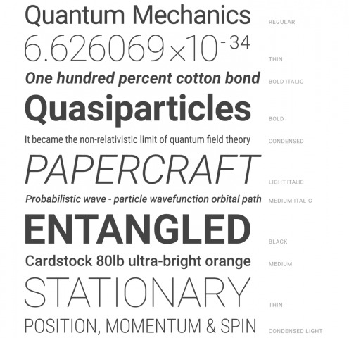
Below you'll see a number of examples of how different Roboto weights can be employed in Android L.


Iconography
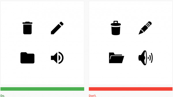
A brand new set of UI icons – or system icons – is being employed in Android L. These icons are reduced in body and in style, making them as super-simple as Google dares them to be at this time in history. Rounded corners are employed and encouraged.
Google suggests developers use their icons in all places – and suggest above all else that they do not mix and match. It's about consistency, here, people!
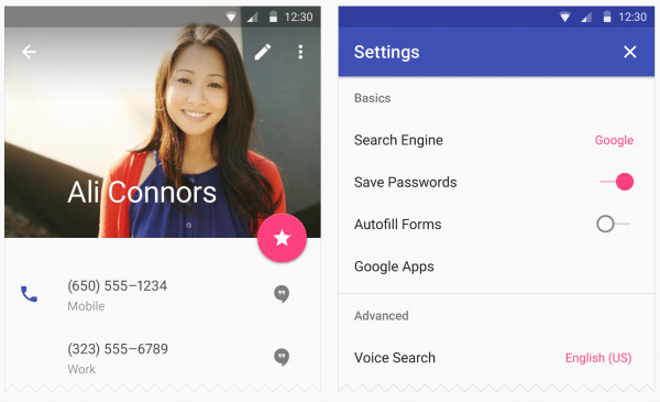
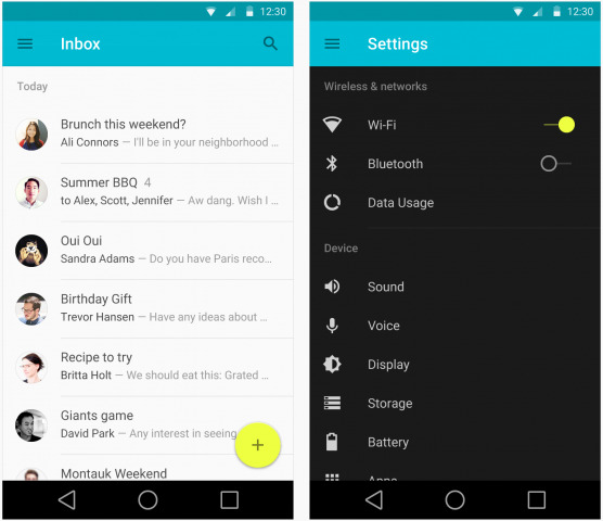
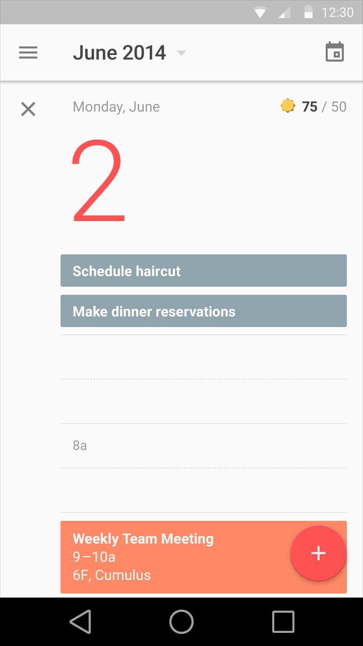
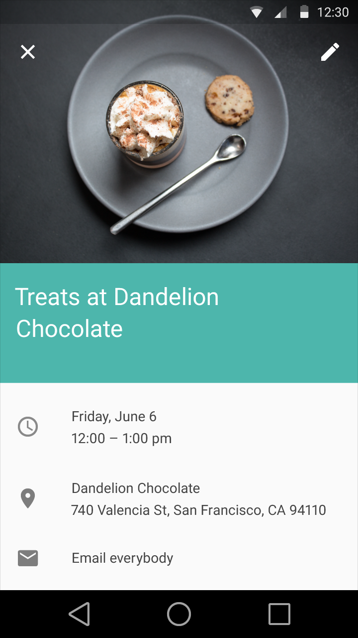
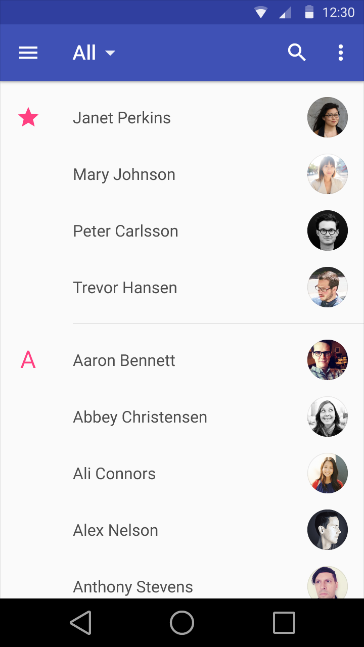
Imagery
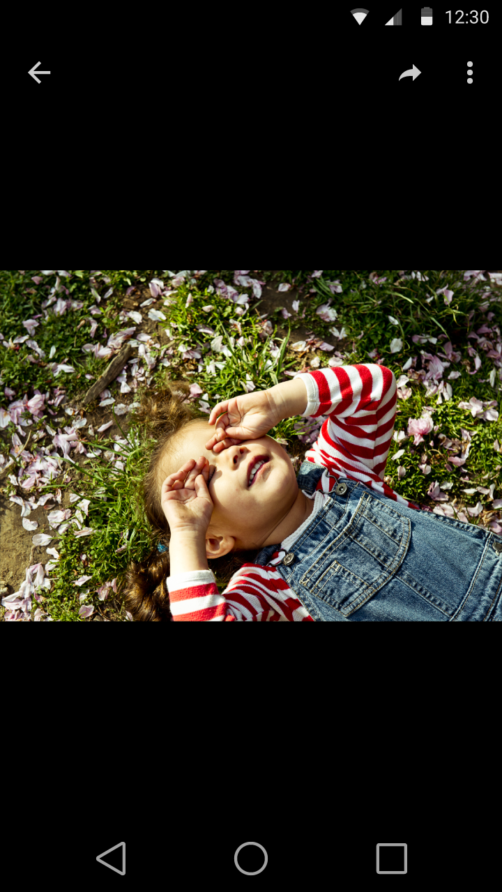
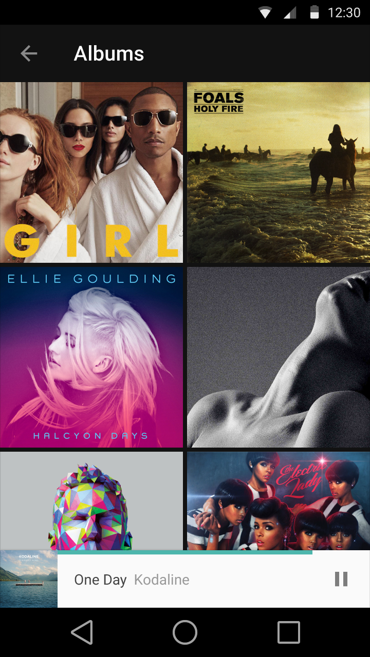
Google suggests that their future in design be delightful, optimistic, and honest. As in the color section above, Google suggests that "unexpected use of color" be employed. Google also says that "in material design, imagery—whether illustration or photography—is constructed but never contrived, magical but never overproduced."
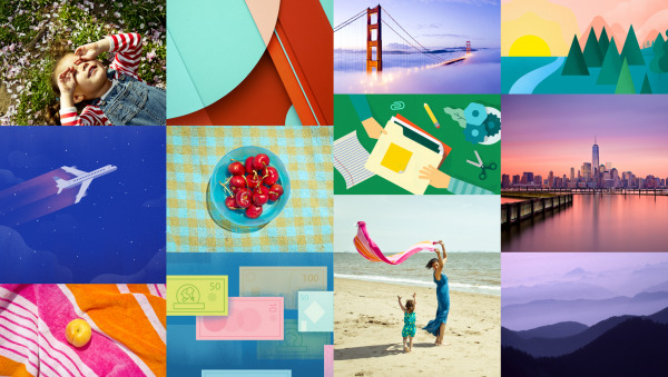
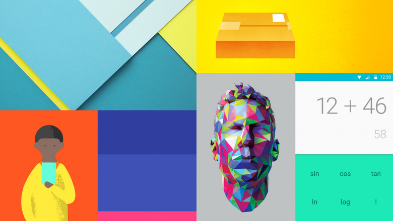
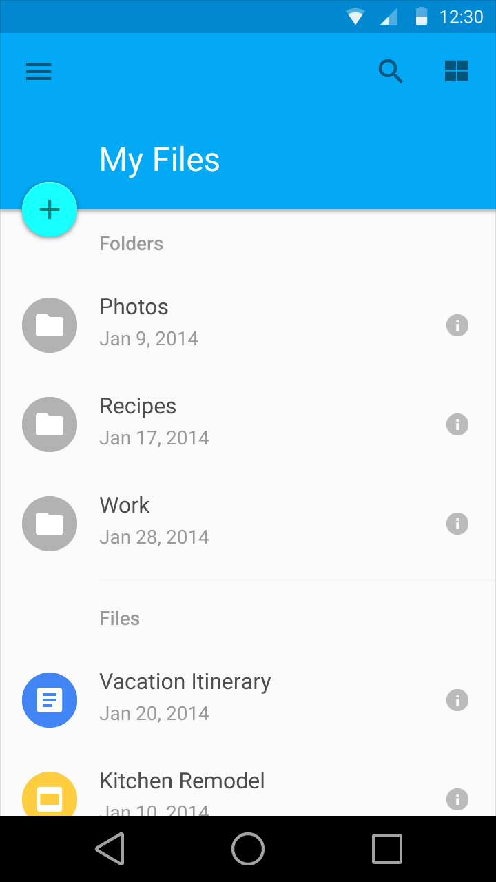
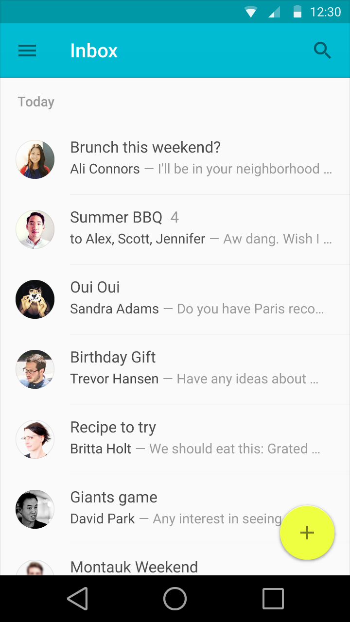
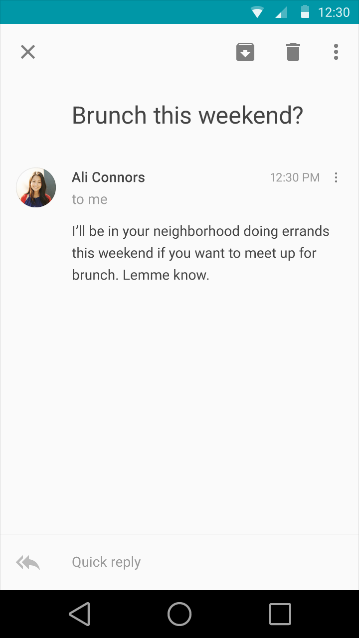
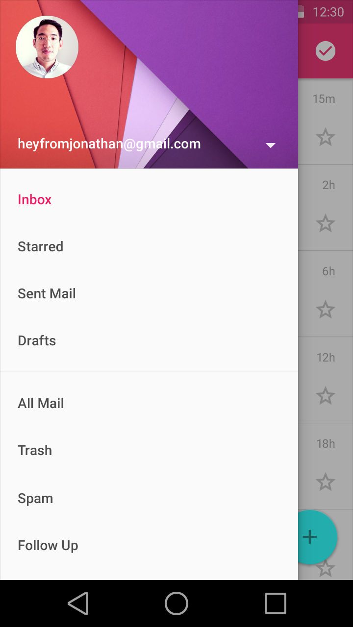
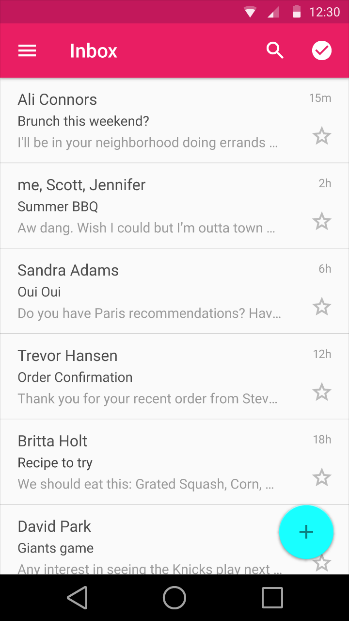
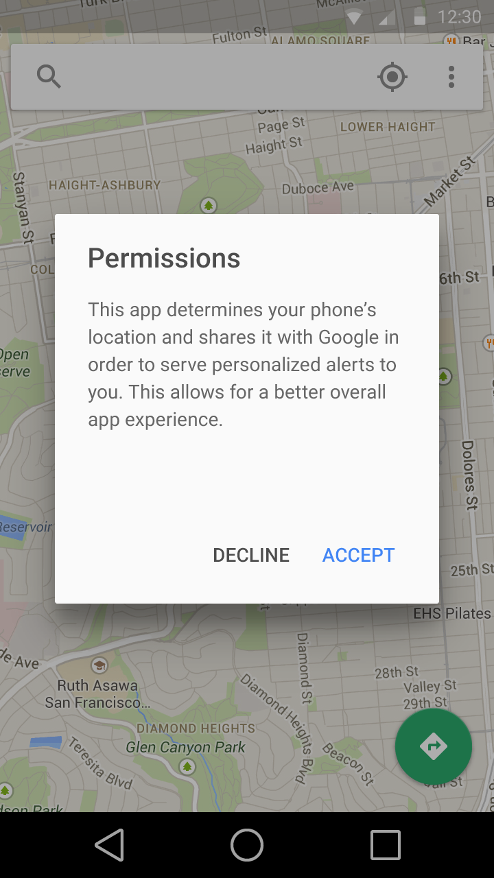
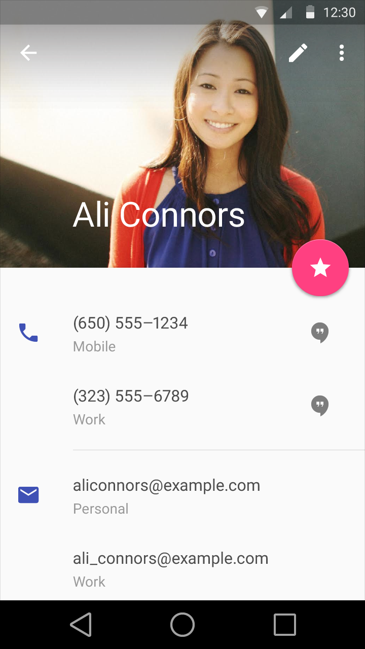
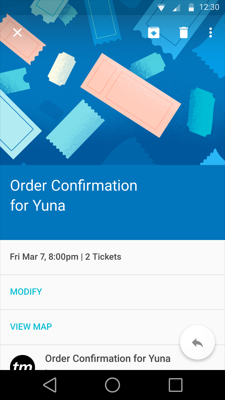
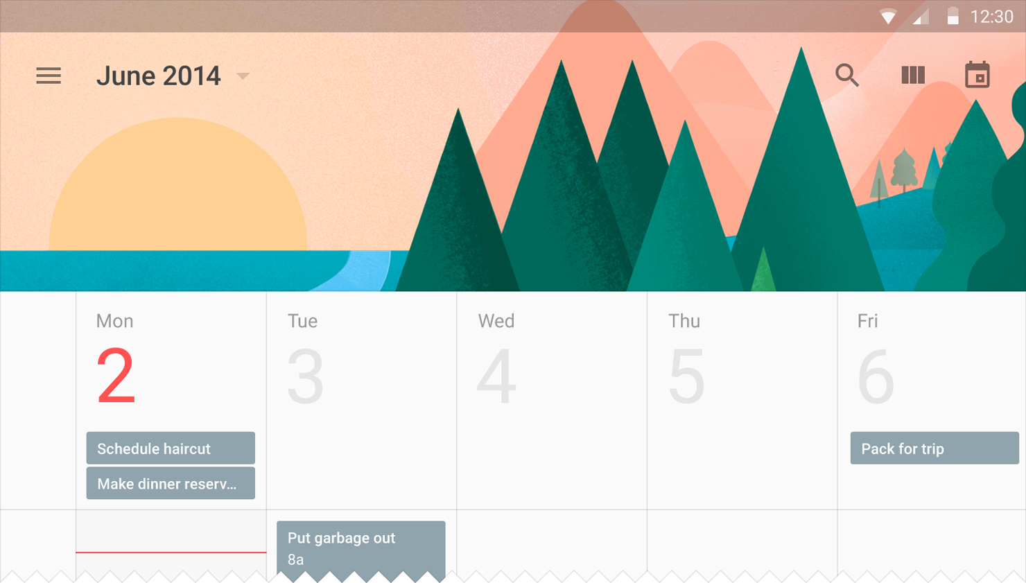
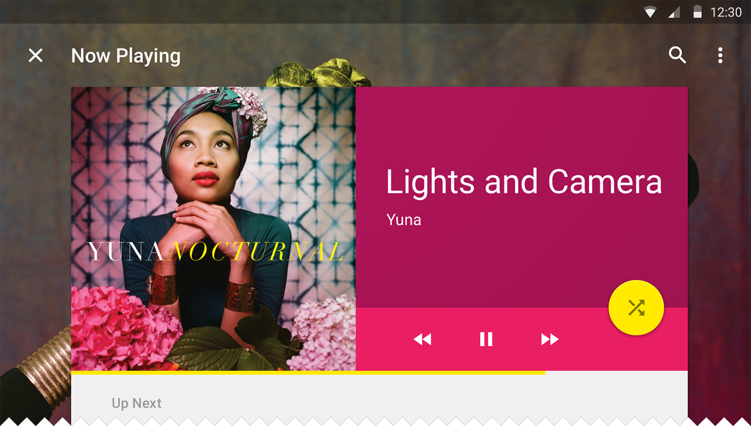
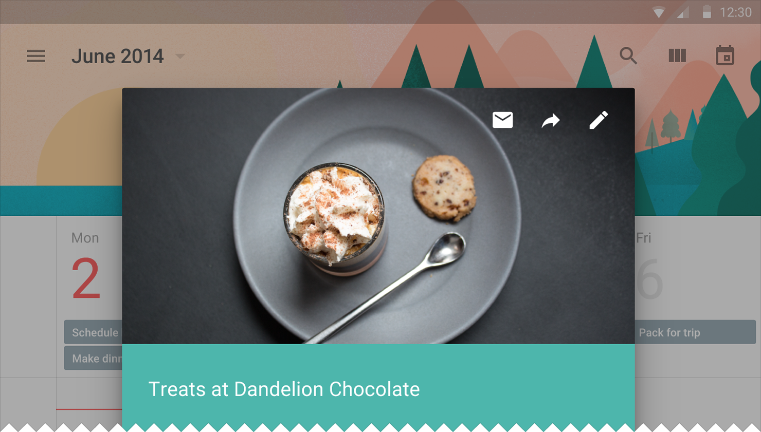
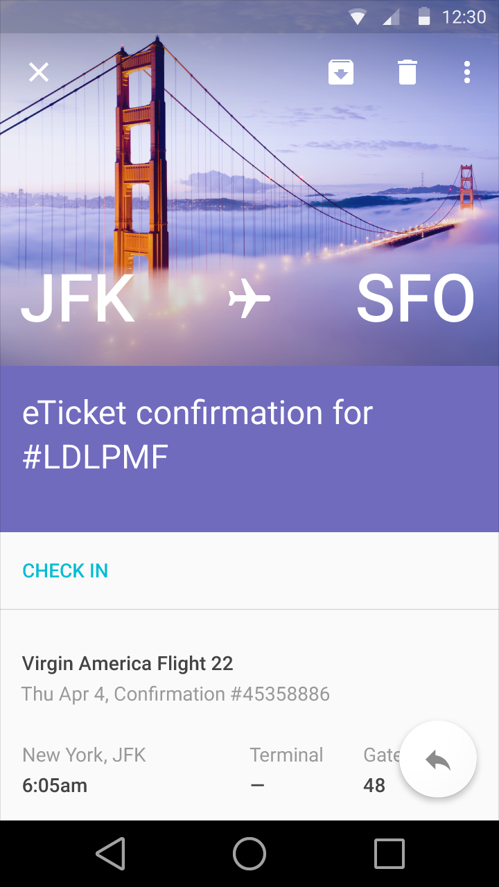
Below you'll see a number of screenshots in which imagery is used correctly, according to Google. This is what Android L will look like from a Google perspective.
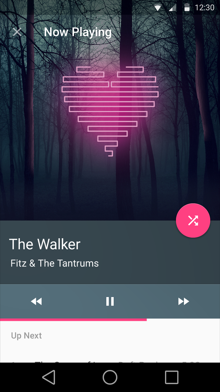
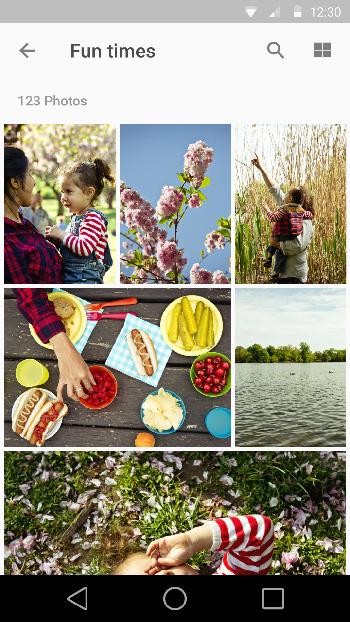
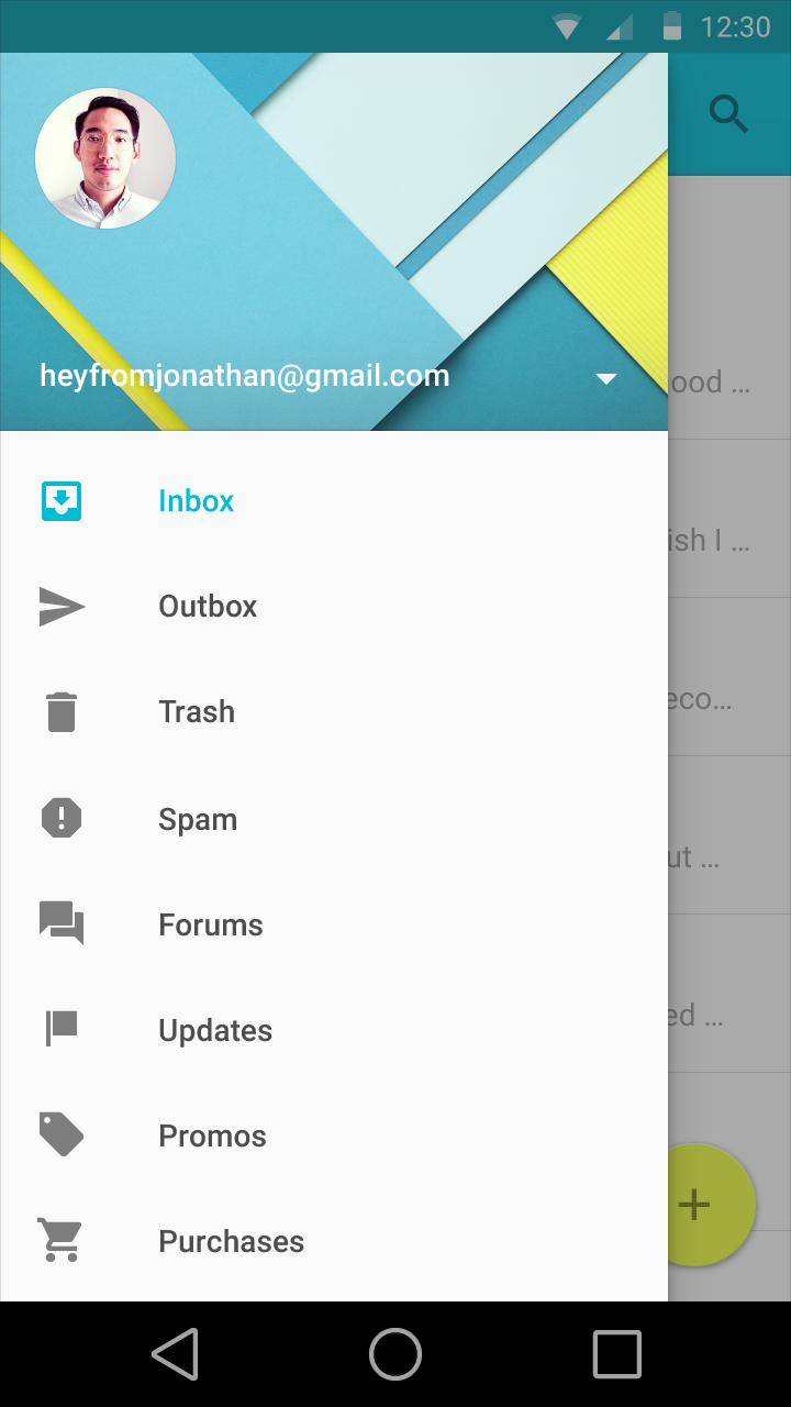
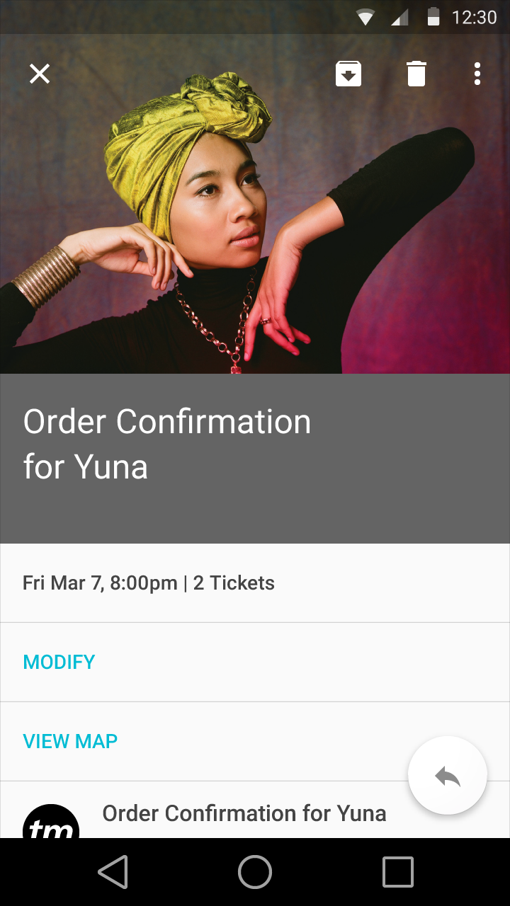
Just the basics
The images you see above are the most basic look at how Android L will look and act. We'll be continuing to explore how Material Design and Android L will be presented later this year as we see it for ourselves, with hands-on and eyes-on presentations for you as much as we're able in the near future.
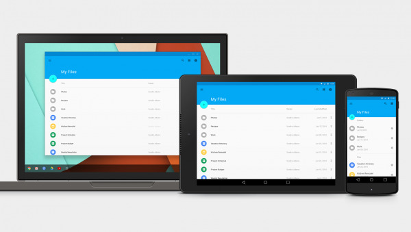
Also remember – while Material Design is being shown here on Android L first, it's mean to be a unifying system for the whole of Google software. Android, Chrome, Chrome OS, Android TV, Android Wear, Android Auto, and more will take advantage of this one overarching visual system. Get familiar!
In-depth for Developers
If you're especially pumped up about the change-over from Holo to Material, you should have a peek at a new "From Holo to Material" Android Developer video released this week for Google I/O 2014. This video is narrated by Google's Chris Banes, developer relations specialist.
VIA: Google Design