Google+ refresh triggers social fury
As Google continues their push to keep the Google+ social network in the spotlight, they've updated the look, feel, and functionality of the entire network in a move that's got some a bit frazzled. As it is with each time a site brings a relatively radical upgrade to their user interface, there are complaints galore across Google+ itself, Twitter, and of course the opposing force: Facebook. Will this newest move have Google jumping in the popularity poles as they did when the service was first shown off, or will this be the first Google+ Update Hate day as Facebook users are all too familiar with already?
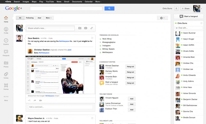
As you'll see above, quite a bit of the talk that surrounds this update centers around the breathing room that now exists between the Hangout list that appears on the right side of your profile and the rest of the items you've got on the left. The two main suggestions for what this space might be for are advertisements and – of course – a giant picture of Barry White(space). Larry Page spoke today about the space that this was there, quite simply, for "The Next Big Feature" – whatever that may be.
The changes here are what Google is saying are increases on the level of ease a user has in sharing and interacting with Google+ friends and associates. With a cut in color across buttons, a rounding of several of the edges, and a live update column flipping down new stories as quick as it ever has – this isn't going to be an easy transition for the masses still getting used to using this social network which does indeed come into direct competition with services like Facebook and Twitter.
For those of you that use Google+ on a regular basis, remember that we're up there officially at +SlashGear – and for all your Android needs, be sure to check out +Android Community as well!
Don't forget to look up Whitespace on Google+ today for some hearty laughs!