Google Play Store's blindingly white update is now official
Google's Material Design was praised for its bold use of colors and images despite the predominantly flat aesthetic. In v2 of the design language, it seems that Google threw all that out the window and adopted a predominantly light, white really, color scheme. It isn't exactly the most well-received change in Google's aesthetic tastes but that's not stopping it from rolling out the "visual refresh" which is now finally arriving at the Google Play Store, whether you like or not.
Google bills it as a cleaner appearance that makes it look more premium as an app store. At the same time, the whiteness of the new design can b pretty blinding in dark environments, especially when the phone itself uses a dark theme. That has been the problem with the new Gmail apps and Google has promised it will eventually introduce a dark theme.
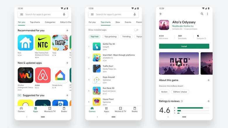
That day hasn't arrived yet but, in the meantime, Android and Chrome OS users can enjoy the all-white Google Play Store. Fortunately, the changes aren't just visual. There are also some functional changes that supposedly makes it easier to browse apps by relocating the navigation panel at the bottom of the screen. Chrome OS devices with larger screens get a left navigation panel instead.
Details about each app have also been moved around, with the call to action now at a more prominent position at the top. More important information is also placed at the top for quicker access. There are also new system icons and Google is advising app makers to update theirs to much the new specification.
The navigation and content changesa have been leaked before and are largely welcomed. The all-white colors, or lack of it, however, is still a bit debatable. Hopefully, Google will make true its word and follow up with a dark theme for users that value their eyesight over aesthetically pleasing colorless pages.