Google Maps redesign promises to make finding places faster
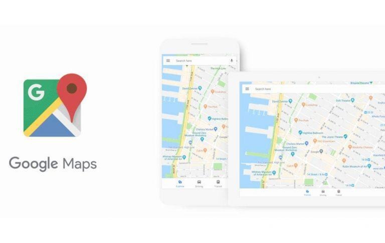
It's almost hard to imagine these days how we've managed to survive the past decades without Google Maps and related services like Waze. But despite their convenience, finding the right spot when and where you need still isn't as easy or as fast as we may want it. Pending direct Internet-to-brain interface, Google is initiating some changes in Google Maps to cut down on the time your eyes spend scanning the screen for relevant markers. And it does so by lowering the information density as well as color coding markers.
When you're commuting, the last thing you might want to see on Google Maps are markers for the nearest gas stations. Those, on the other hand, would come in handy when you're driving your own car. That is why Google Maps will now only highlight points of interest that might be relevant depending on what kind of map you're using, be it explore, driving, or transit.

Even then, those points might still be more than you can digest in a single glance. That is why Google is adopting a new color scheme and new icons to help better indicate the type of establishment in that marker. For example, restaurants and food places will have orange colored icons while services are in blue.

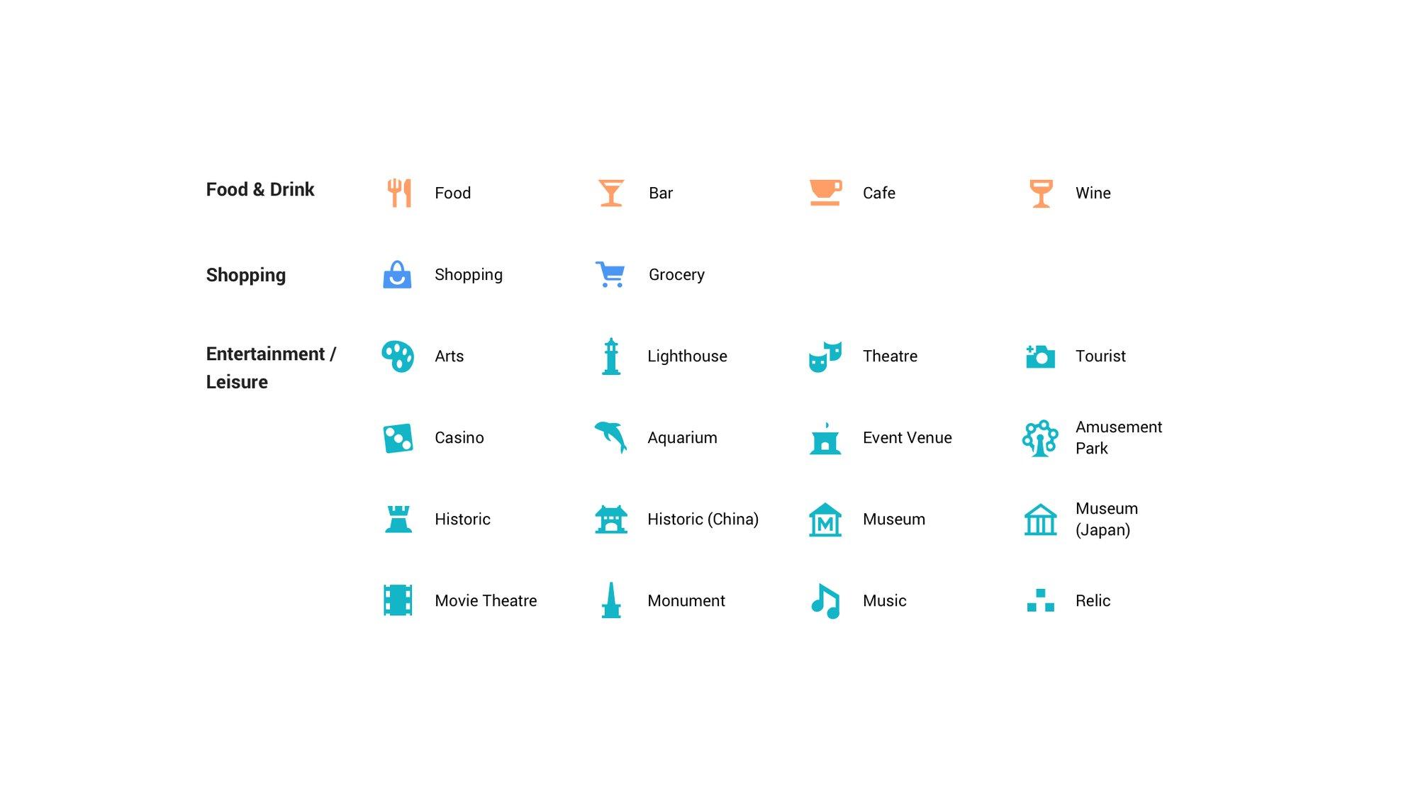
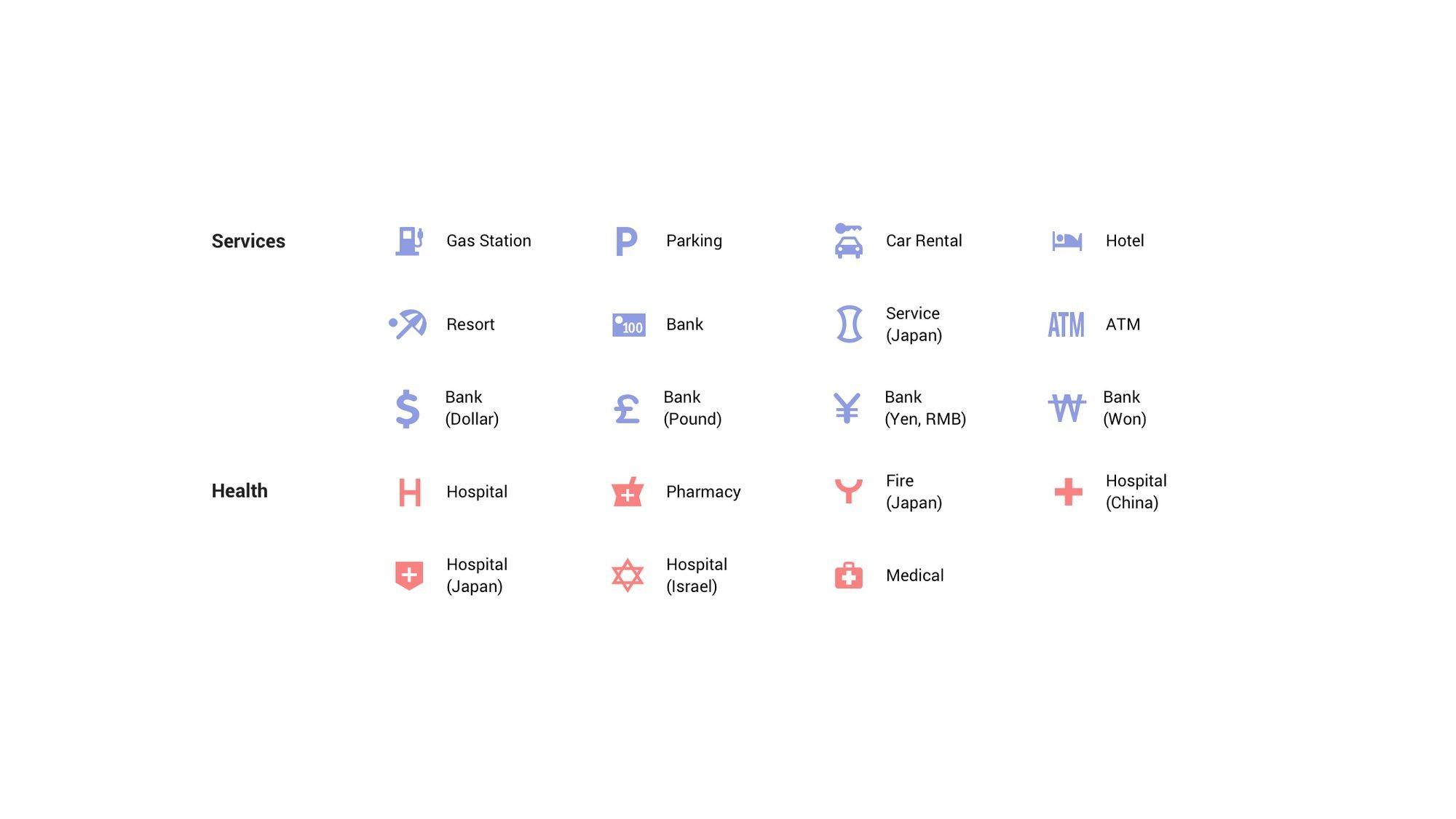
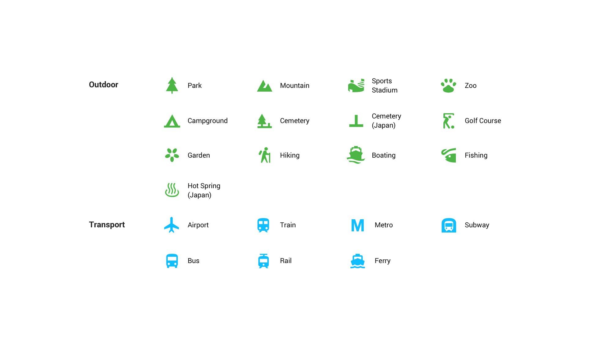
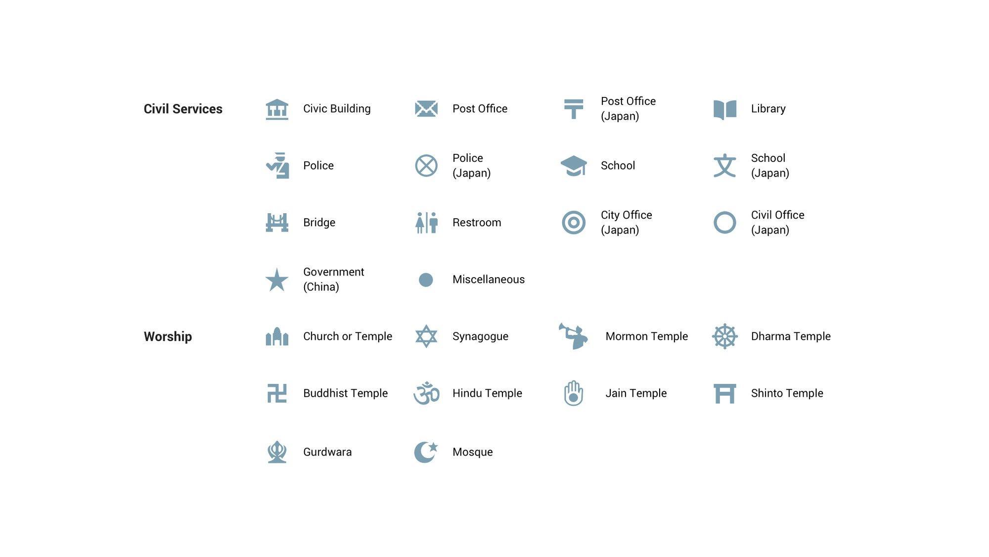
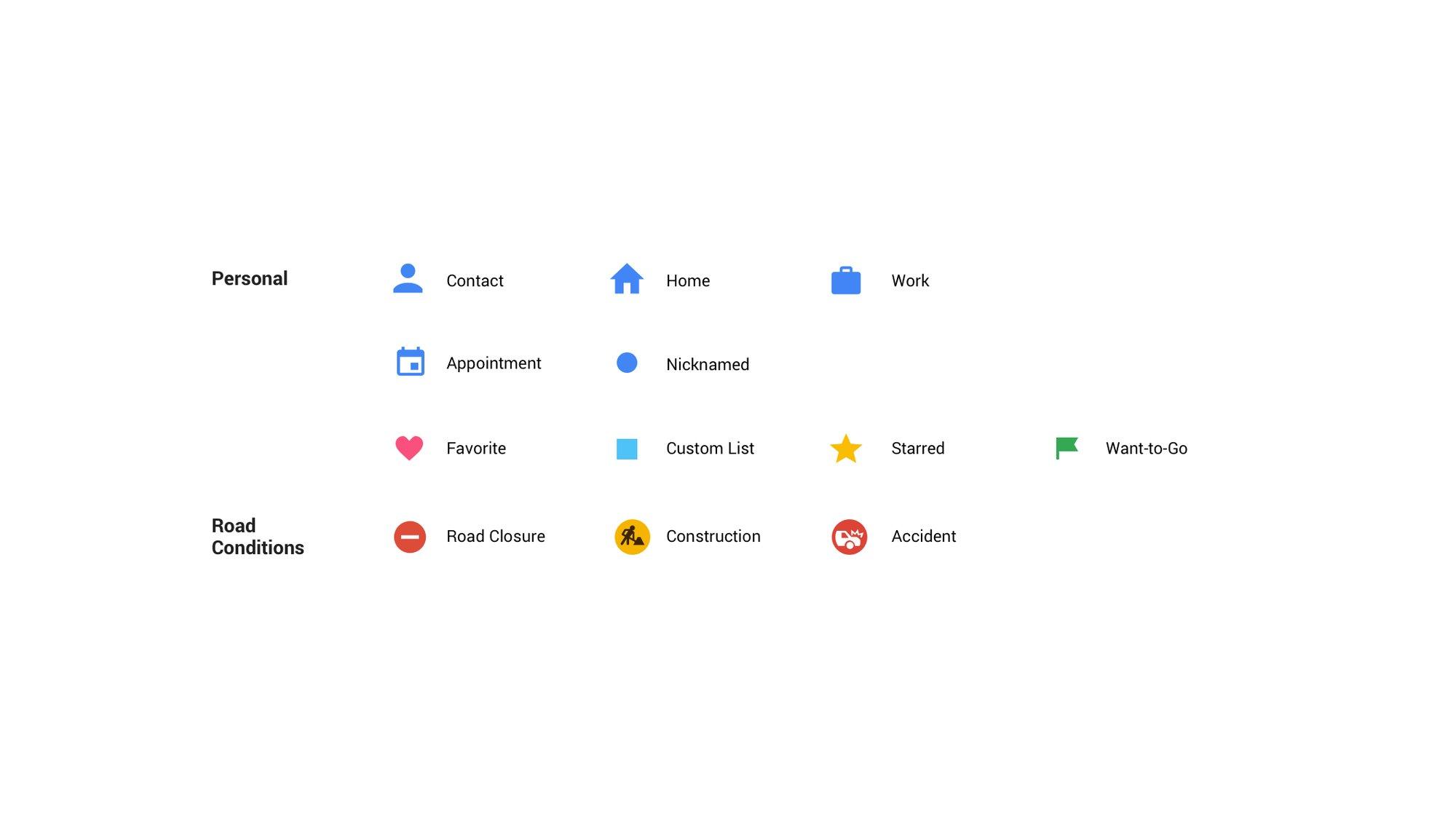
That said, this new scheme does sort of imply you can somewhat remember what the colors mean. And when places of the same type are huddled closely together, you'll see a single sea of color instead. Google also doesn't mention anything regarding accessibility, leaving color blind people to just rely on the old-fashioned icon shapes instead.
These design changes are rolling out to Google Maps now. But to keep it consistent across other Google services that also use Maps, the changes will also be applied to Google Assistant, Google Search, Google Earth, and even Android Auto in the coming weeks.
SOURCE: Google