Google Maps now shows you the best time to leave
It's one thing to know that your next commute might take an hour. But it's another thing to know when it might take 30 minutes. Travel times aren't always fixed and they ebb and flow with the rise and setting of the sun, a.k.a. rush hour. To better help give travels an idea of what they're facing, Google has very sneakily rolled out an update to Maps that shows users a graph that visually shows just how much, or how less, traffic you will face, depending on what time you hit the road.
Unless you really have no choice, it would almost be suicide to go out when you know rush hour is in full swing. But rush hour is more or less constant. There are times, however, when traffic can be just as bad in the middle of the day. Although Google Maps is no crystal ball, the data Google has gathered over the years help it at least make an estimate on the traffic situation at different hours of the day.
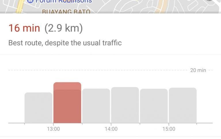
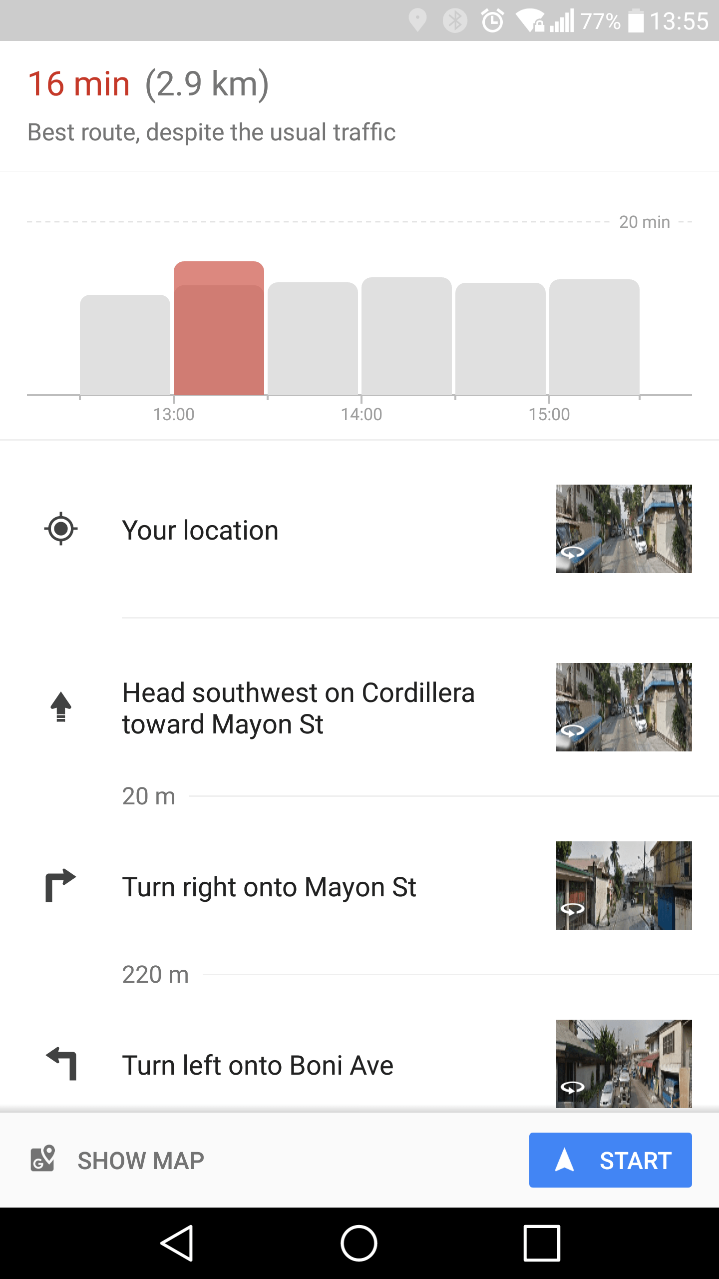
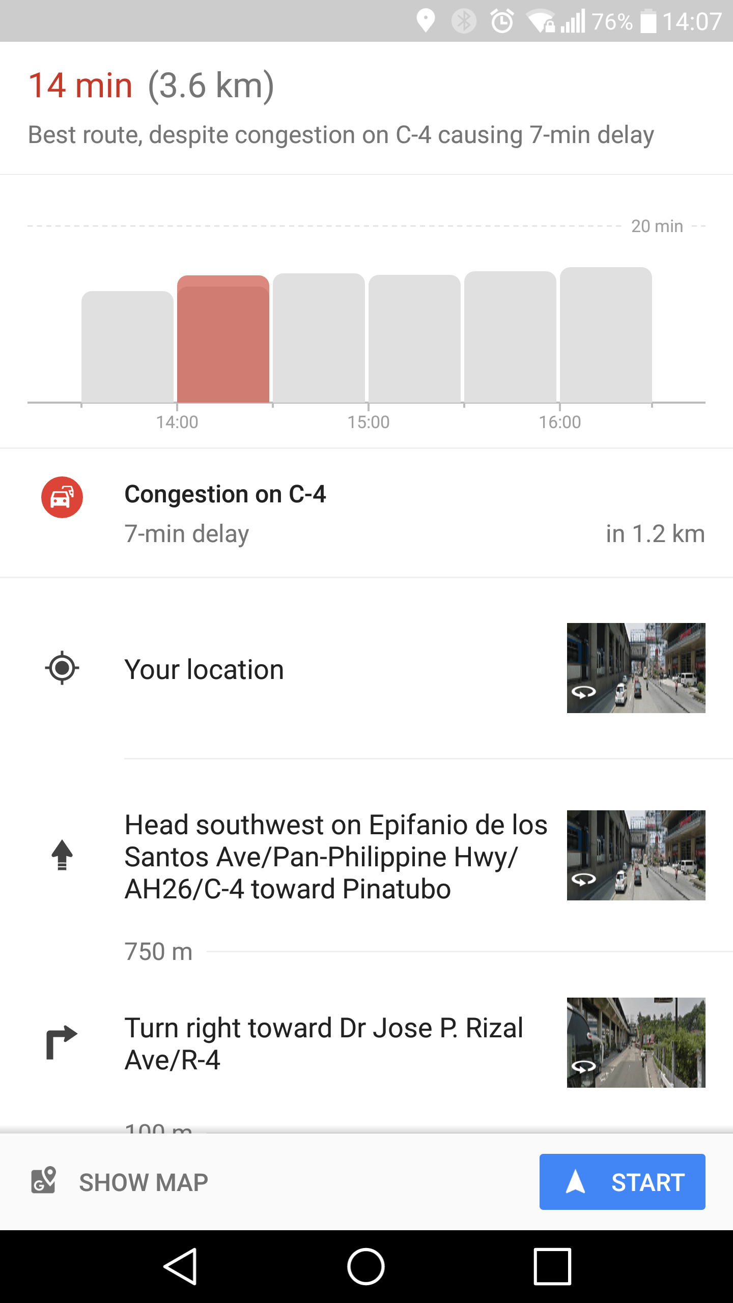
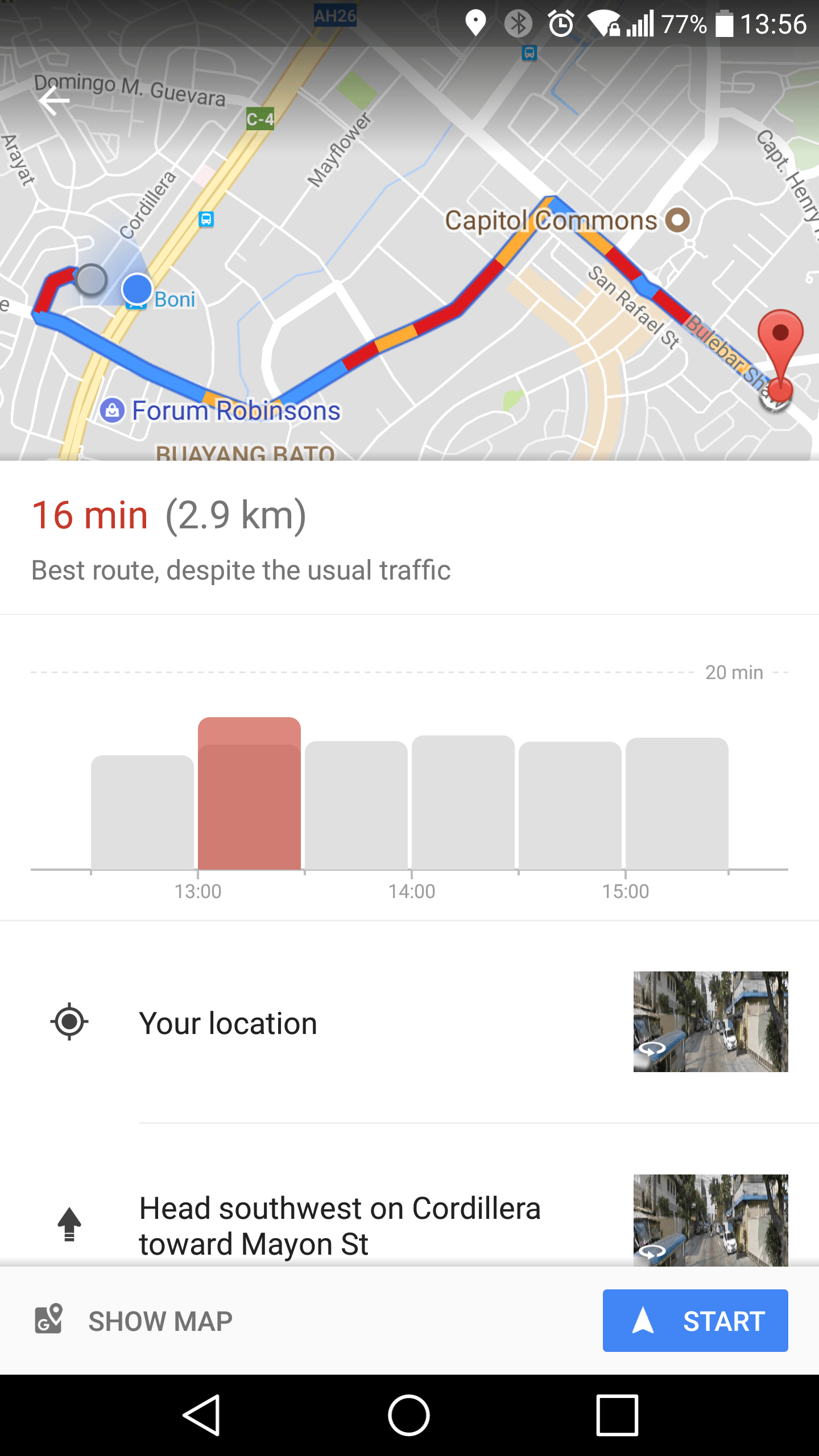
The way it works is quite simple, provided you already have the feature in your Maps. You enter a destination and tap on the Get Directions button but instead of Starting immediately, you can swipe up to see details of your route. At the very top, which is the new part, is a graph that shows the amount of traffic you will meet in 30 minute increments. You don't need to be a computer scientist to know that red is a bad thing and that higher graphs is just as bad. With that data in hand, you can at least make a choice whether to brave the road ahead or bid your time instead.
It's not going to be perfect of course and Google Maps may sometimes get it wrong. And sometimes you might not have any choice anyway. At least you can mentally prepare yourself should that trial come to pass. Google hasn't made a big splash about this new feature, even on the Google Maps Play Store page. It seems to be slowly rolling out to random markets, though most users in the US and the UK probably have it by now already.