Google Maps gets color coded visuals, areas of interest
Map and navigation apps, be they from Google, Apple, previously Nokia, or even Microsoft, can be life savers, especially when venturing into territory unknown. But that only works if you can actually make heads or tails of the information crammed within. Making something look prettier isn't just a matter of aesthetic enhancement. It can also be about whether you'll be able to tell one road or area from another at a glance. That is why in its latest Maps update, Google is splashing some new colors and removing a few lines for the sake making Google Maps easier to "read", even when you're mind is stressed out from getting lost.
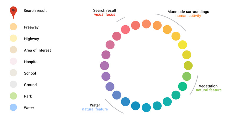
Google Maps is using a new color scheme that will help users quickly identify the nature of areas and structures. For example, natural features related to water take a bluish hue while those more related to vegetation are green. Man-made structures go from orange to green, depending on where they sit on the new scale, as can be seen below.
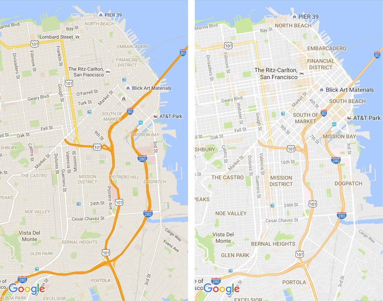
Overall, Google Maps is getting a slight visual revamp to make roads and structures easier to see and look less crowded. Road outlines, for example, have been removed for a cleaner look, while fonts have been improved to make picking out street names easier.
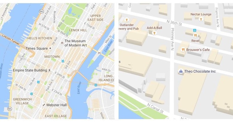
The udpate isn't just about visual changes either, although the new "areas of interest" also do have some aesthetic elements to them. When you explore a new map, such areas are shaded in orange and you can zoom in on those or tap on names to get more details.
These changes to Google Maps will be available on Android, iOS, and the desktop, ensuring that wherever you go and whatever platform you're on, you won't be at a loss for interesting places to go to, or won't be lost at all.
SOURCE: Google