Fake the Windows 10 Start Menu update until Microsoft makes it
There's a new Windows 10 Start Menu in the mix, and it's appeared first courtesy of a strange source. The folks at Microsoft 365 showed off a new look for Windows 10 in the form of a Theme for Pride month. But this is no simple Theme, this is a slight revamping of the bones of the system, from backgrounds to supposed rounded corners.
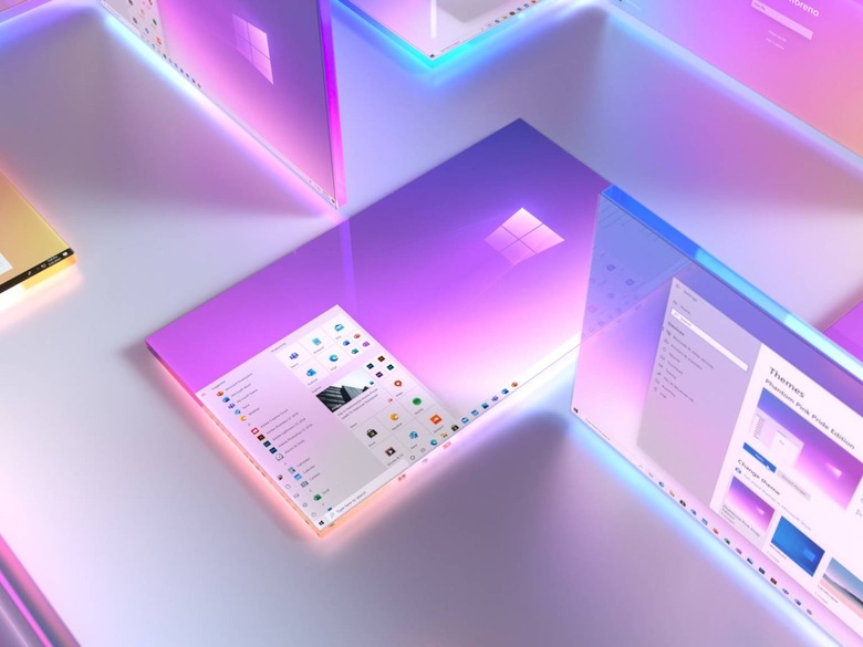
In this preview, we see icons in the app list without required background squares. We see the topmost bit of the app list changed to "Suggested" instead of the default hashtag (for apps with names that start with a number). On the right we see Productivity and Explore categories with updated iconography.

While we've seen it suggested that this section has slightly more "rounded" corners, it's likely that we're seeing blurred points due to the relatively low resolution of the imagery. We DO see some slight changes in the way that the backgrounds for icons on the right are handled – they can be on light colors on top of the light semitransparent back of the Start Menu, which looks rather nice.
If we head to "Themes" in Windows 10, we see a bit of cleanup action going on. Instead of saying "Current Theme:" then listing the theme name, we see a way to sort of "preview" a theme before hitting the "Apply" button.

The closest you can get to what we see in the Microsoft 365 teaser right this minute is in the Microsoft made Theme called "Pride 2020 Flags." If you drop in on your Start Menu options, you'll want to switch on "Show suggestions occasionally in Start" and "Show app list in Start menu."

Go to Personalization – Colors – and make sure you've got "Light" selected for color. Make sure "Transparency effects" are switched on. The theme shown by Microsoft has the default accent color – but you could select something like a very light gray in order to nearly hide the background squares around icons.
I'd suggest you pick Light Gray under the Blue area of the spectrum. Otherwise you've got icons that look like they're... orange...red... bleh. After you've done that, cross your fingers that Microsoft implements the basic changes they've shown in their concept work above – because it's great!