Facebook borrows Google+ style for UI tweak
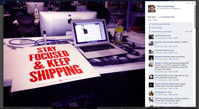
Facebook may be looking at a $100m floatation, but it apparently only spent a few cents on photocopying the image gallery UI from Google+ and using it itself. The new Facebook layout floats a comments/Likes box over the right hand side of a black lightbox, Faceblog spotted, with the tweaked interface being rolled out to certain users already; Julien Girard snapped a shot of Mark Zuckerberg's desk, shown below, for instance. It's a layout that's mighty similar to what Google+ already offers, and the latest example of the two social sites seemingly "borrowing" design cues from each other.
As the screengrab below – the same photo, but shared on Google+ instead – illustrates, it's tricky to tell the difference at first glance.

Of course, you could well argue that there are limited ways in which you can set out images and comments, and this is definitely an improvement over the existing Facebook layout. There's less scrolling involved to see comments and tags, for instance. It also allows Facebook to slot in adverts above the fold.
It's not the first time Google+ features have been seen "educating" Facebook. Back in September, Facebook rolled out Smart Lists, a system of grouping contacts that users quickly compared to Google+ circles.
While the new photo system seems an improvement, other recent changes by Facebook have been less popular. User research suggested the Timeline layout, which Facebook has now made mandatory, was proving more of a turn-off than appealing to social networkers, while the Open Graphs apps were similarly divisive.
[via TNW]