Apollo 11 was iconic - now NASA wants to do the same for Artemis
The week, NASA is celebrating the 50th anniversary of one of its biggest achievements – the Apollo 11 mission, which was the mission that first landed humans on the Moon. 50 years later, NASA is gearing up to return to the Moon, but plans on making this visit more permanent. It'll do that by way of the Artemis program, which is a call back to the Apollo missions in more ways than one.
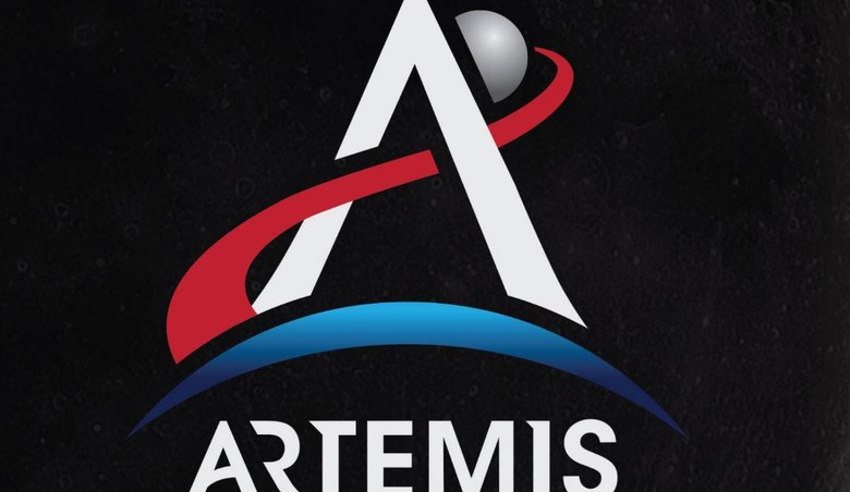
Artemis, after all, was the twin sister of Apollo according to Greek mythology, and with the goal of returning humans to the moon – including the first woman this time around – that name certainly seems appropriate. Today, NASA unveiled a "new identity" for the Artemis program, showing off a new logo that has quite a bit of underlying meaning to it.
The logo features the letter A in the center, sitting above a crescent representing Earth with the Moon behind it. A streak of red – NASA calls it "Rocket Red" and the other colors "Earth Blue" and "Lunar Silver" – both completes the A and shows the trajectory of the flight from the Earth to the Moon.
There's a little more subtext to this logo, though – for instance, NASA says that the "A" symbolizes an arrowhead from the quiver of Artemis while at the same time representing a rocket launch. Both the fact that the tip of the A extends beyond the Moon and that the trajectory from Earth to the Moon is painted red represent the notion that the Artemis program is the first step in getting humans to Mars. Even the crescent representing the Earth has a double meaning, as it also represents Artemis' bow.
So, the new look for the Artemis program certainly has a lot of subtext to it. July 20th will mark 50 years to the day since Neil Armstrong and Buzz Aldrin stepped foot on the Moon, so the reveal of this branding makeover is certainly timely. The Artemis program has a goal of returning to the Moon by 2024, which means we've got a long way to go before the program's vision is realized. Stay tuned.