Android dashboard update shows data based on active users
Android's device dashboard is an easy way to visually access the mobile operating system's use among device owners, and is now more useful than before due to an update in the way the data is calculated. This information comes via an announcement on the Android Developers' Google+ profile, which advises followers that starting today, the pie chart has undergone a bigger shift than is typical.
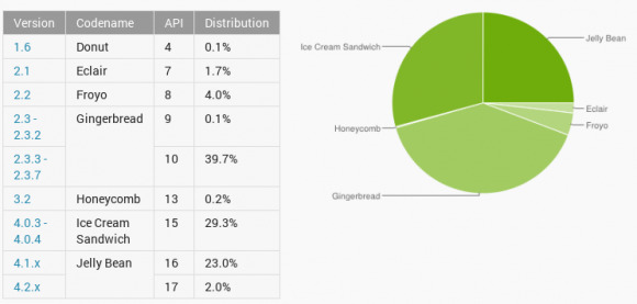
Per the announcement, the new dashboards presented are based on the number of active users rather than the number of pings that Google's servers receive, causing a relevant – if not significant – shift in the distribution. This is determined by basing the dashboards on the users that hit up the Google Play Store, giving a more accurate profile of the active users who are using the mobile OS and engaging with its content.
This change not only provides a more accurate look at what versions of Android are most actively being used by the consumer public, but also provides developers with a better idea of who is visiting the Play Store and potentially buying their apps. This is in addition to the more detailed information provided by the developers' own Developer Console.
The screen size distribution charts have been updated as well as the operating system version. You can check out the distribution for yourself, along with the green-shaded pie chart, over at Android's official website, and while you're at it, there's a lively discussion about screen size happening on the Android Developer's Google+ announcement, which you can hit up via the link below.
[via Google+]