The Real Reason The Apple Logo Has A Bite Out Of It
Apple's logo is one of the most distinct pieces of branding in the world. The company has been using the logo, which consists of a silhouette of an apple with a bite taken from it, for almost the entirety of its history. Plenty of theories have emerged about the reason for the bite, and it has been thought of as a nod to a number of famous figures in the worlds of science and religion. The real reason the logo has a bite out of it is actually much simpler than that.
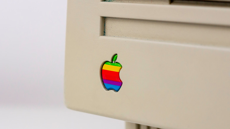
The original Apple logo was more colorful than the silver or white version that adorns the company's products now; it first appeared on the Apple II in 1977. The logo Apple used before that featured a drawing of Isaac Newton sitting underneath a tree. In the drawing, Newton had been hit by the apple that allegedly inspired him to begin working on his theory of gravity. The obvious reference to Newton may have inspired some of the theories hinting at a link between the bite logo and Alan Turing, a man who many refer to as the father of modern computing.
Who was Alan Turing?
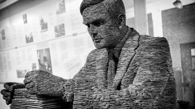
Alan Turing was born in 1912, and by the 1930s he was laying the groundwork modern computers are built upon. He invented the algorithm and the idea of a computing machine that could run said algorithms. In the late '30s and early '40s, Turing's work on codebreaking was a vital part of the allied war effort. Highlights include the cracking of the Enigma code, something the Germans thought was impossible.
One place you may see Turing's name these days is in stories and papers related to artificial intelligence (AI). Turing's Imitation Game, also known as the Turing Test, has long been held up as a benchmark for AI to aspire to. To pass the test, an AI would have to hold a conversation with a human and not give away the fact it was a computer. Turing's name has also been attached to a number of electrical devices, including one of NVIDIA's GPU architectures and a now-defunct cellphone company.
Turing and his team's codebreaking work at Bletchley Park is often credited with shortening the length of World War II and saving lives. Turing was also homosexual, which was illegal in Britain at the time. In 1952, he was convicted of gross indecency and chemically castrated after his relationship with a 19-year-old Manchester man was discovered by the authorities. Despite his pioneering work in computing and codebreaking, Turing's conviction overshadowed his later life (via Britannica).
So how could any of this be related to Alan Turing? Turing's body was discovered close to a cyanide-laced apple with a bite taken from it. His death was ruled a suicide, but many people, including some official biographers, believe Turing's death was accidental. The codebreaker received a posthumous Royal Pardon in 2013 (via BBC).
The real reason the logo has a bite
So was the logo's missing bite a nod to Turing's death and its pride-flag-like appearance a reference to his conviction? As compelling as the story sounds, it sadly isn't true. The logo's creator Rob Janoff revealed the real reason the bite is there in an interview with Creative Bits. Janoff said, "When I explain the real reason why I did the bite it's kind of a let down. But I'll tell you. I designed it with a bite for scale, so people get that it was an apple not a cherry. Also it was kind of iconic about taking a bite out of an apple."
The designer also brushed off any suggestion that the bite was a clever reference to the computing term byte, claiming he wasn't even aware of the term at the time: "It was after I designed it that my creative director told me: 'Well you know, there is a computer term called byte.' And I was like: 'You're kidding!' So, it was like perfect, but it was coincidental that it was also a computer term."
Janoff was also worried that Steve Jobs wouldn't like the logo's quirky design choice, so he presented the Apple founder with two designs when the pair met — one with the logo and one without. He also provided a selection of tones and colors in case the original striped logo didn't go down well. Fortunately, Jobs decided to take a chance on the outlandish design. "Steve liked the idea, because he liked things that were outside the box. And, it's not so revolutionary now, but it was a little different then," Janoff said. There were some objections from an account executive, but those were ignored and the logo is still there to this day.


