You'll be happy with this Android update with Material Design
This week Google updated their spec guidance for bottom navigation for developers making Android apps – for the apps you use. What does this mean for you? It means that the apps you're working with tomorrow should look a whole lot more pleasing than they do today. ...If they're following Google's rules, that is. Google's Material Design library makes all apps look like they belong in the Google Android universe, and with this update, they'll be ready to tap through with extreme ease.
With Google's latest update to the Material Design specifications for bottom menus, users will find design choices gathered around common sensibilities. Icons will be the primary color of the app itself. There'll be no more scrollable menus to the left and to the right. It'll be simple.

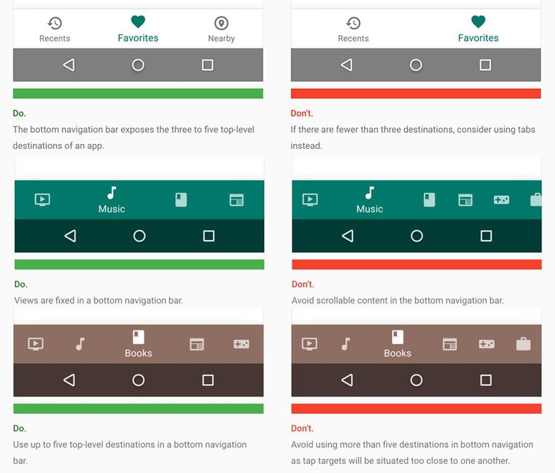
Above you'll see the most important set of dos and don'ts from this most current listing of Material Design bottom menus from Google. Notice the simple nature with which the menus will be arranged. Notice how fast you'll understand what's about to happen to the app you'll be in.
One of the most confusing sets of rules left slightly open for developers here is addressed by Google in short: "Be cautious when combining bottom navigation with tabs, as the combination may cause confusion when navigating an app."
"For example, tapping across both tabs and bottom navigation could display a mixture of different transitions across the same content."
Watch yourself, developers.
If we didn't say the word enough already: Simplicity is key.
Above you'll see the demonstration movements of future menus for developers of Android apps all combined into a single video. Notice the smoothness with which all transitions occur. How kind of them!
Android design is looking up!
