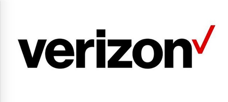
Verizon's new logo is simple, clean and incredibly boring
Verizon has, like certain other companies in recent weeks, introduced a newly redesigned logo that it feels better suits its modern-day self. While there's nothing wrong with that, there is something wrong with the new logo...it is a giant step backward, and while cleaner, it is also considerably more boring. The checkmark is still there, but it's not even trying anymore. And the word "Verizon"? It is now content merely existing as a shell of its former self.
Following a brief vague appearance online, Verizon has officially introduced the logo you see above as its new mark. This redesign is "to go along with our renewed purpose", says Verizon, and to express its "purpose in a way that is truly ours."

It's unclear, then, why the company decided to strip away all personalized aspects from its logo in favor of the most basic sans-serif non-italicized bland text possible. The checkmark has even lost its unique personality, now resting at the end of the word entirely indistinguishable from any other red checkmark in existence.
Admittedly, slanting letters have become a bit dated, and simple-is-beautiful is a design favorite right now. Neither a lack of slanting nor simplicity means a logo has to be boring, though, and it doesn't appear Verizon received that memo.
Said Verizon about its design choices:
The new brand identity takes the best elements of Verizon's heritage, represented by its colors and the Verizon "checkmark," and transforms them for a new era. At its most basic level, the new logo is a visual statement that honors our history and reflects an identity that stands for simplicity, honesty and joy in a category rife with confusion, disclaimers and frustration. It's a cleaner, more human design and the checkmark, the universal symbol for getting things done, uniquely expresses the reliability of Verizon.
SOURCE: Verizon
