Twitter Redesigned: Endless Scrolling, In-Line Media, More
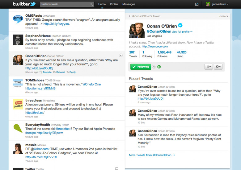
Twitter has updated its web interface in an attempt to lure users away from their third-party apps, and the general consensus seems to be that it's a slicker, more immediate way to interact with the short-message service. The single-column view is gone, replaced by a twin-column interface that allows for a preview on the right hand side and a full timeline on the left. Twitter has also embedded photo and video content – as long as it has a deal with the site hosting it, such as TwitPic and YouTube – in the preview itself, meaning less hopping around looking at multimedia.
There are also new mini profiles, which show user information and a potted summary of that person's recent tweets, and a related content section which shows replies, other recent messages, map content (if the tweet had location data attached) and other information. Best of all, the "more" button has been replaced with endless scrolling. Twitter expect to roll the new version of the site out to users over the next few weeks, so don't be surprised if you don't see it for a while.
[via GigaOM]