The Frube GameCube Is Meant To Frustrate
The designer of this very odd GameCube was asked to choose a product and then redesign it based on the dominant emotion it is associated with. I find it incredibly hilarious that Kathryn Elliot decided frustration was the emotion that belonged with the GameCube.
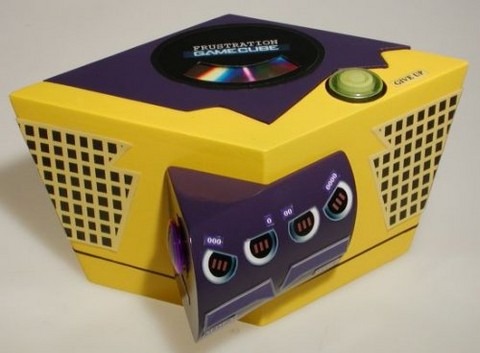
Therefore she created this little bit of machinery, the Start button now says "Give Up" and the reset "Start Over". The color scheme, purple and yellow, are used because they are aggressive colors. The shape will also no longer sit nicely on a shelf, or not as well as the classic square shape did.
The panels have jagged shapes and are difficult to figure out how to open. The controller plug-ins are also all in the wrong order. I'd say the designer definitely succeeded.
[via slipperybrick]